
Your landing page’s weakest score is Trust.
How Vestris ranks
- 1.
Vestris74
- 2.
Ottimate... wait38
74Growth scoreupdated
category scores
category scoresShowHide
Trust
62FairProof that the product is real, competent, and safe to try.
| Trust read | |
|---|---|
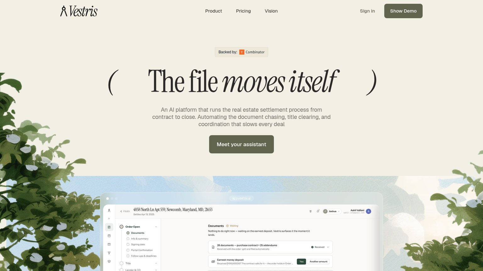
| Vestris | "Backed by: Y Combinator" badge above the hero headline |
| No visible trust signal identified. |
CTA
68FairCopy, size, verb, cost-feel — does the primary CTA earn the click?
Problems
- 'Meet' is vague — payoff unclear
- competes with nav's 'Show Demo'
- no destination hint (demo? signup?)
Value props
78FairTitle, subtitle, hero — do they sell the product's true value?
Vestris’s headline sells
The file moves itself
An AI platform that runs the real estate settlement process from contract to close. Automating the document chasing, title clearing, and coordination that slows every deal
Working
- Subhead names the exact pain: document chasing
- Hero screenshot shows product doing the work
- "Contract to close" scopes the promise clearly
Could improve
- No numbers: time saved, deals, hours
- Headline needs subhead to be parsed
- Only proof point is YC badge
Mobile web
80StrongThe phone experience as a first-class citizen.
 12
- Hero headline wrap — Display type scales down too little, wrapping into four tall lines that eat a third of the viewport.
- Four-line subhead — Long paragraph pushes the CTA toward the bottom edge of the first viewport.
Information hierarchy
82StrongDoes the design help or inhibit what the page is trying to say?
12- Show Demo vs hero CTA — "Show Demo" is styled in the same olive fill as "Meet Vestris's assistant", splitting the primary action into two equal-weight buttons.
- Product screenshot cropped — The app UI is cut off mid-panel at the fold, so the dense document detail communicates little at this crop.
Competitors
inferred from product, audience, and value prop#1Vestris74
#2