
Your landing page’s weakest score is Trust.
How Trope ranks
72Growth scoreupdated
category scores
category scoresShowHide
Score over time
Trust
58FairProof that the product is real, competent, and safe to try.
| Trust read | |
|---|---|
| Trope | "Backed by Y Combinator" badge above the headline |
| "Built natively on ServiceNow" platform claim in the subheadline | |
| No visible trust signal identified. | |
| No visible trust signal identified. | |
| See the latest updates to DOSS in our H1 Product Recap |
CTA
68FairCopy, size, verb, cost-feel — does the primary CTA earn the click?
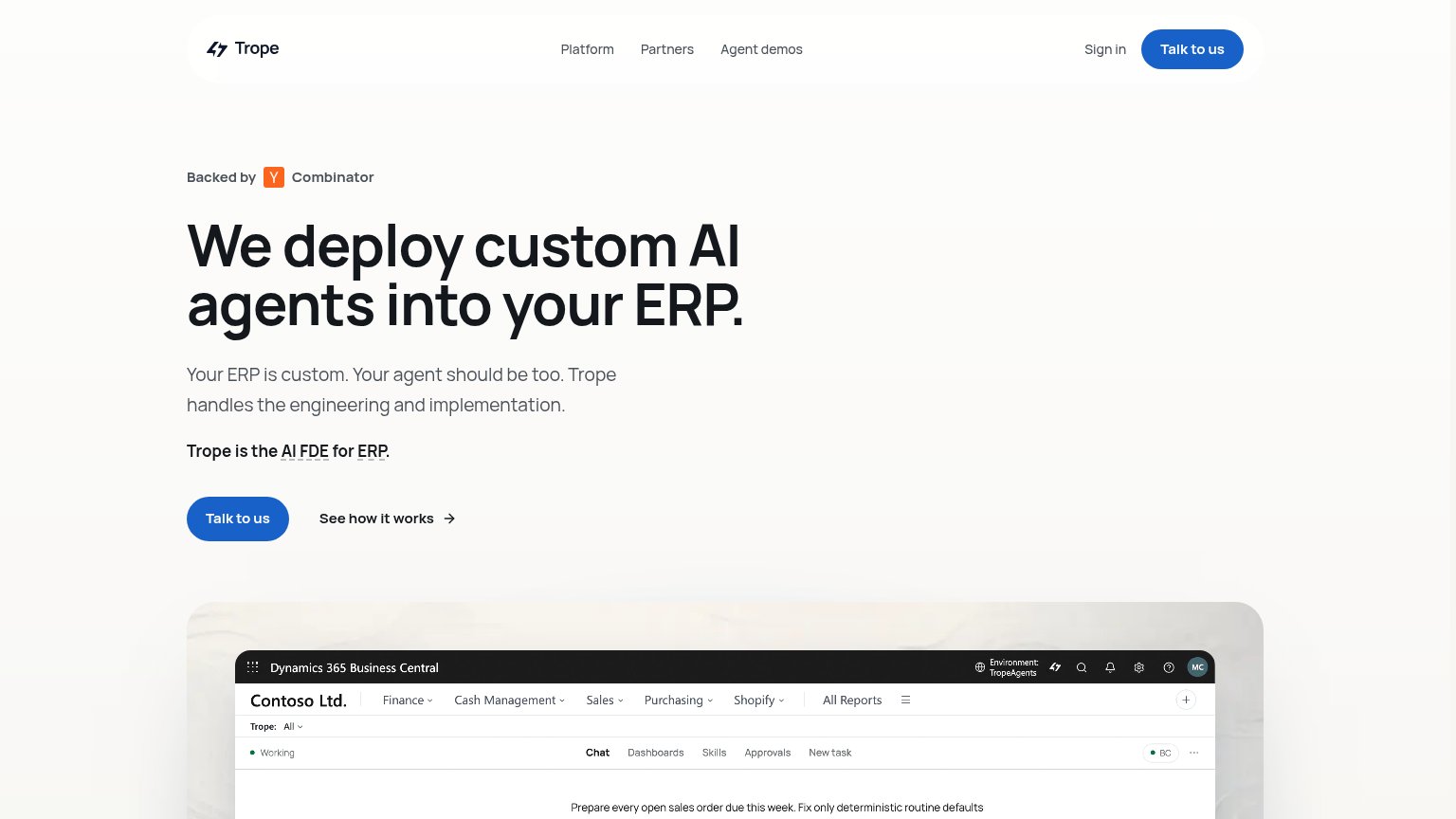
Problems
- click feels like a sales call
- no value promised for the click
- no low-friction product path
Value props
72FairTitle, subtitle, hero — do they sell the product's true value?
Trope’s headline sells
We deploy custom AI agents into your ERP.
Your ERP is custom. Your agent should be too. Trope handles the engineering and implementation.
Working
- Names category, delivery model, and target system
- Hero screenshot shows agent working in Dynamics 365
- 'Handles engineering and implementation' is a real hook
Could improve
- Zero numbers or named outcomes
- 'AI FDE for ERP' is insider jargon
- No emotional payoff for the buyer's pain
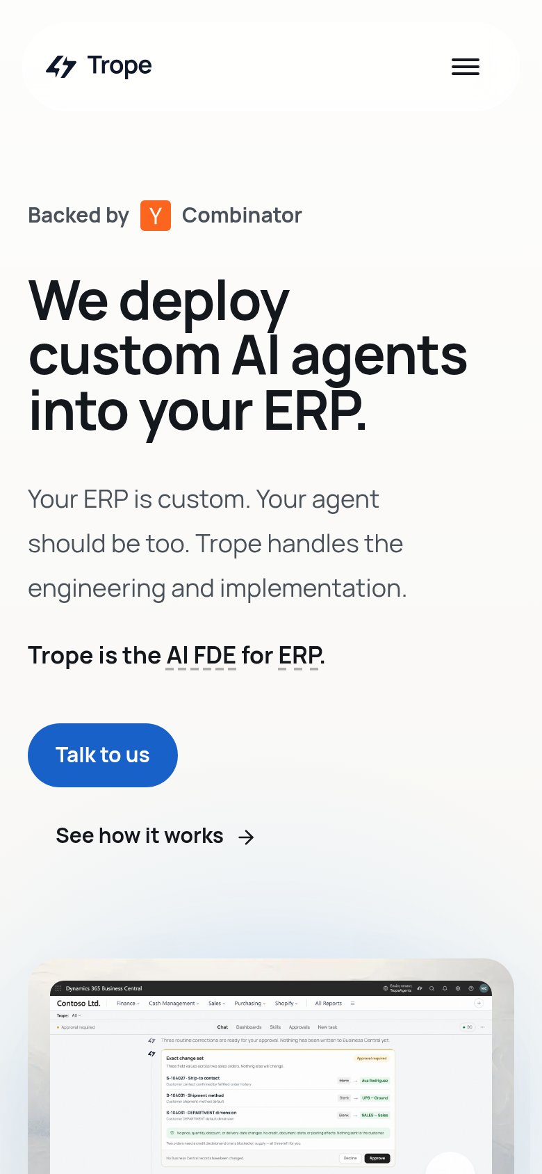
Mobile web
78FairThe phone experience as a first-class citizen.
 12
- Talk to us button — Desktop-proportioned pill floats at roughly half column width instead of a full-bleed, thumb-friendly bar.
- Headline block — Headline plus subhead plus tagline stack pushes the 'Talk to us' CTA to the very bottom edge of the first viewport.
Information hierarchy
82StrongDoes the design help or inhibit what the page is trying to say?
1234- Header nav links — Platform, Partners, Agent demos, and Sign in offer four exits at the same eye level as the primary CTA.
- Dotted glossary links — Underlined "AI FDE" and "ERP" terms invite clicks away right above the hero CTA pair.
- Cropped product screenshot — The Business Central capture cuts off before the agent's task result, muting the proof it exists to deliver.
- Duplicate Talk to us — Header and hero buttons share identical weight, splitting focus between two equal primary CTAs.