
Your landing page’s weakest score is Trust.
How Touchmark ranks
69Growth scoreupdated
category scores
category scoresShowHide
Score over time
Trust
48PoorProof that the product is real, competent, and safe to try.



| Trust read | |
|---|---|
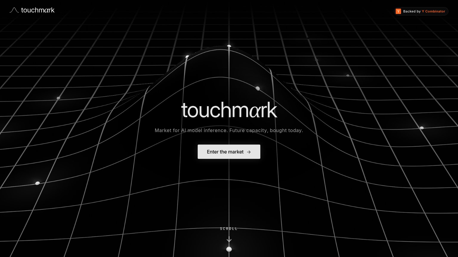
| Touchmark | "Backed by Y Combinator" badge in the header |
| Logo strip featuring NVIDIA, Modal, Standard Intelligence, HeyGen, and MIT at the bottom of the fold | |
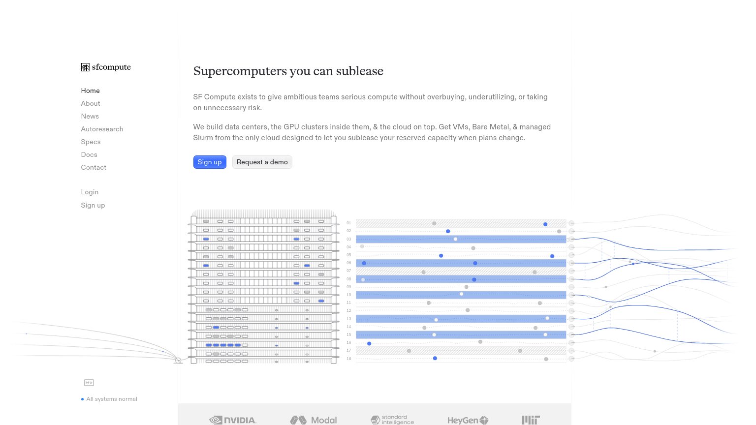
| Stats bar: "700K+ transactions/mo · 20,000+ GPUs · 40+ data centers · 68+ GPU types" | |
| Logo strip with yesnoerror, Pluralis Research, Princeton University, and Gensyn plus "Read Razer Case Study" link | |
| Customer logo strip (Tinfoil, Moises, Parasail, Berkeley) below the mobile hero |
Value props
58FairTitle, subtitle, hero — do they sell the product's true value?
Touchmark’s headline undersells
touchmark
Market for AI model inference. Future capacity, bought today.
Working
- Subhead names category and mechanism
- "Bought today" implies concrete action
- No buzzword abstraction stack
Could improve
- H1 is just the brand name
- No numbers, prices, or proof points
- Hero visual decorates, shows no market
Information hierarchy
78FairDoes the design help or inhibit what the page is trying to say?
123- Subheadline gray text — Low-contrast gray copy at small size makes the only explanation of the product easy to skim past.
- Y Combinator badge — The single brightest color on the fold (orange) pulls the eye to a credibility badge instead of the CTA.
- Enter the market CTA — Label names an action, not a benefit, and its muted gray fill blends into the grayscale scene rather than popping.
CTA
80StrongCopy, size, verb, cost-feel — does the primary CTA earn the click?
Problems
- label names a place, not a payoff
- no secondary low-intent path
- arrow icon adds no meaning
Mobile web
82StrongThe phone experience as a first-class citizen.
 12
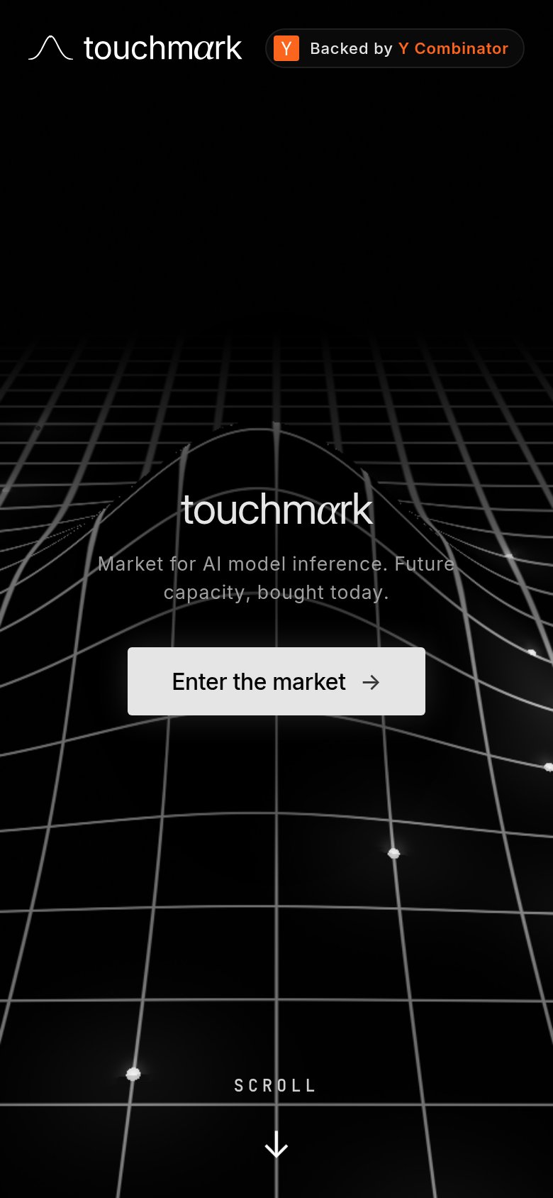
- Subheadline over mesh — Low-contrast grey text with grid lines cutting through the words reads poorly at arm's length.
- Enter the market button — Desktop-proportioned pill floats narrow in the column instead of a full-bleed thumb target.