
Your landing page’s weakest score is Trust.
How Torus ranks
- 1.
Torus73
- 2.
Kognitos... wait38
73Growth scoreupdated
category scores
category scoresShowHide
Trust
48PoorProof that the product is real, competent, and safe to try.
| Trust read | |
|---|---|
| Torus | "BACKED BY Y COMBINATOR" badge below the Request a Pilot CTA |
| No visible trust signal identified. |
CTA
72FairCopy, size, verb, cost-feel — does the primary CTA earn the click?
Problems
- 'Request' feels like joining a queue
- 'Pilot' implies sales process, not value
- no payoff or timeframe implied
Value props
74FairTitle, subtitle, hero — do they sell the product's true value?
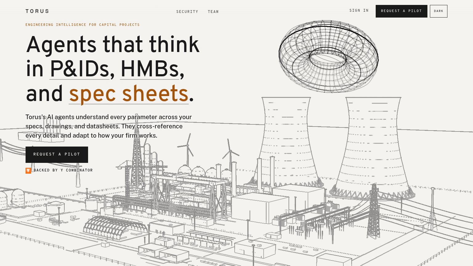
Torus’s headline sells
Agents that think in P&IDs, HMBs, and spec sheets.
Torus's AI agents understand every parameter across your specs, drawings, and datasheets. They cross-reference every detail and adapt to how your firm works.
Working
- Domain nouns (P&IDs, HMBs) qualify the audience fast
- Eyebrow names the market: capital projects
- YC badge adds credibility proof
Could improve
- No outcome or metric named anywhere
- Torus graphic decorates, doesn't demo
- Subhead states capability, not payoff
Information hierarchy
84StrongDoes the design help or inhibit what the page is trying to say?
1234- Duplicate header CTA — Second REQUEST A PILOT in the header splits attention from the hero button and pulls the eye to the top-right corner.
- Hero pilot button — The primary action is smaller and less prominent than the headline's orange 'spec sheets' link styling, so the scan path ends on text, not the CTA.
- DARK theme toggle — A boxed utility control styled at near-button weight sits beside the CTA row and adds a competing click target.
- Underlined headline terms — P&IDs, HMBs, and spec sheets read as links, inviting exploratory clicks before the visitor reaches the pilot request.
Mobile web
86StrongThe phone experience as a first-class citizen.
 12
- Supporting body paragraph — Four full-width lines push the primary CTA to the bottom edge of the first viewport.
- Dark mode toggle — A boxed utility control sits next to the hamburger, competing with the menu for header attention.
Competitors
inferred from product, audience, and value prop#1Torus73
#2