

Your landing page’s weakest score is Trust.
How Tenor ranks
67Growth scoreupdated
category scores
category scoresShowHide
Score over time
Trust
54FairProof that the product is real, competent, and safe to try.
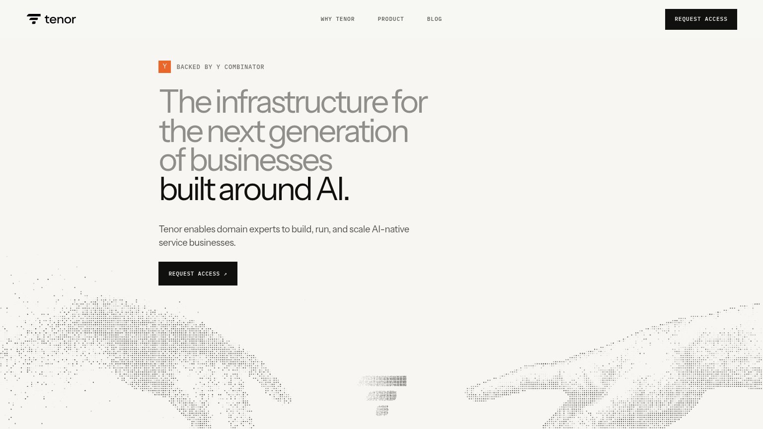
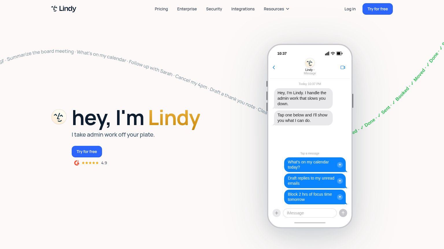
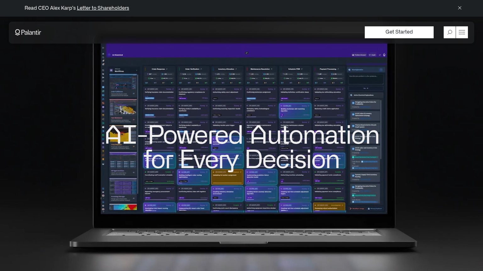
| Trust read | |
|---|---|
| Tenor | "BACKED BY Y COMBINATOR" badge above the headline |
| Detailed real product screenshot of the AI Hivemind workflow dashboard | |
| No visible trust signal identified. | |
| G2 badge with 4.9 star rating below the "Try for free" CTA |
Value props
58FairTitle, subtitle, hero — do they sell the product's true value?
Tenor’s headline vague
The infrastructure for the next generation of businesses built around AI.
Tenor enables domain experts to build, run, and scale AI-native service businesses.
Working
- Subhead names audience: domain experts
- Y Combinator badge adds credibility
- Killer stat (1,536 hours) exists on page
Could improve
- Headline is a generic AI abstraction stack
- Proof stat buried below desktop fold
- Hero art decorates, shows nothing of product
CTA
62FairCopy, size, verb, cost-feel — does the primary CTA earn the click?
Problems
- click feels like asking, not getting
- no payoff implied by the label
- small footprint vs huge headline
- no urgency or value word
Mobile web
78FairThe phone experience as a first-class citizen.
 123
- Hero REQUEST ACCESS button — Desktop-proportioned centered button instead of a full-bleed, thumb-friendly tap target.
- Header REQUEST ACCESS block — Duplicates the hero CTA and crowds the collapsed header with a competing tap target.
- Gray headline lines — Light gray on cream reads low-contrast for the first three headline lines at phone distance.
Information hierarchy
82StrongDoes the design help or inhibit what the page is trying to say?
123- Greyed headline lines — First three lines of the value prop render in low-contrast grey, de-emphasizing the core promise.
- Faded center logo motif — The blurred dot-matrix mark reads as a rendering artifact rather than intentional brand imagery.
- Duplicate Request Access — Nav button matches the hero CTA's weight and label, splitting attention between two identical targets.