RisklyticsYC S26 landing page report.
← Back to YC S26

Your landing page’s weakest score is Trust.

Fix Trust

Score over time

807060504030Koop Technologies 61 on Sep 20 (Live)Vouch Insurance 42 on Jun 9 (Wayback)Vouch Insurance 58 on Jul 15 (Wayback)Vouch Insurance 58 on Aug 6 (Wayback)Vouch Insurance 57 on Aug 22 (Wayback)Vouch Insurance 69 on Sep 20 (Live)Embroker 63 on Apr 4 (Wayback)Embroker 64 on Apr 23 (Wayback)Embroker 65 on May 7 (Wayback)Embroker 61 on May 19 (Wayback)Embroker 66 on Jun 28 (Wayback)Embroker 64 on Aug 18 (Wayback)Embroker 71 on Sep 20 (Live)Risklytics 72 on Aug 26 (Wayback)Risklytics 69 on Sep 15 (Wayback)Risklytics 72 on Sep 20 (Live)Aug 26Sep 15Sep 20
Past reportsShow past reportsHide past reports
  1. Sep 20, 202672LiveOverall +3 · Information hierarchy +6 · Value props +6Viewing
  2. Sep 15, 202669Overall −3 · Value props −6 · CTA −4View →
  3. Aug 26, 202672First tracked report — strongest Mobile web 86, weakest Trust 48View →

Trust

48Poor

Proof that the product is real, competent, and safe to try.

Risklytics
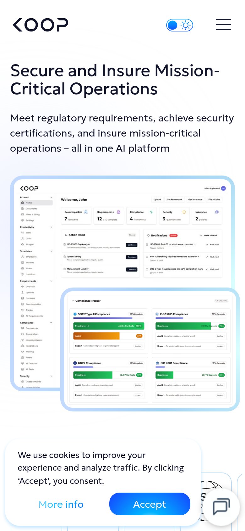
Koop Technologies
Trust read
Risklytics"Backed by Y Combinator" badge under the Get Insured CTA
Koop TechnologiesDetailed product dashboard screenshot showing a Compliance Tracker with SOC 2 Type II, ISO 13485, GDPR, and ISO 9001 pro
Vouch InsuranceNo visible trust signal identified.
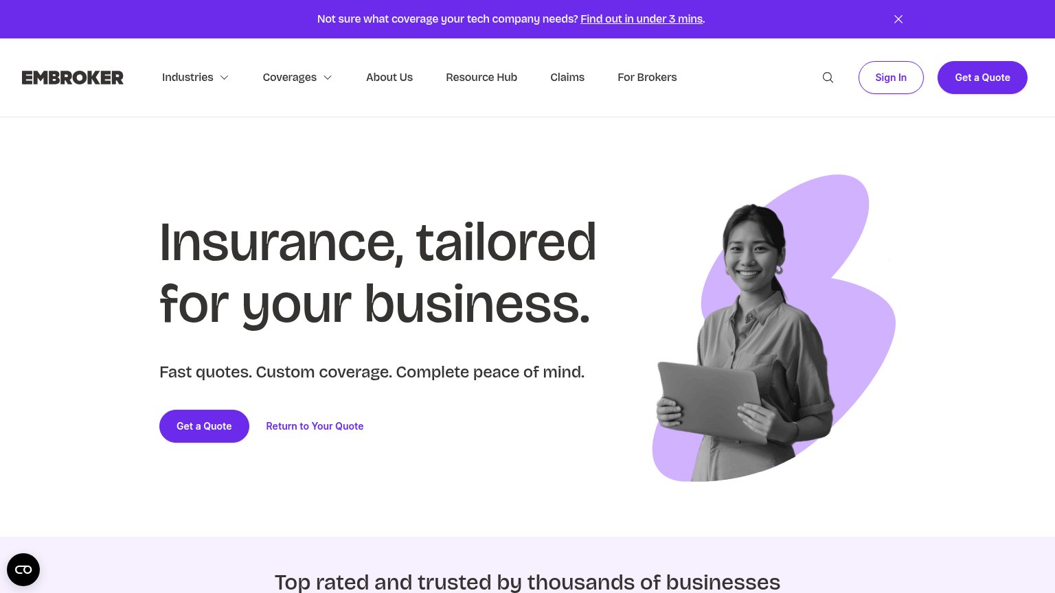
Embroker"Top rated and trusted by thousands of businesses" section header

Value props

68Fair

Title, subtitle, hero — do they sell the product's true value?

Risklytics’s headline sellsInsurance for Frontier TechCommercial insurance for robots, autonomy and hardware in the field.

Working

  • Instantly clear who it's for
  • Concrete nouns: robots, autonomy, hardware
  • YC badge adds credibility

Could improve

  • No numbers or outcome named
  • Zero emotional pull; states category only
  • Hero art decorates, doesn't demonstrate

CTA

78Fair

Copy, size, verb, cost-feel — does the primary CTA earn the click?

Risklytics
Embroker

Problems

  • click feels committal, like buying
  • no low-cost first step (quote)
  • hero button modest vs. huge headline

Information hierarchy

84Strong

Does the design help or inhibit what the page is trying to say?

Information hierarchy annotations on the desktop capture123
  1. Black Login button — Solid dark button rivals the primary CTA's weight and pulls existing users' eyes before the hero pitch lands.
  2. Six-item nav row — Coverage, Solutions, For insurers, Referrals, Resources, Company give six equal-weight exits before the fold's one action.
  3. Header Get Insured — Duplicates the hero CTA in the same fold, splitting the single conversion target into two.

Mobile web

84Strong

The phone experience as a first-class citizen.

Mobile web annotations on the mobile capture12
  1. Hero Get Insured button — Desktop-proportioned button floats narrow in the phone column instead of near-full-bleed.
  2. Header Get Insured button — Duplicates the hero CTA in the sticky header, splitting attention on a small screen.

Competitors

inferred from product, audience, and value prop