
Your landing page’s weakest score is CTA.
How Proprio Robotics ranks
- 1.
Rack Renew (Fieldwork Robotics alternatives excluded)71
- 2.
Reflex Robotics70
- 3.
Proprio Robotics46
46Growth scoreupdated
category scores
category scoresShowHide
Score over time
CTA
32PoorCopy, size, verb, cost-feel — does the primary CTA earn the click?

Problems
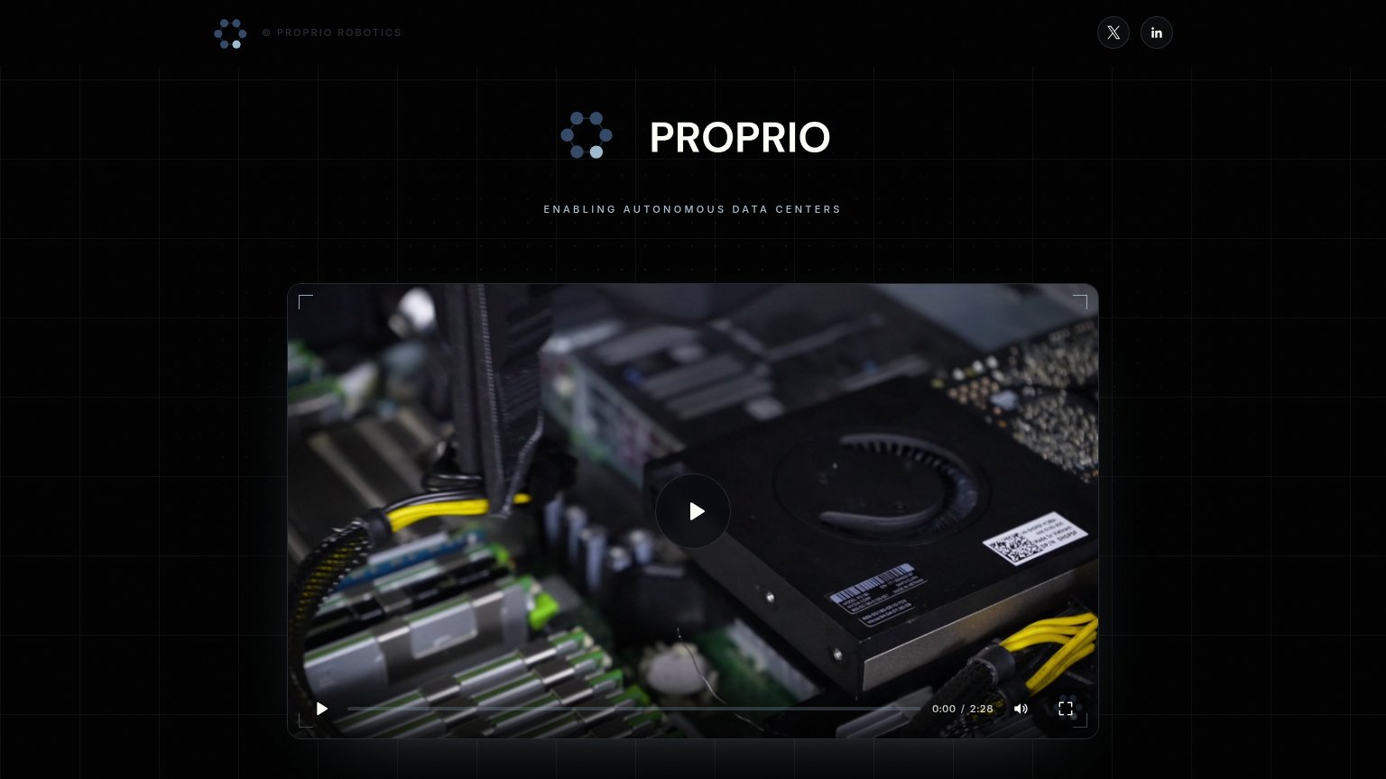
- no CTA anywhere in either capture
- video play is only action
- social icons are only links
- no email capture or contact path
Value props
42PoorTitle, subtitle, hero — do they sell the product's true value?
Proprio Robotics’s headline vague
PROPRIO
ENABLING AUTONOMOUS DATA CENTERS
Working
- Clear target market: data centers
- Bold ambition signals category leadership
- Video promises a real product demo
Could improve
- Headline is just the logo, not a claim
- No outcome, task, or number named
- Demands video play to learn anything
Trust
52FairProof that the product is real, competent, and safe to try.

| Trust read | |
|---|---|
| Proprio Robotics | "BACKED BY" Y Combinator badge with Harvard, BAIR, and NVIDIA Inception Program logos (mobile) |
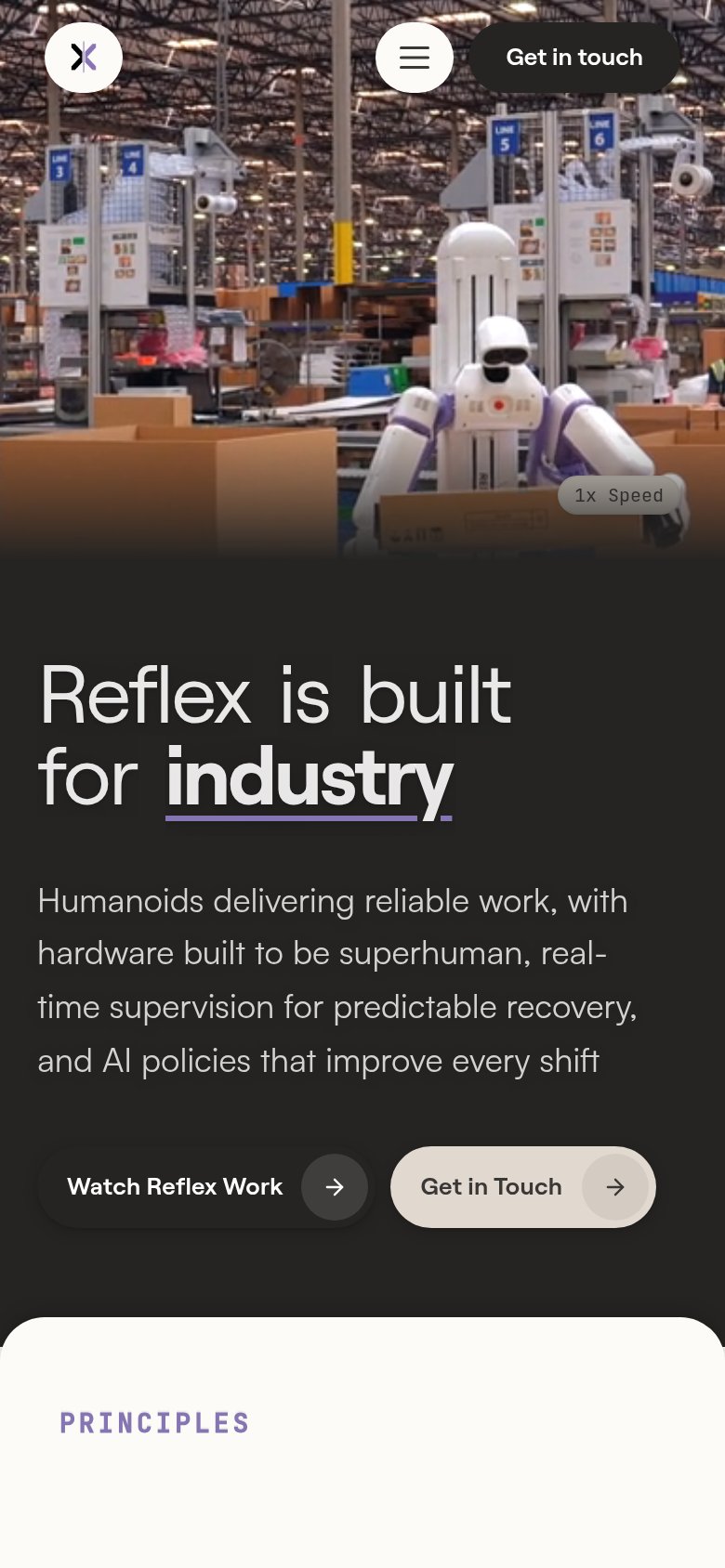
| Hero video of the Reflex humanoid robot working a live warehouse packing line alongside human workers | |
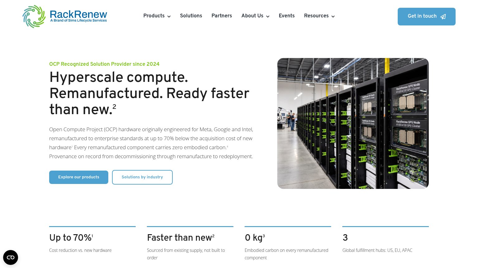
| Hero photo of branded RackRenew GPU Node H100/A100 GPU Cluster racks in a real warehouse facility |
Mobile web
52FairThe phone experience as a first-class citizen.
123- Video card hero — The only action on the page is a video play — no contact, signup, or waitlist CTA exists anywhere in the fold.
- Video control bar — A second play button duplicates the large center play control, cluttering the sole interactive element.
- Header social icons — X and LinkedIn icons are the only header actions, routing the sole tap targets off-site instead of into a funnel.
Information hierarchy
54FairDoes the design help or inhibit what the page is trying to say?
 123
- Social icons top-right — X and LinkedIn buttons are the highest-contrast interactive elements on the page and both lead off-site.
- Video thumbnail frame — A dark, blurred motherboard close-up dominates the fold without communicating the robotics/autonomy promise the tagline makes.
- Tagline text — "ENABLING AUTONOMOUS DATA CENTERS" is set in small, low-contrast letter-spaced caps that visually recede beneath the logo lockup.