
Your landing page’s weakest score is Trust.
How Prodigy Research ranks
71Growth scoreupdated
category scores
category scoresShowHide
Score over time
Trust
54FairProof that the product is real, competent, and safe to try.
| Trust read | |
|---|---|
| Prodigy Research | "Backed by Y Combinator" badge |
| Terminal snippet with real repo: "git clone git@github.com:numerai/example-scripts.git" and Codex/Claude/Cursor tabs | |
| Black-and-white office photo showing a physical Voleon Group sign on the wall |
CTA
68FairCopy, size, verb, cost-feel — does the primary CTA earn the click?
Problems
- click delivers contact, not value
- generic label, no product payoff
- no echo of headline promise
Value props
72FairTitle, subtitle, hero — do they sell the product's true value?
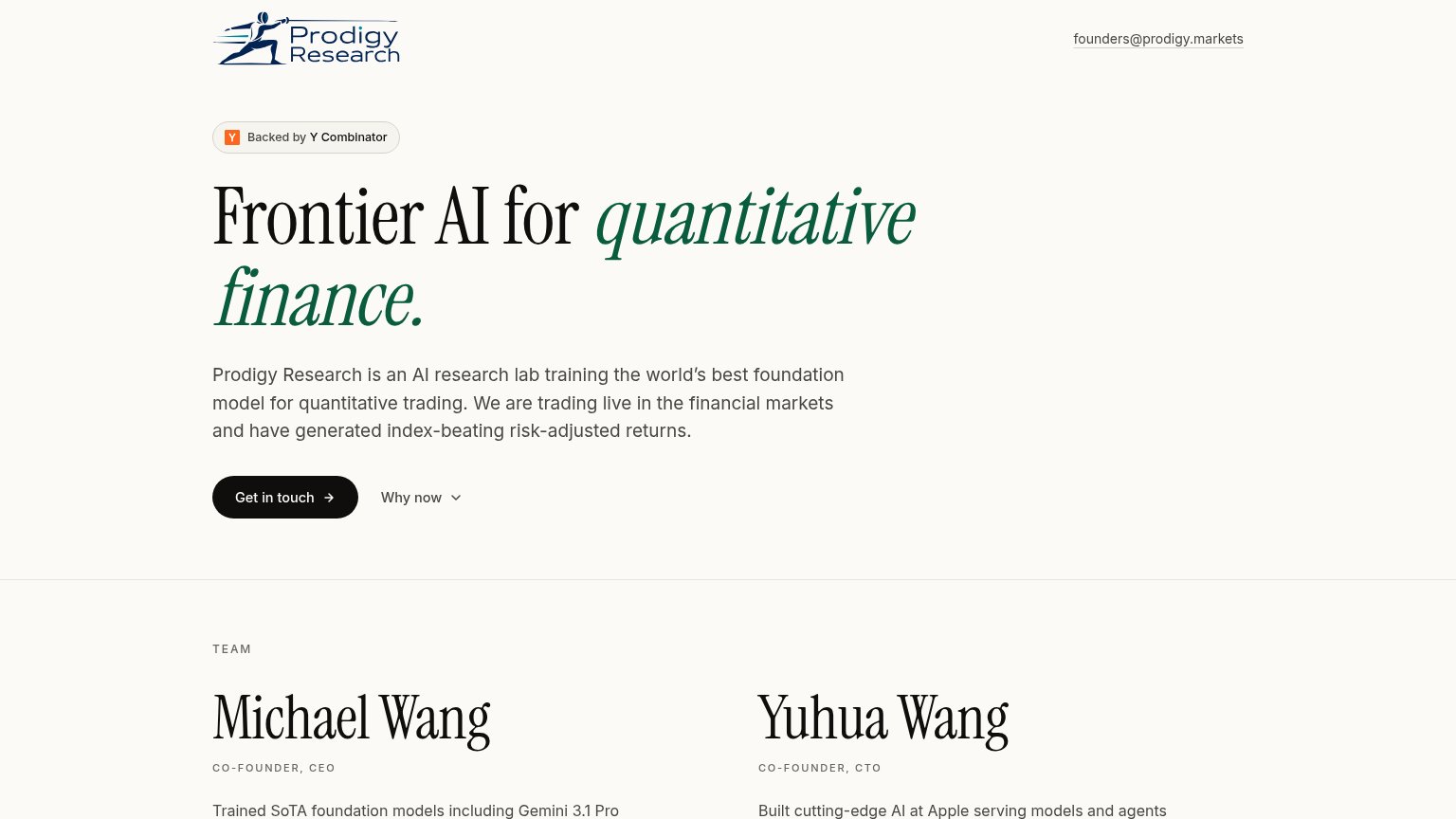
Prodigy Research’s headline undersells
Frontier AI for quantitative finance.
Prodigy Research is an AI research lab training the world's best foundation model for quantitative trading. We are trading live in the financial markets and have generated index-beating risk-adjusted returns.
Working
- Live-trading proof is concrete
- Index-beating claim names outcome
- YC badge adds instant credibility
Could improve
- Headline is category, not value
- No numbers on returns claimed
- Hero has no product/performance visual
Mobile web
78FairThe phone experience as a first-class citizen.
 12
- Intro paragraph — Body copy barely scales down and wraps into seven long lines, pushing the CTA to the fold's edge.
- Get in touch button — Half-width desktop pill instead of a full-bleed thumb-friendly button, sharing the row with 'Why now'.
Information hierarchy
82StrongDoes the design help or inhibit what the page is trying to say?
123- Why now dropdown — Same-weight secondary control beside the primary CTA splits the single decisive action into a choice.
- Founders email link — Bare mailto text in the header duplicates the contact action at lower commitment, leaking clicks from 'Get in touch'.
- Team section creep — The Team heading and founder bios crest into the fold, competing with the hero argument before the CTA is acted on.