
Your landing page’s weakest score is CTA.
How Praxis Robotics ranks
- 1.
Micropsi Industries64
- 2.
Physical Intelligence56
- 3.
Skild AI50
- 4.
Praxis Robotics47
47Growth scoreupdated
category scores
category scoresShowHide
CTA
32PoorCopy, size, verb, cost-feel — does the primary CTA earn the click?

Problems
- no CTA anywhere in either fold
- only a scroll hint, no action
- convinced visitors have no next step
Trust
44PoorProof that the product is real, competent, and safe to try.
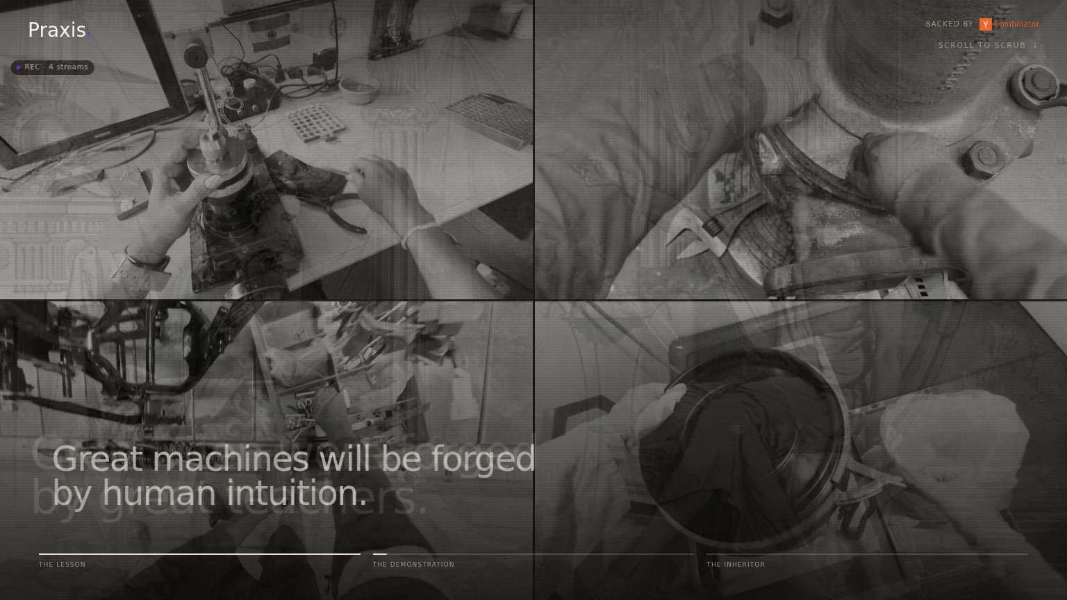
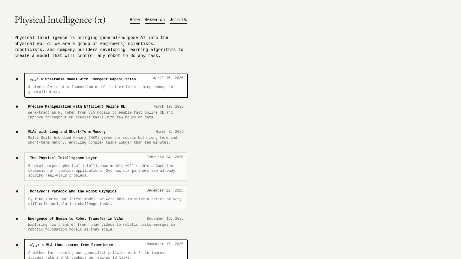
| Trust read | |
|---|---|
| Praxis Robotics | "BACKED BY Y Combinator" badge in the header |
| Dated research timeline, e.g. "π0.7: a Steerable Model with Emergent Capabilities — April 16, 2026" | |
| No visible trust signal identified. | |
| No visible trust signal identified. |
Value props
52FairTitle, subtitle, hero — do they sell the product's true value?
Praxis Robotics’s headline vague
Great machines will be forged by human intuition.
Working
- Evocative, memorable manifesto tone
- Live demo footage shows real human skill
- Lesson/demonstration framing hints at method
Could improve
- No literal statement of what Praxis does
- No subhead, numbers, or named outcome
- Requires decoding metaphor to parse product
Information hierarchy
54FairDoes the design help or inhibit what the page is trying to say?
12- Overlapping headline text — "Great machines will be forged" renders on top of the ghosted "by great teachers" line, making the value prop momentarily illegible.
- Low-contrast timeline labels — "THE LESSON / THE DEMONSTRATION / THE INHERITOR" sit in tiny grey caps at the fold edge — the only navigation cue is nearly invisible.
Mobile web
54FairThe phone experience as a first-class citizen.
 12
- Faded video captions — Labels like 'EGOCENTRIC · DIAMOND' render in low-contrast gray over busy footage and are nearly unreadable.
- Backed by YC badge — The only interactive-looking element in the header routes attention off-site instead of into the product.