
Your landing page’s weakest score is Trust.
How Neuromorphic ranks
72Growth scoreupdated
category scores
category scoresShowHide
Score over time
Trust
58FairProof that the product is real, competent, and safe to try.
| Trust read | |
|---|---|
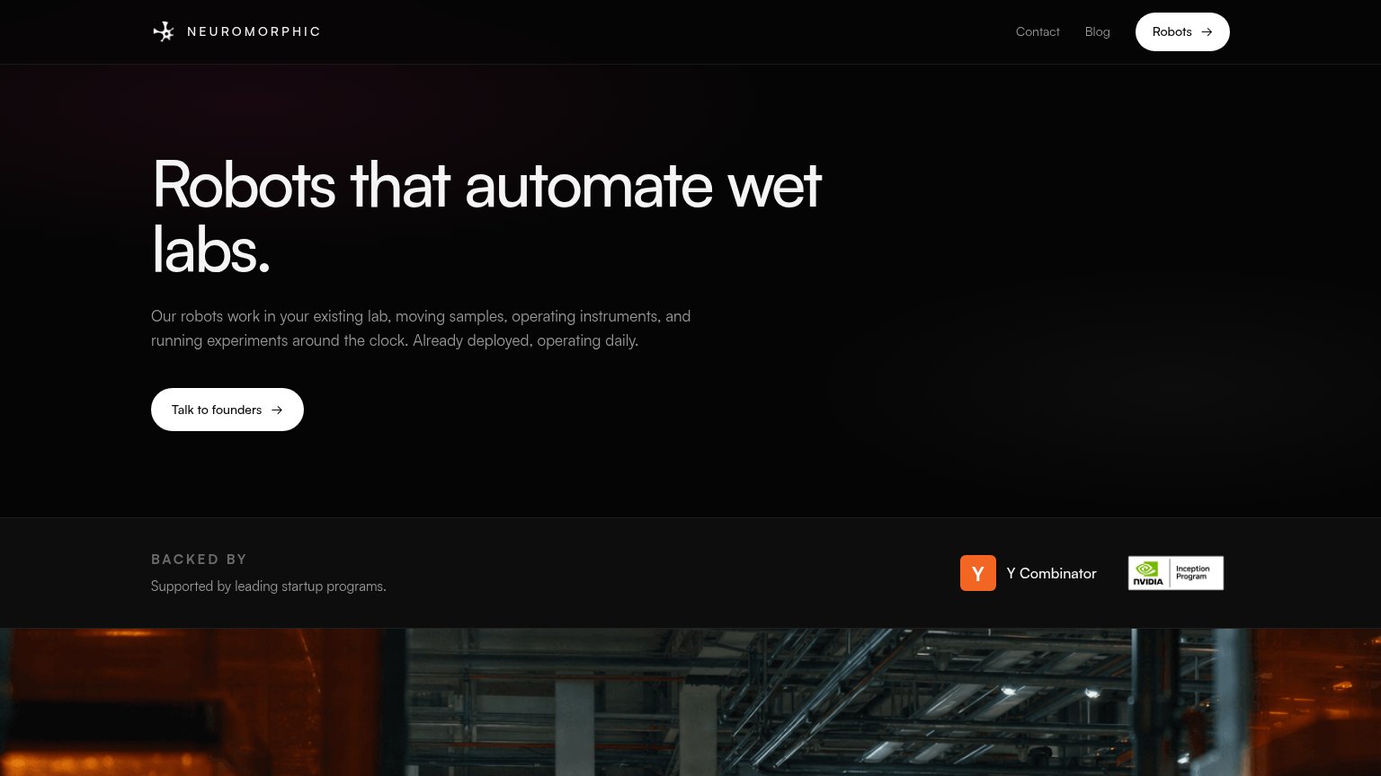
| Neuromorphic | "BACKED BY" strip with Y Combinator and NVIDIA Inception Program badges |
| Petri-dish product image with "CFU count 473" AI-analysis overlay | |
| No visible trust signal identified. | |
| No visible trust signal identified. | |
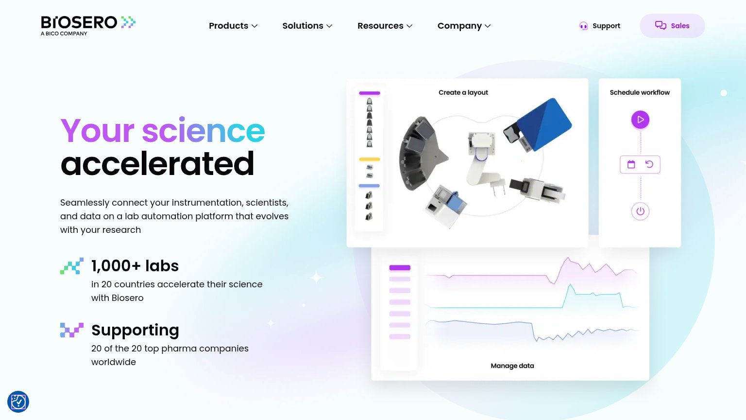
| Supporting 20 of the 20 top pharma companies worldwide | |
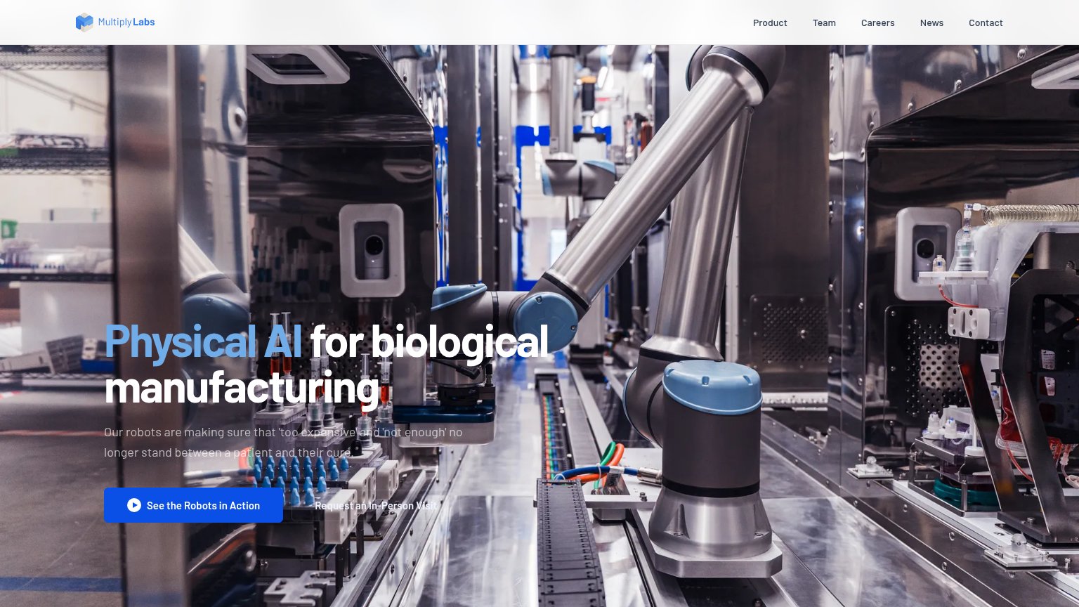
| Real photograph of Chemify's automated robotic chemistry lab with a video play button |
CTA
68FairCopy, size, verb, cost-feel — does the primary CTA earn the click?
Problems
- talking to founders feels costly
- nav CTA 'Robots' mismatches hero
- no low-commitment alternative
- talks about founders, not to visitor
Information hierarchy
74FairDoes the design help or inhibit what the page is trying to say?
123- Robots nav button — Pill-styled 'Robots' link in the nav matches the primary CTA's weight and pulls attention away from 'Talk to founders'.
- Talk to founders CTA — Low-key white outline on black is smaller and less prominent than the nav's 'Robots' pill it competes with.
- Awkward headline wrap — 'Robots that automate wet labs.' breaks so only 'labs.' sits on line two, weakening the headline's visual punch.
Value props
78FairTitle, subtitle, hero — do they sell the product's true value?
Neuromorphic’s headline sells
Robots that automate wet labs.
Our robots work in your existing lab, moving samples, operating instruments, and running experiments around the clock. Already deployed, operating daily.
Working
- Six words state product and market
- Concrete verbs: samples, instruments
- "Already deployed" preempts vaporware doubt
Could improve
- Zero numbers or quantified outcomes
- Hero image barely visible in fold
- No named customer or lab example
Mobile web
82StrongThe phone experience as a first-class citizen.
 12
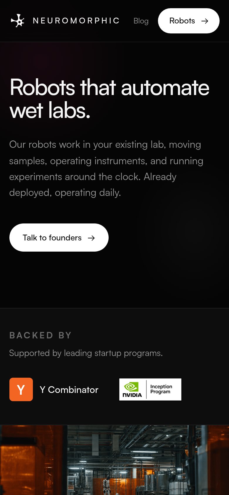
- Talk to founders button — Desktop-proportioned button floats at half the column width instead of a thumb-friendly full-bleed tap target.
- Uncollapsed nav row — Nav keeps inline links and a pill instead of a hamburger, and drops the desktop Contact link entirely.