
Your landing page’s weakest score is Trust.
How Marker ranks
72Growth scoreupdated
category scores
category scoresShowHide
Score over time
Trust
48PoorProof that the product is real, competent, and safe to try.

| Trust read | |
|---|---|
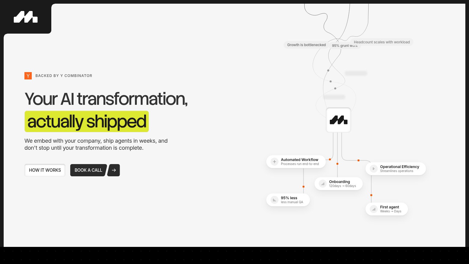
| Marker | "BACKED BY Y COMBINATOR" badge above the hero headline |
| No visible trust signal identified. | |
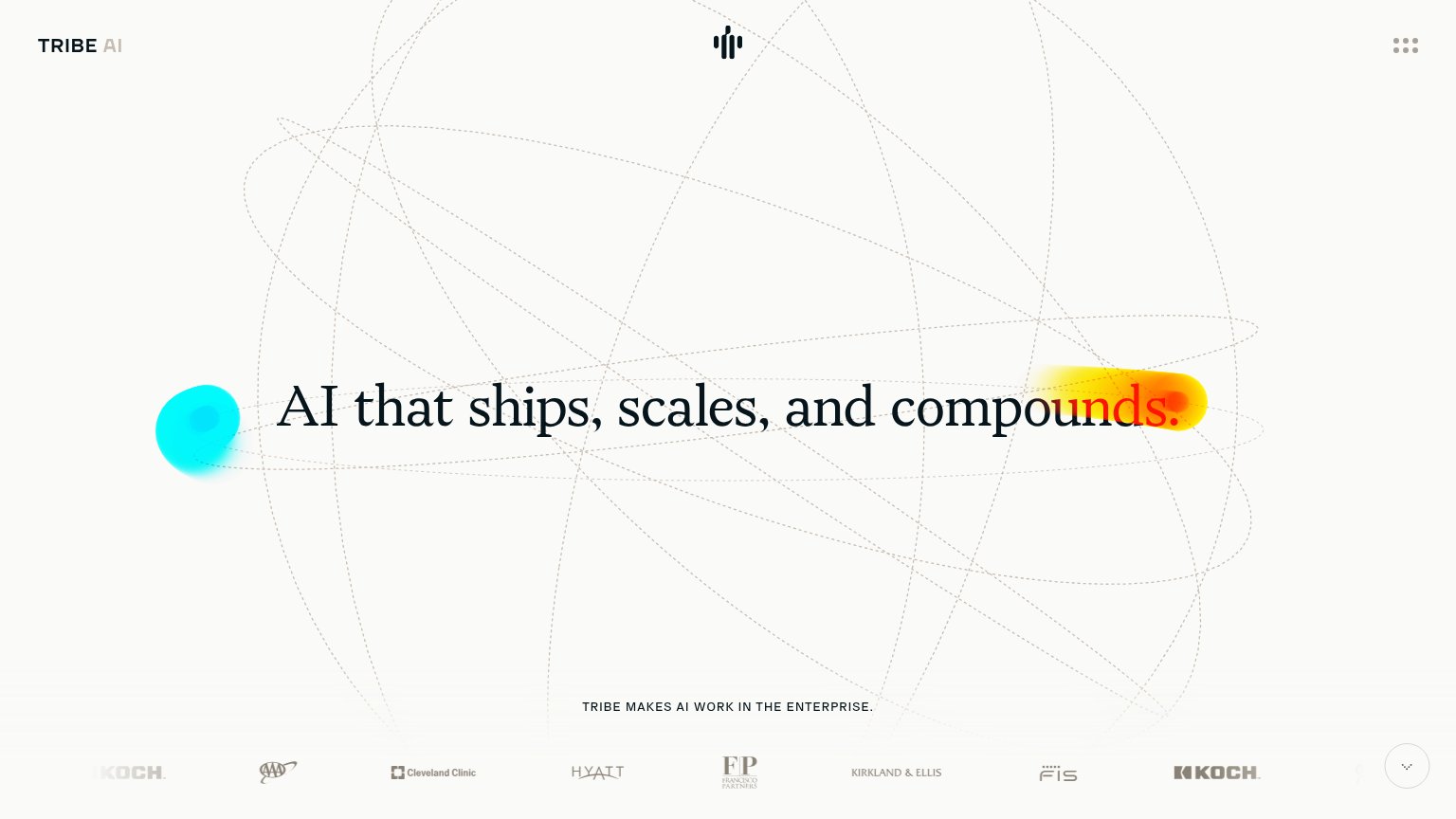
| Client logo strip featuring AAA, Cleveland Clinic, Hyatt, Kirkland & Ellis, Francisco Partners, FIS, and Koch | |
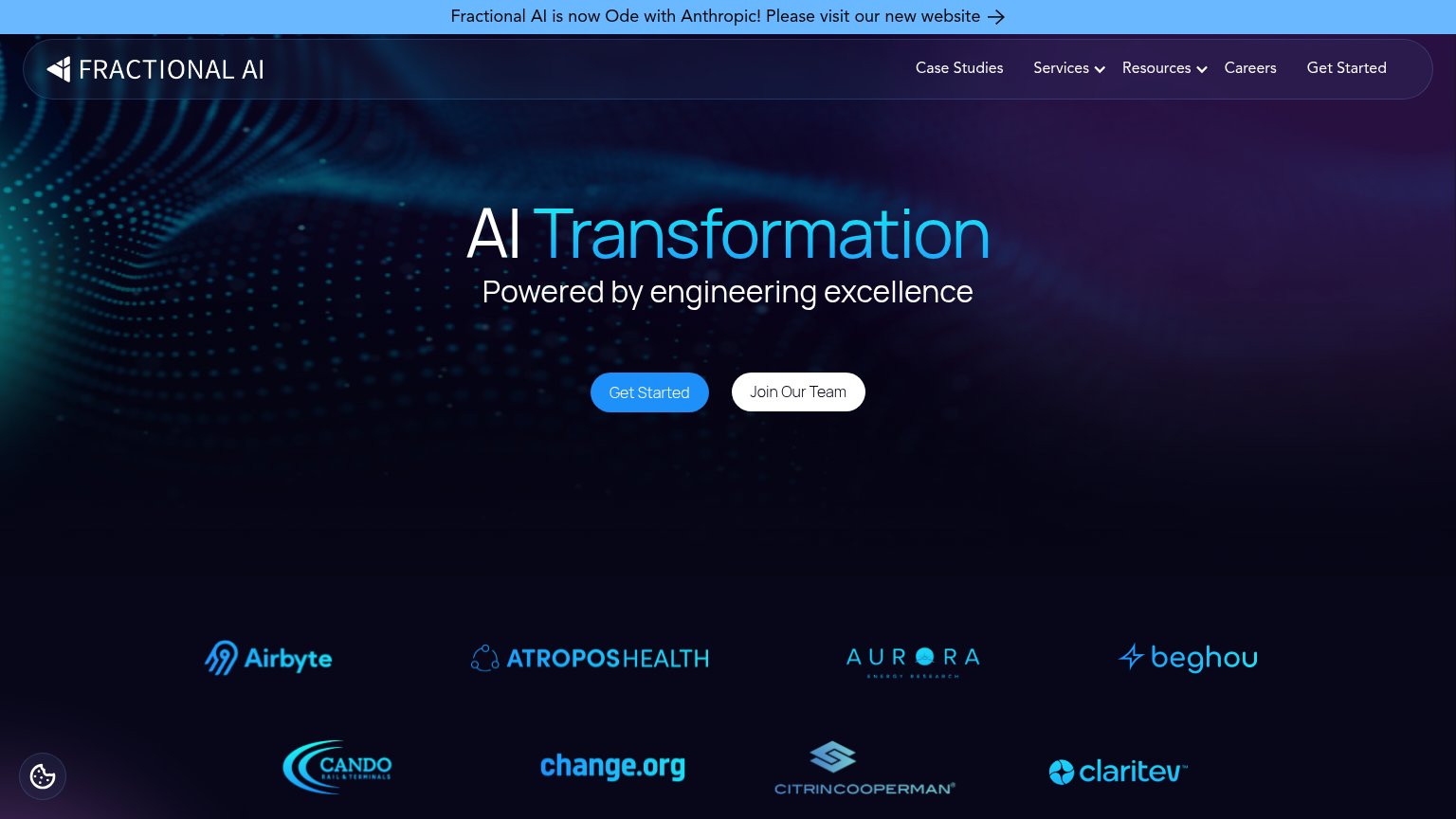
| Client logo wall: Airbyte, Atropos Health, Aurora Energy Research, Beghou, Cando, change.org, CitrinCooperman, Claritev | |
| "We've trained over 80% of the world's leading AI models and deploy them at enterprise scale." |
CTA
68FairCopy, size, verb, cost-feel — does the primary CTA earn the click?
Problems
- click feels costly — sales call
- no value named in the label
- no echo of 'shipped' promise
Information hierarchy
78FairDoes the design help or inhibit what the page is trying to say?
123- Node diagram labels — Tiny gray labels like "95% grunt work" overlap the tangled lines and are barely legible, so the proof points on the right half of the fold don't land.
- HOW IT WORKS button — Styled at nearly the same size and position as BOOK A CALL, splitting the click between two equal-weight buttons.
- Book a Call button — Dark button on light background reads, but its slanted-edge treatment merges with the arrow chip and shrinks the perceived click target.
Value props
82StrongTitle, subtitle, hero — do they sell the product's true value?
Marker’s headline sells
Your AI transformation, actually shipped
We embed with your company, ship agents in weeks, and don't stop until your transformation is complete.
Working
- "actually shipped" hits AI-fatigue frustration
- Subhead names mechanism and timeframe
- Hero diagram shows real metrics, not decoration
Could improve
- Best numbers hidden in tiny diagram labels
- "AI transformation" leans on category jargon
- No customer or category proof beyond YC badge
Mobile web
82StrongThe phone experience as a first-class citizen.
 123
- Split CTA row — Primary "BOOK A CALL" shares the row at half-width with "HOW IT WORKS" instead of getting a full-bleed, thumb-first button.
- Detached arrow chip — The arrow sits in a separate slanted chip beside "BOOK A CALL", making the tappable boundary of the primary CTA ambiguous.
- Faded diagram label — The "95% grunt work" caption in the network graphic is rendered at near-invisible contrast, adding noise without communicating.