
Your landing page’s weakest score is Trust.
How Manifold ranks
71Growth scoreupdated
category scores
category scoresShowHide
Score over time
Trust
48PoorProof that the product is real, competent, and safe to try.
| Trust read | |
|---|---|
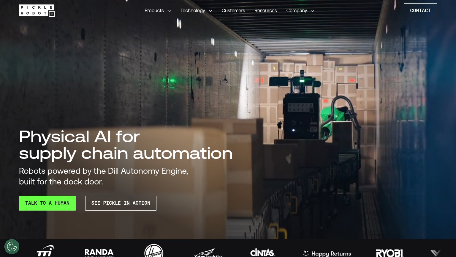
| Manifold | No visible trust signal identified. |
| No visible trust signal identified. | |
| Customer logo strip (Cintas, Ryobi, Happy Returns, Hoover, TTI, Randa, Yusen Logistics) | |
| No visible trust signal identified. | |
| No visible trust signal identified. |
CTA
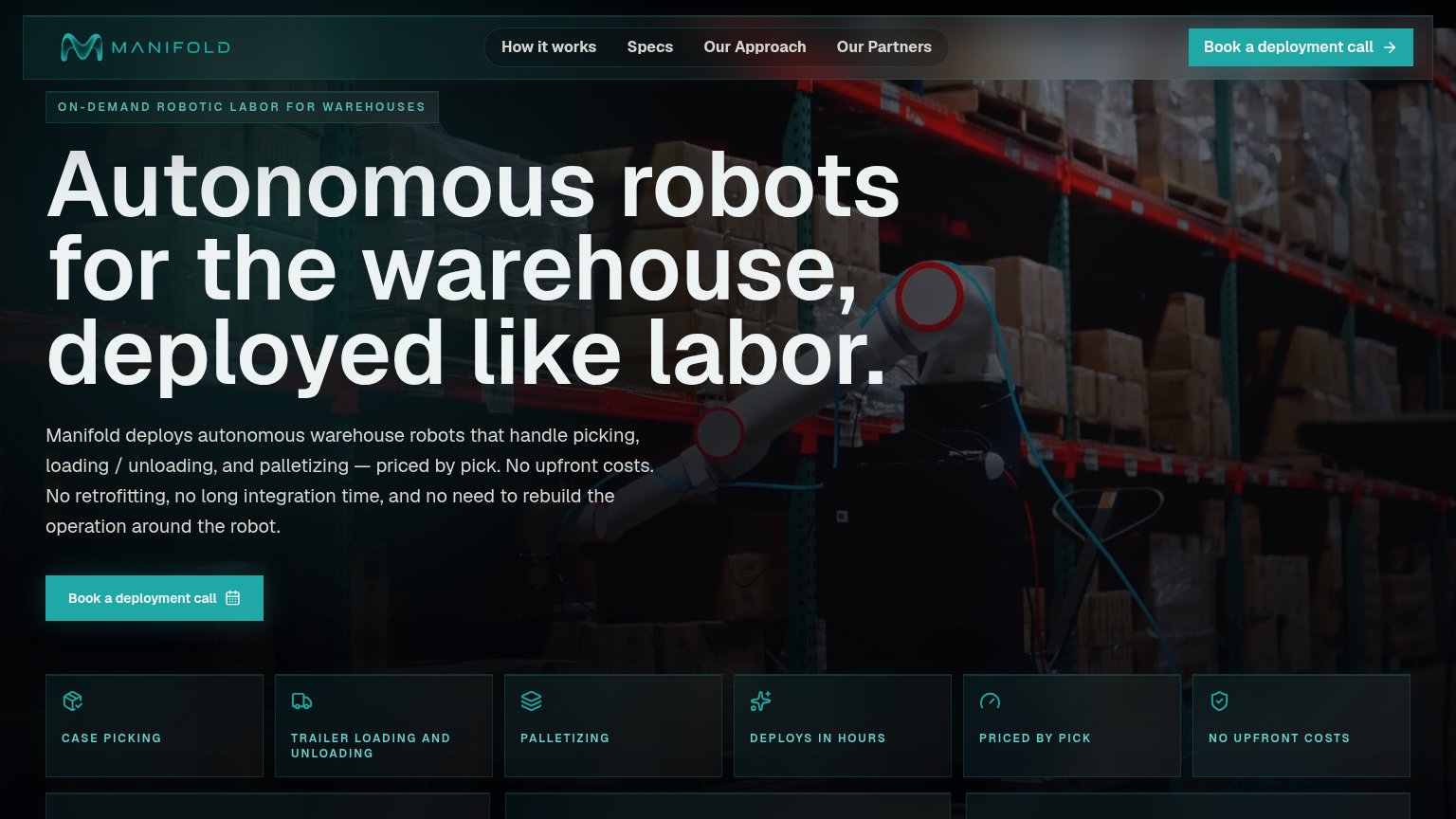
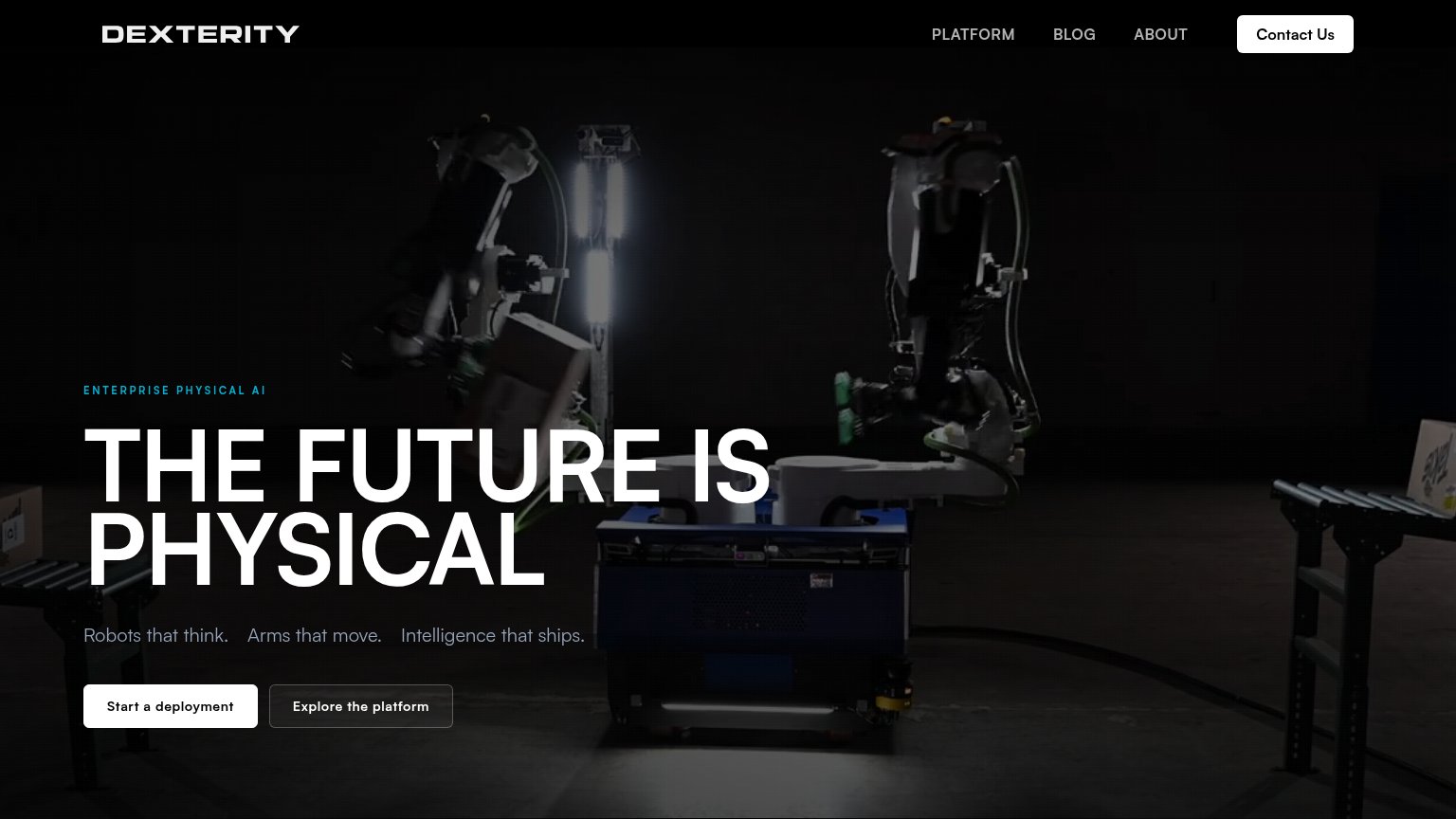
68FairCopy, size, verb, cost-feel — does the primary CTA earn the click?
Problems
- 'call' makes click feel costly
- 4 words, past single-fixation length
- no value promise in the label
- no secondary lower-commitment path
Mobile web
72FairThe phone experience as a first-class citizen.
 1234
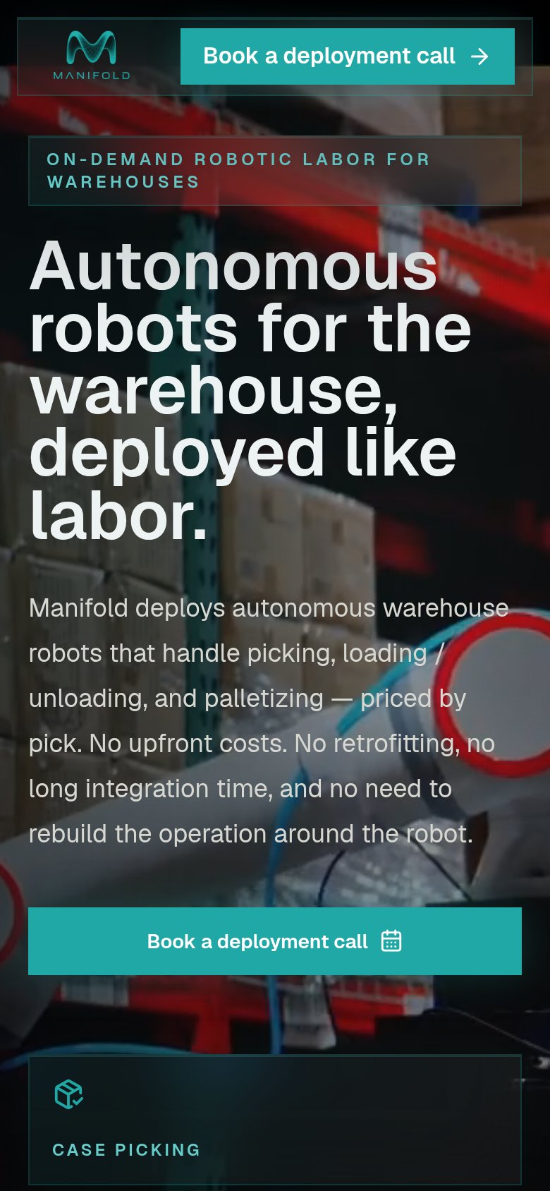
- Six-line body paragraph — Desktop-length copy fills half the fold and shoves the primary CTA to the bottom edge.
- Oversized hero headline — Headline barely scales down, wrapping into five tall lines that eat the viewport.
- Header without menu — Nav links like How it works and Specs vanish on mobile with no hamburger fallback.
- Duplicate header CTA — Header repeats the same Book a deployment call as the hero, adding redundancy over navigation.
Information hierarchy
84StrongDoes the design help or inhibit what the page is trying to say?
123- Six capability chips — Six equal-weight chips mix features with pricing terms, ending the fold as an undifferentiated index.
- Cropped card row — A second row of cards peeks in at the fold edge, adding visual noise without communicating anything.
- Duplicate nav CTA — The nav repeats "Book a deployment call" at equal weight, splitting attention with the hero button below.
Value props
84StrongTitle, subtitle, hero — do they sell the product's true value?
Manifold’s headline sells
Autonomous robots for the warehouse, deployed like labor.
Manifold deploys autonomous warehouse robots that handle picking, loading / unloading, and palletizing — priced by pick. No upfront costs. No retrofitting, no long integration time, and no need to rebuild the operation around the robot.
Working
- 'Deployed like labor' nails the business model
- Subhead names tasks and pricing model
- Proof chips kill capex and integration fears
Could improve
- No hard numbers anywhere in the fold
- Hero image is dim, robot barely visible
- Subhead runs long on mobile