
Your landing page’s weakest score is Trust.
How Magma ranks
- 1.
Paid72
- 2.
Magma60
- 3.
Humanloop39
60Growth scoreupdated
category scores
category scoresShowHide
Score over time
Trust
42PoorProof that the product is real, competent, and safe to try.
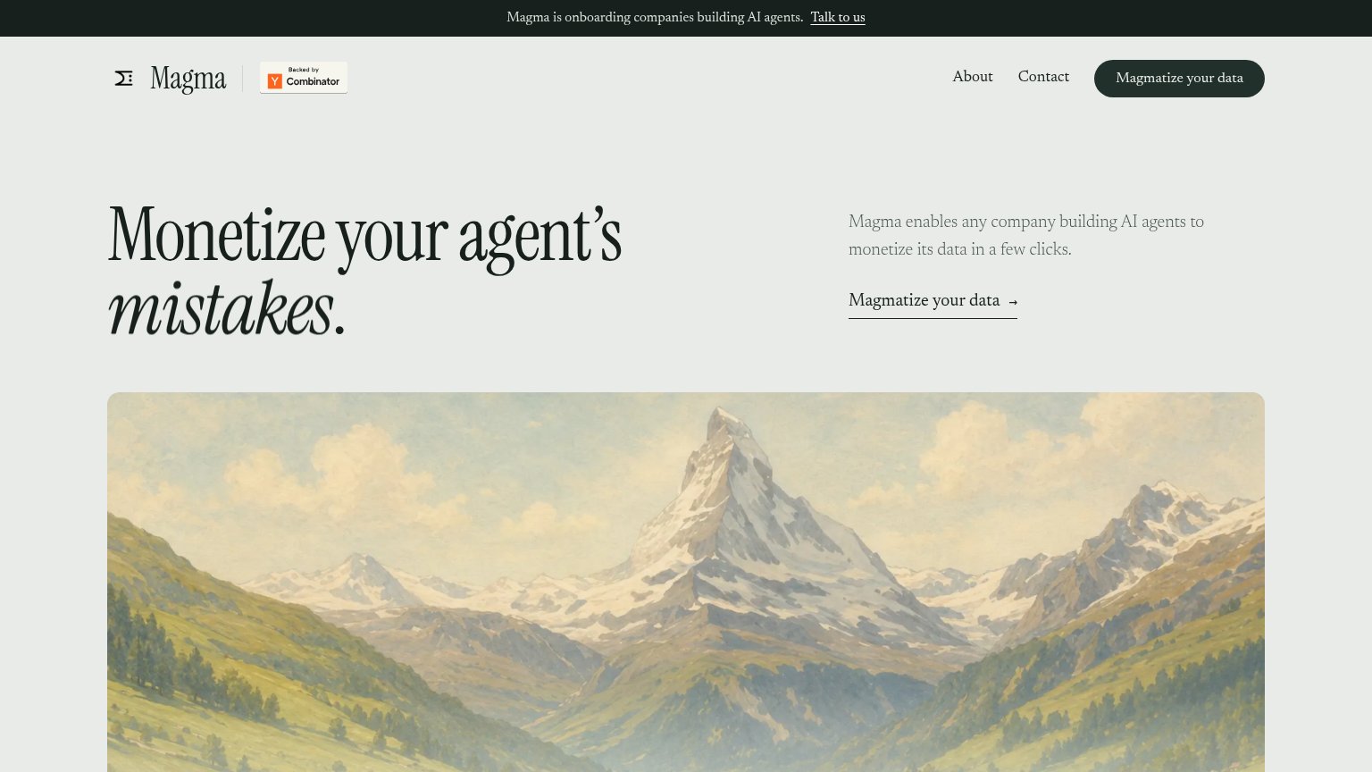
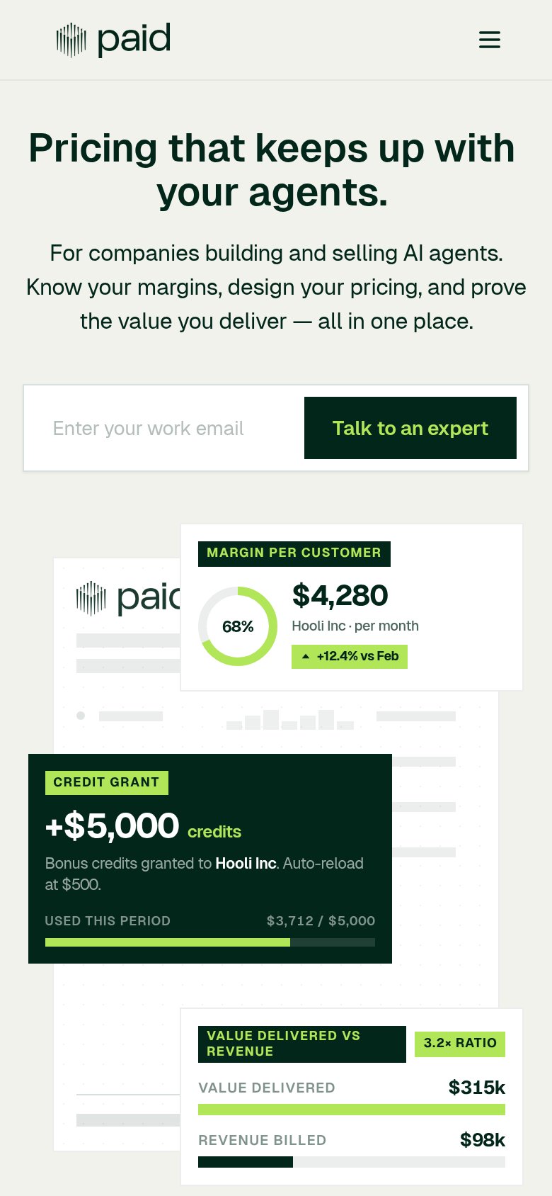
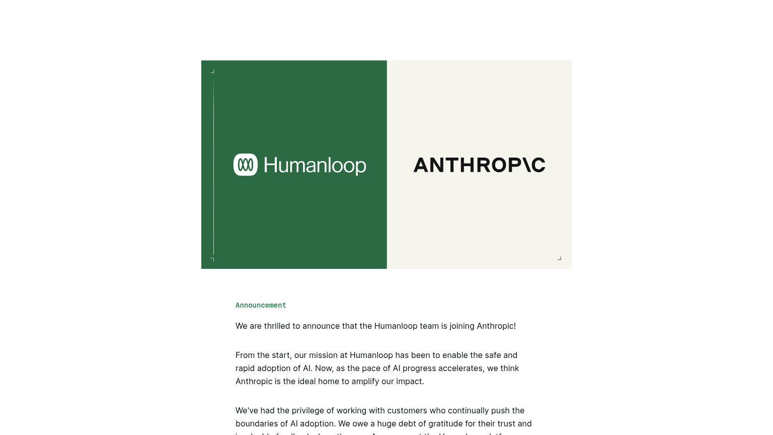
| Trust read | |
|---|---|
| Magma | "Backed by Y Combinator" badge next to the logo |
| "MARGIN PER CUSTOMER" product UI card showing "68% NET" and "$4,280" per month | |
| Humanloop and ANTHROP\C co-branded hero announcing "the Humanloop team is joining Anthropic!" |
Mobile web
54FairThe phone experience as a first-class citizen.
 1234
- Broken headline word — The italic 'mistakes.' fails to render on mobile, leaving a stray period and an incomplete value statement.
- Uncollapsed nav row — Full desktop link row stacks under the logo instead of collapsing, forming a triple-decker header that eats the fold.
- Underlined text CTA — Hero 'Magmatize Magma's data' is a small underlined link, not a thumb-friendly full-width button.
- Two-line promo banner — The 'Talk to us' banner wraps to two lines, adding header height before the hero starts.
CTA
62FairCopy, size, verb, cost-feel — does the primary CTA earn the click?
Problems
- invented verb obscures the action
- click outcome unclear — feels risky
- hero CTA is a thin text link
Value props
62FairTitle, subtitle, hero — do they sell the product's true value?
Magma’s headline undersells
Monetize your agent's mistakes.
Magma enables any company building AI agents to monetize its data in a few clicks.
Working
- Provocative hook: mistakes as an asset
- Names a clear outcome: monetization
- Speaks directly to AI agent builders
Could improve
- Subhead lacks numbers or mechanism
- Hero image decorates, shows nothing
- Mobile headline drops 'mistakes'
Information hierarchy
78FairDoes the design help or inhibit what the page is trying to say?
123- Underlined text CTA — "Magmatize Magma's data" styled as a body-copy link duplicates the nav pill and dilutes which action is primary.
- Talk to us banner — A second underlined action above the nav competes with "Magmatize Magma's data" for the first click.
- YC badge placement — The bright orange badge is the highest-saturation element in the header, outranking the wordmark and CTA in the scan path.