
Your landing page’s weakest score is Trust.
How Glen ranks
67Growth scoreupdated
category scores
category scoresShowHide
Score over time
Trust
44PoorProof that the product is real, competent, and safe to try.


| Trust read | |
|---|---|
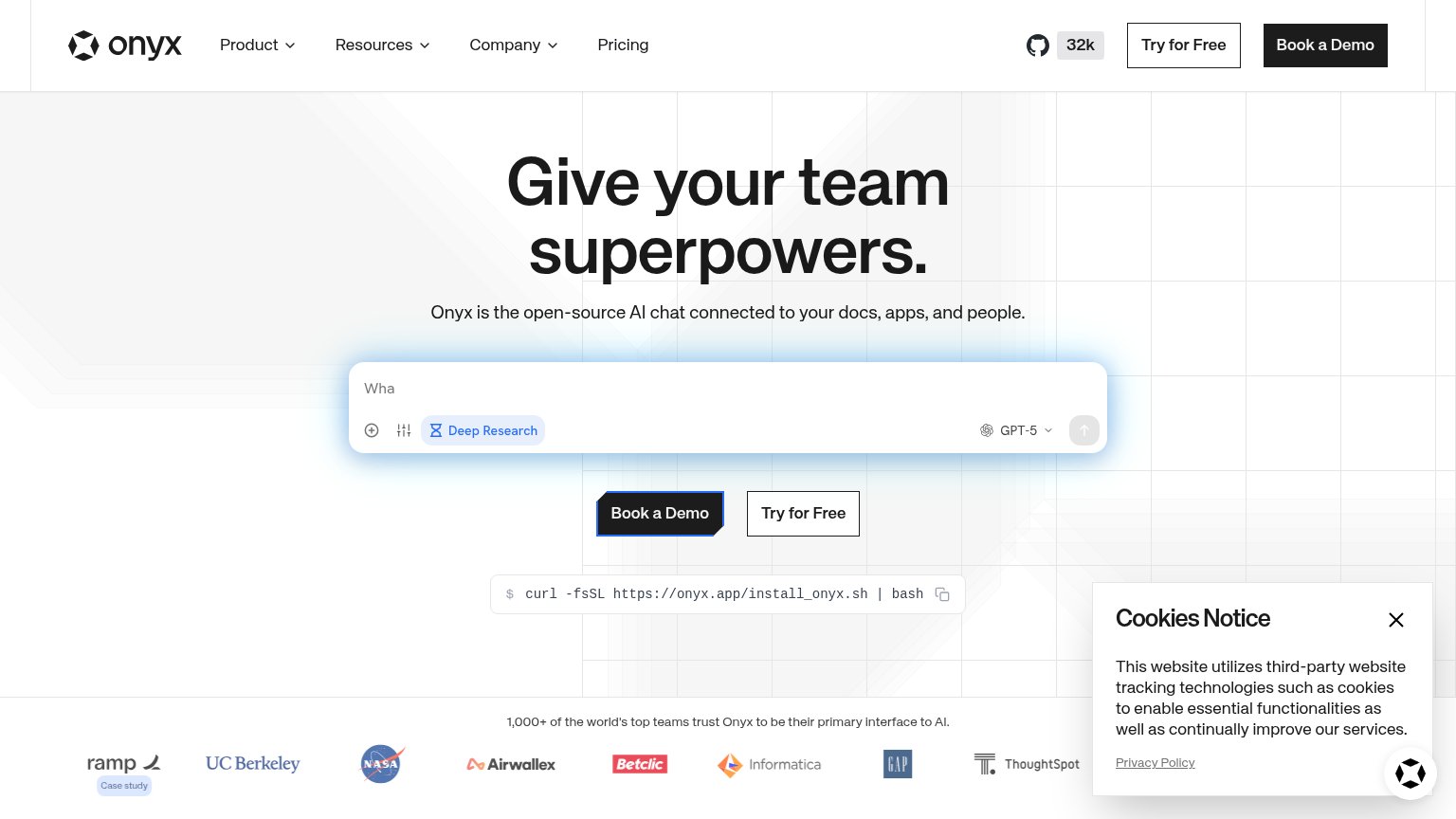
| Glen | "Powering knowledge work at" logo strip (Zaplar, Composio, Litmus, Corgi, Zima, Amorphic Labs) |
| No visible trust signal identified. | |
| "1,000+ of the world's top teams trust Onyx to be their primary interface to AI" logo wall with NASA, UC Berkeley, Ramp, | |
| No visible trust signal identified. | |
| "Trusted by leading engineering teams" logo strip with Cribl, Clio, Cloudbeds, Big Cartel, dott, and perk+ |
CTA
66FairCopy, size, verb, cost-feel — does the primary CTA earn the click?

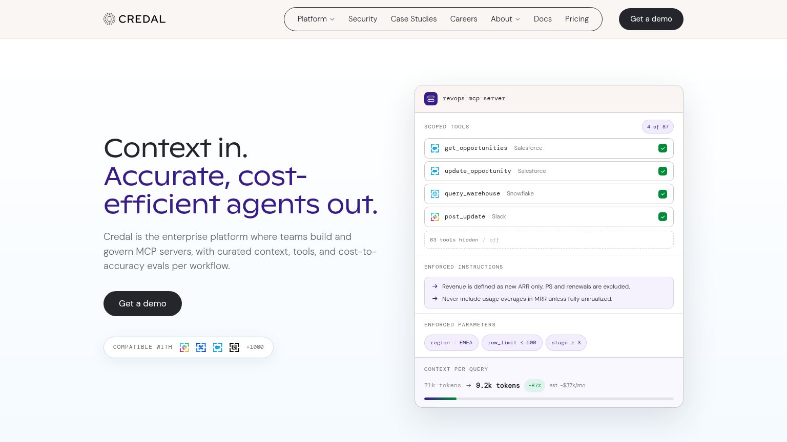
Problems
- 'access' feels gated, not valuable
- secondary CTA rivals its footprint
- mobile header shows only sign-in
- no payoff or product named
Information hierarchy
72FairDoes the design help or inhibit what the page is trying to say?
123- Design Partner button — Outlined secondary at near-equal size beside "Get access" splits the single decision the fold should drive.
- Header CTA pair — Duplicates both hero buttons in the top-right, doubling competing actions before the visitor reads the headline.
- Five-link nav pill — Product/Why Glen/How it works/Security/FAQ add five exit paths at equal visual weight above the primary action.
Mobile web
76FairThe phone experience as a first-class citizen.
123- Get access button — Desktop-sized button squeezed beside a wider secondary action instead of full-bleed thumb target.
- Seven-line subhead paragraph — Body copy scales down too little, running seven lines and pushing the CTA to the fold's edge.
- Design Partner Sign In — Near-equal visual weight competes with Get access and duplicates the header's sign-in button.
Value props
78FairTitle, subtitle, hero — do they sell the product's true value?
Glen’s headline sells
Agents that get smarter as your company works.
Glen puts the right organizational context into every prompt, pulled from your agent sessions, Slack, GitHub, tickets, calls, and docs. Agents work better, faster, and on fewer tokens, and the whole company becomes queryable.
Working
- Headline names a compounding, differentiated outcome
- Subhead lists concrete data sources by name
- Three tangible payoffs: better, faster, fewer tokens
Could improve
- No numbers behind "faster" or "fewer tokens"
- Hero sphere decorates, doesn't demonstrate
- Subhead packs two ideas into one long sentence