Egoist MachinesYC S26 landing page report.
← Back to YC S26
Egoist Machineshttps://ego.ist/

Your landing page’s weakest score is Trust.

How Egoist Machines ranks

  1. 1.Mem078
  2. 2.Egoist Machines70
  3. 3.Rewind (Limitless)48
Fix Trust

Score over time

908070605040Rewind (Limitless) 48 on Sep 22 (Live)Mem0 75 on Mar 7 (Wayback)Mem0 66 on Mar 20 (Wayback)Mem0 70 on Apr 12 (Wayback)Mem0 73 on Apr 22 (Wayback)Mem0 72 on May 15 (Wayback)Mem0 70 on Jun 10 (Wayback)Mem0 78 on Jul 28 (Live)Egoist Machines 65 on Aug 12 (Wayback)Egoist Machines 64 on Sep 17 (Wayback)Egoist Machines 70 on Sep 20 (Live)Aug 12Sep 17Sep 20
Past reportsShow past reportsHide past reports
  1. Sep 20, 202670LiveOverall +6 · Mobile web +24 · Information hierarchy +8Viewing
  2. Sep 17, 202664Overall −1 · Value props −6 · Information hierarchy −4View →
  3. Aug 12, 202665First tracked report — strongest Information hierarchy 72, weakest Mobile web 54View →

Trust

58Fair

Proof that the product is real, competent, and safe to try.

Egoist Machines
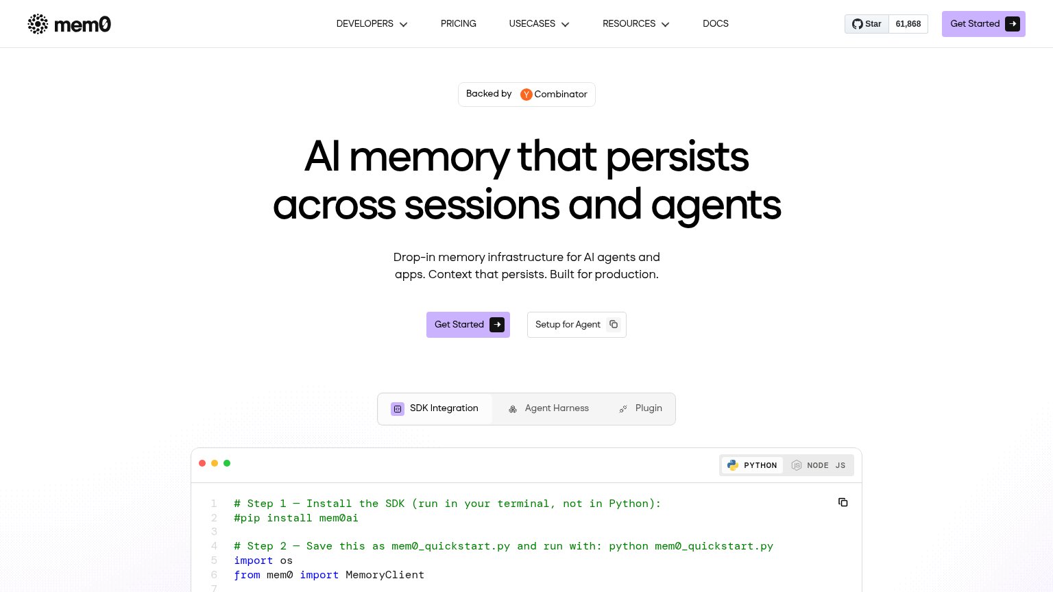
Mem0
Trust read
Egoist Machines"Backed by Y Combinator" badge above the headline
Rewind (Limitless)Headline "Limitless has been acquired by Meta" paired with the founder video "Message from Dan Siroker, Co-Founder & CEO
Mem0GitHub star badge showing "61,868" stars in the nav

Value props

68Fair

Title, subtitle, hero — do they sell the product's true value?

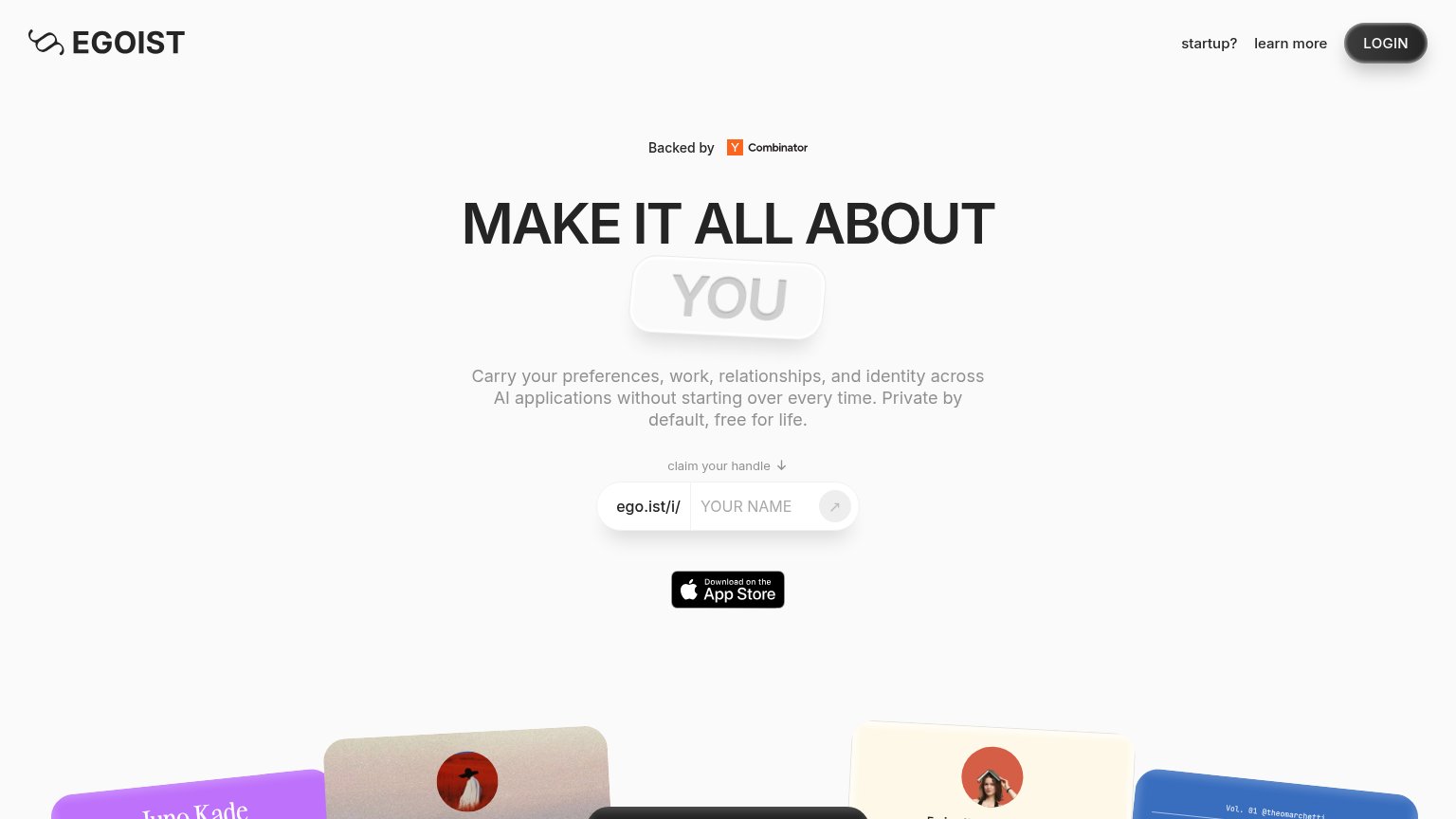
Egoist Machines’s headline vagueMAKE IT ALL ABOUT YOUCarry your preferences, work, relationships, and identity across AI applications without starting over every time. Private by default, free for life.

Working

  • Subhead names real pain: 'starting over every time'
  • 'Private by default, free for life' is a trust hook
  • Handle claim input is a concrete, low-friction CTA

Could improve

  • Headline could caption any product
  • Zero numbers or named AI integrations
  • Hero cards decorate, don't demo cross-app value

CTA

72Fair

Copy, size, verb, cost-feel — does the primary CTA earn the click?

Egoist Machinesin-product action
Mem0

Problems

  • placeholder has no action verb
  • unlabeled icon-only submit arrow
  • no 'free' despite 'free for life' copy
  • verb lives in tiny microcopy above

Information hierarchy

76Fair

Does the design help or inhibit what the page is trying to say?

Information hierarchy annotations on the desktop capture1234
  1. LOGIN button styling — The dark pill LOGIN button is the highest-contrast element in the fold, outranking the handle-claim input as the visual primary action.
  2. App Store badge — A second conversion path sits directly below the handle input at similar weight, splitting the visitor between claiming a handle and downloading an app.
  3. Egoist Machines pill lockup — The embossed low-contrast 'Egoist Machines' pill nearly disappears against the grey background, weakening the headline's payoff word.
  4. Submit arrow button — The pale grey arrow inside the handle input has almost no contrast, making the primary action's trigger easy to miss.

Mobile web

78Fair

The phone experience as a first-class citizen.

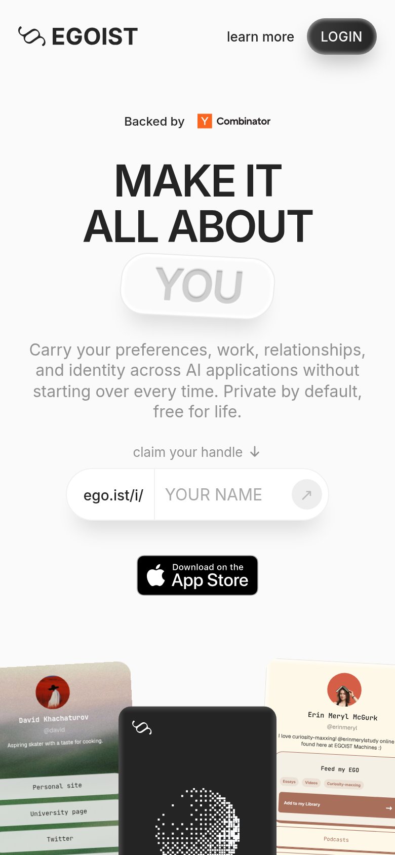
Mobile web annotations on the mobile capture123
  1. Handle input row — The ego.ist/i/ prefix plus Egoist Machines's NAME field leaves only a small circular arrow as the tap target; the actual submit affordance is desktop-proportioned, not thumb-sized.
  2. Nav link row — The header keeps a desktop-style inline "learn more" link plus LOGIN pill instead of collapsing to a hamburger, adding a competing action at the top of the fold.
  3. App Store badge — A second CTA stacked right under the handle input splits the primary action between claiming a handle and downloading the app.

Competitors

inferred from product, audience, and value prop