
Your landing page’s weakest score is Value props.
How Dock ranks
66Growth scoreupdated
category scores
category scoresShowHide
Score over time
Value props
58FairTitle, subtitle, hero — do they sell the product's true value?
Dock’s headline vague
Spend your time on what only you can decide.
Working
- Emotional hook: reclaim decision-level work
- Hero demo shows agents doing real work
- YC badge lends instant credibility
Could improve
- No subhead — product is never named
- Headline could caption any productivity app
- Numbers live only inside the screenshot
Trust
58FairProof that the product is real, competent, and safe to try.

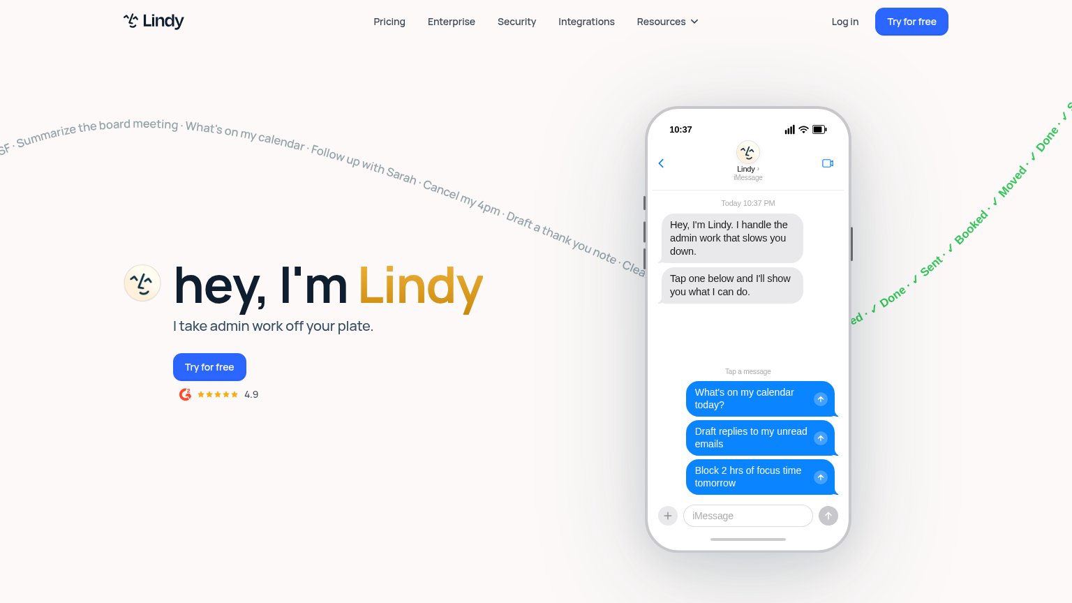

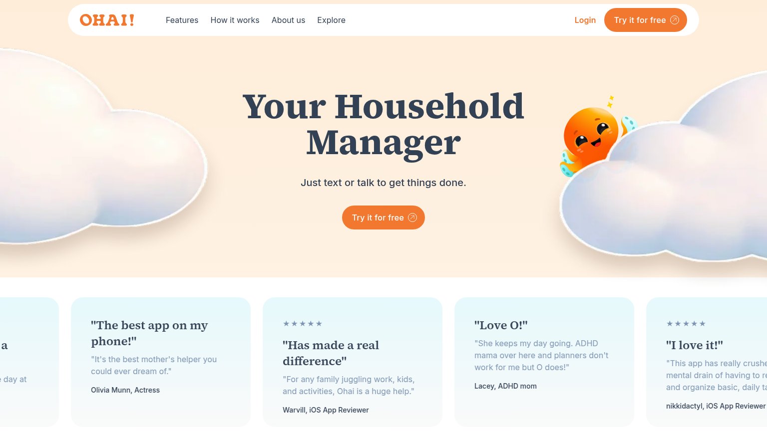
| Trust read | |
|---|---|
| Dock | "Backed by Y Combinator" badge above the headline |
| G2 badge with 4.9 star rating below the "Try for free" CTA | |
| Product Hunt "#1 Product of the Day" badge above the headline | |
| No visible trust signal identified. | |
| No visible trust signal identified. | |
| Five-star testimonial card: "The best app on my phone!" — Olivia Munn, Actress |
CTA
68FairCopy, size, verb, cost-feel — does the primary CTA earn the click?
Problems
- waitlist = deferred value, costly feel
- label drift: 'Join the waitlist' vs 'Join waitli
- no payoff named in the copy
Mobile web
68FairThe phone experience as a first-class citizen.
 1234
- Cursor chips over headline — The Tobin and Romi chips cover "time" and "Dock", making the headline unreadable on the phone.
- Garbled launch banner pill — The "We're live" banner collapses into an illegible pill with unreadable text in the mobile header.
- Duplicate header waitlist button — A second "Join waitlist" crowds the header alongside the pill instead of leaving one clean action.
- Half-width hero CTA — "Join the waitlist" keeps desktop proportions instead of stretching near full-bleed for the thumb.
Information hierarchy
76FairDoes the design help or inhibit what the page is trying to say?
1234- Mobile headline overlap — The Tobin and Romi cursor chips sit on top of the headline words on mobile, obscuring "time" and "Dock" — the value prop reads broken (visible on mobile capture; desktop chips crowd "time" too).
- Duplicate waitlist buttons — Nav "Join waitlist" and hero "Join the waitlist" are styled at identical dark-pill weight, splitting attention between two equal CTAs.
- Launch post banner — The bright purple "We're live · Read the launch post" pill outshines the primary CTA and routes first attention to an exit.
- Dense product screenshot — The two-pane chat mockup is cropped at the fold and packed with small unreadable message threads, adding noise without communicating an outcome at a glance.