
Your landing page’s weakest score is Trust.
How Definite ranks
- 1.
Datarails72
- 2.
Definite70
- 3.
Codat66
- 4.
Concourse64
- 5.
Cube63
70Growth scoreupdated
category scores
category scoresShowHide
Score over time
Trust
48PoorProof that the product is real, competent, and safe to try.

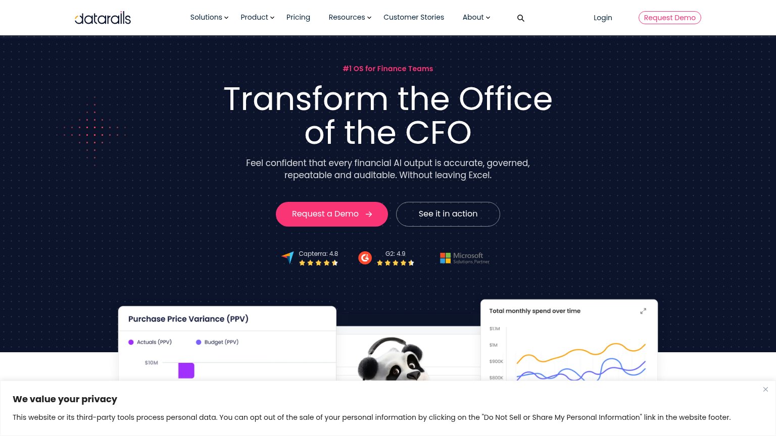
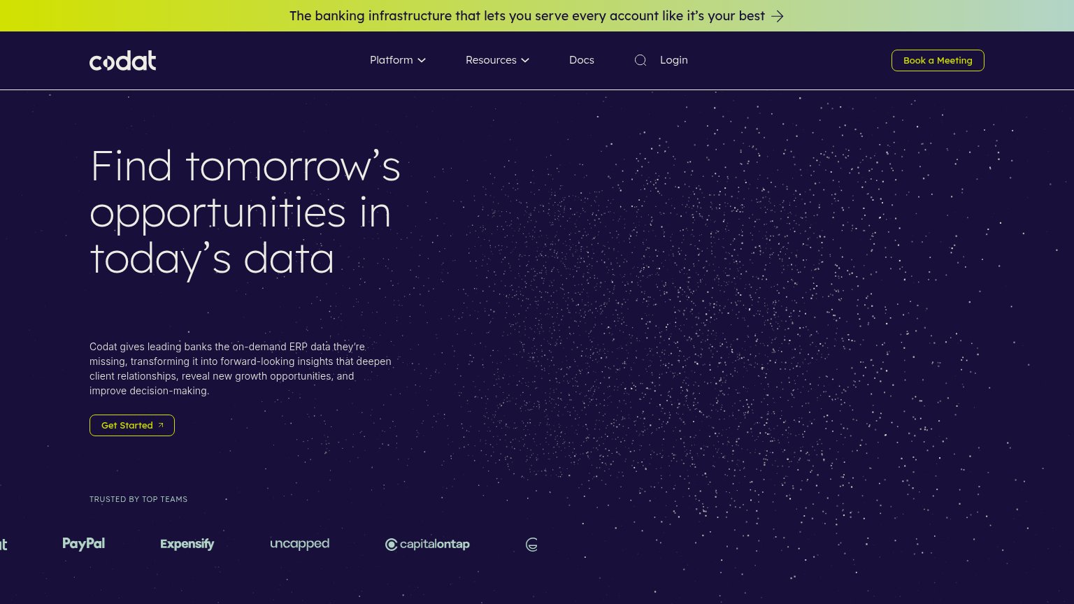

| Trust read | |
|---|---|
| Definite | "DEFINITE IS BACKED BY Y COMBINATOR. LEARN MORE →" banner |
| Embedded product video titled "cube — The Agentic Finance Layer" (1:57) below the hero | |
| "TRUSTED BY TOP TEAMS" logo strip with PayPal, Expensify, Uncapped, and Capital on Tap | |
| Capterra: 4.8 and G2: 4.9 star-rating badges below the hero CTA | |
| "WORKING WITH 100+ FINANCE DEPARTMENTS" logo strip (Palo Alto Networks, Tempo, Carrot, Lightmatter) |
CTA
72FairCopy, size, verb, cost-feel — does the primary CTA earn the click?
Problems
- "Request" feels costly, sales-gated
- mobile nav shortens to "DEMO"
- no self-serve or free path visible
Value props
72FairTitle, subtitle, hero — do they sell the product's true value?
Definite’s headline sells
Make finance data usable by people and agents.
Definite connects the systems your finance team already uses, then maps the entities, relationships, definitions, and lineage between them. The result is one context layer for reporting, reconciliation, dashboards, chat, APIs, and agent wor
Working
- Outcome-first headline, not feature list
- Subhead explains the actual mechanism
- Names six concrete use cases
Could improve
- No numbers or proof points anywhere
- Hero image decorates, shows no product
- "Usable" is flat; no emotional pull
Information hierarchy
78FairDoes the design help or inhibit what the page is trying to say?
123- REQUEST A DEMO button — Muted slate fill blends into the dark background; the primary action fails the one-second find test.
- YC announcement banner — Bright orange bar is the highest-contrast element on the page and links attention away before the headline.
- SEE HOW IT WORKS button — Same size and shape as the demo CTA, splitting the click at the decision point.
Mobile web
78FairThe phone experience as a first-class citizen.
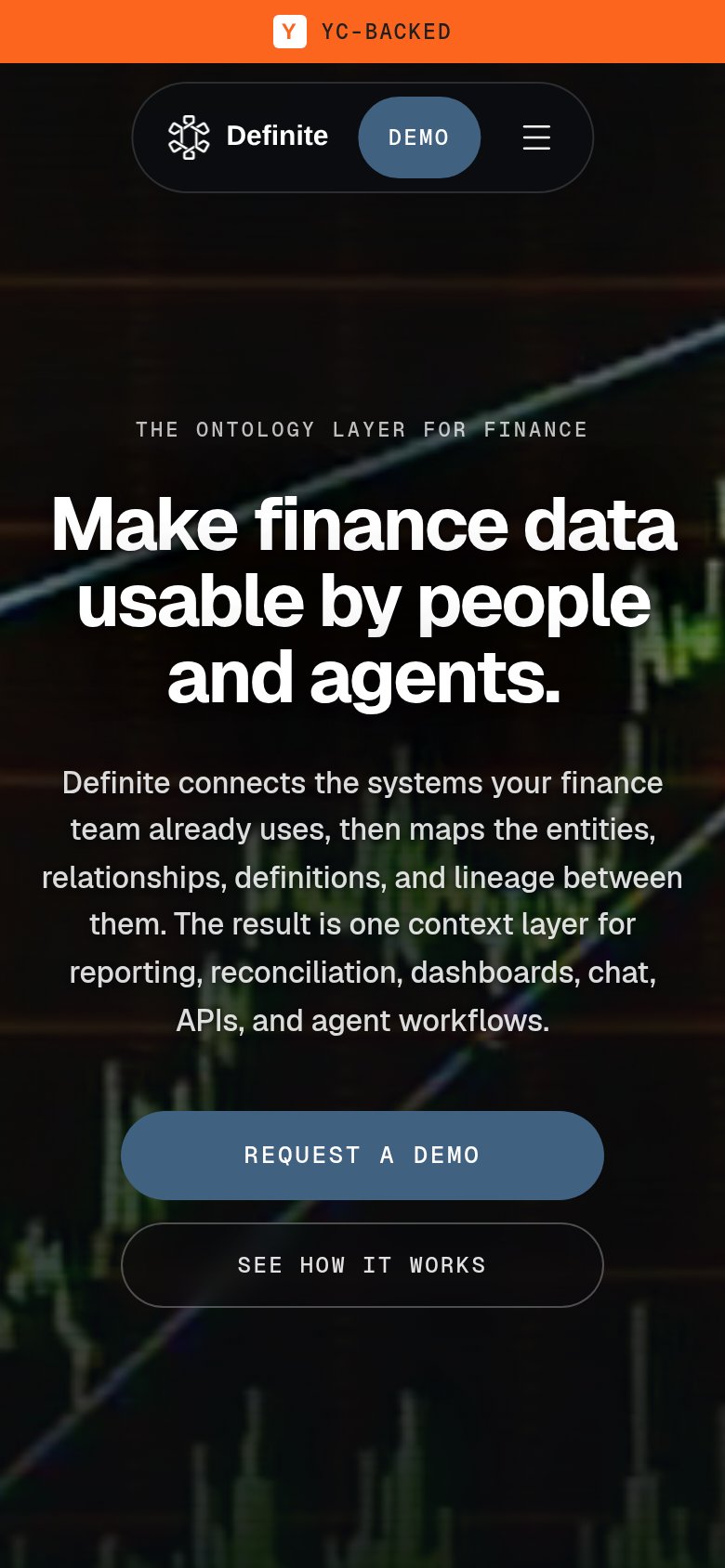 123
- Six-line body paragraph — Desktop-length copy wraps into six lines and shoves the primary CTA to the fold's edge.
- REQUEST A DEMO button — Sits at the very bottom of the first viewport; shorter screens will crop it below the fold.
- Nav DEMO pill — Duplicates the hero's REQUEST A DEMO with a vaguer label, splitting attention in the header.