
Your landing page’s weakest score is Trust.
How Decawork ranks
73Growth scoreupdated
category scores
category scoresShowHide
Score over time
Trust
62FairProof that the product is real, competent, and safe to try.
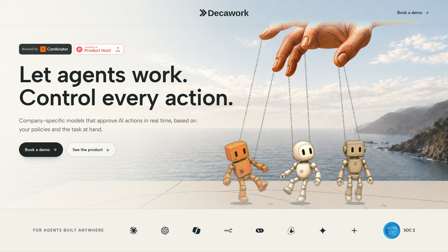
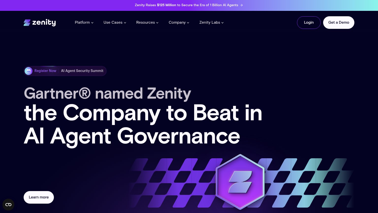
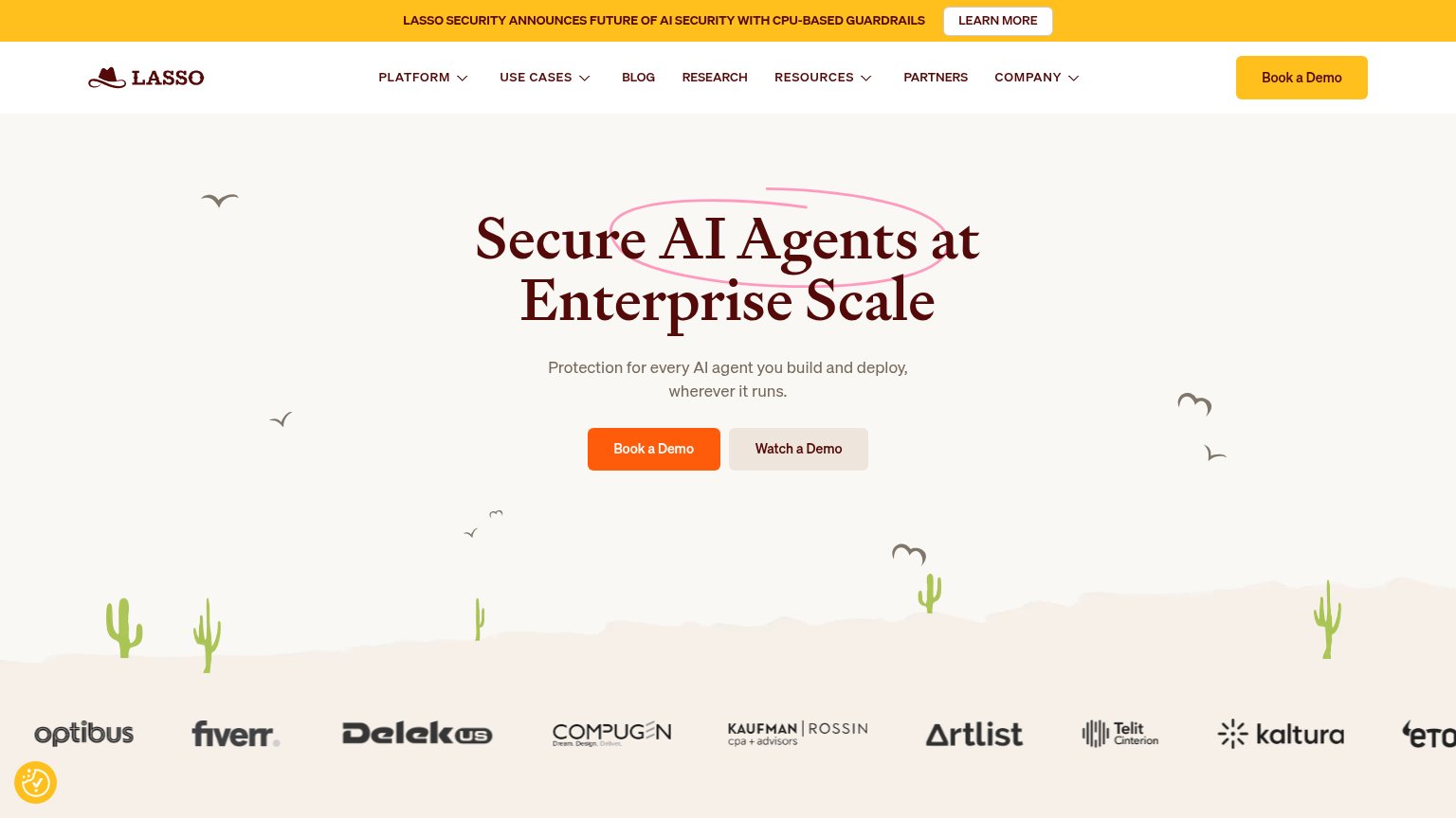
| Trust read | |
|---|---|
| Decawork | "Backed by Y Combinator" badge alongside "Featured on Product Hunt" (329) and an AICPA SOC 2 seal |
| Gartner® named Zenity the Company to Beat in AI Agent Governance | |
| Customer logo row featuring Fiverr, Kaltura, Artlist, Delek US, Compugen, Kaufman Rossin, and Telit Cinterion | |
| SentinelOne | Prompt Security co-branded header lockup | |
| No visible trust signal identified. | |
| "F5 recognized as a Market Shaper in the 2026 Gartner® Emerging Market Quadrant™ for AI Application Security" banner |
CTA
68FairCopy, size, verb, cost-feel — does the primary CTA earn the click?
Problems
- 'Book' feels costly and committal
- no product value in the click
- no header echo
- demo-only path, no self-serve
Value props
74FairTitle, subtitle, hero — do they sell the product's true value?
Decawork’s headline sells
Let agents work. Control every action.
Company-specific models that approve AI actions in real time, based on your policies and the task at hand.
Working
- Headline nails autonomy-vs-control tension
- Marionette visual demonstrates the promise
- Subhead states mechanism plainly
Could improve
- No numbers anywhere in the fold
- Outcome for the buyer left implicit
- Target user never named
Mobile web
78FairThe phone experience as a first-class citizen.
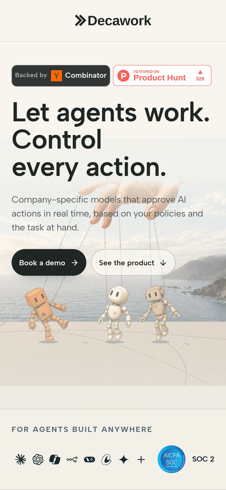 12
- Book a demo button — Desktop-proportioned half-width button side-by-side with a secondary CTA instead of a full-bleed thumb target.
- Badge row — Two social-proof badges sit above the headline, delaying the value statement and splitting first attention.
Information hierarchy
82StrongDoes the design help or inhibit what the page is trying to say?
123- See the product button — Secondary CTA sits at nearly the same size and shape as "Book a demo", splitting the click between two adjacent pills.
- Product Hunt badge — Outbound Product Hunt link with red accent is the brightest-colored element in the fold, pulling first attention to an exit.
- Subheadline text — Light gray weight at small size makes the only explanation of what Decawork does the least legible copy in the fold.