
Your landing page’s weakest score is Trust.
How Daqstra ranks
72Growth scoreupdated
category scores
category scoresShowHide
Score over time
Trust
54FairProof that the product is real, competent, and safe to try.
| Trust read | |
|---|---|
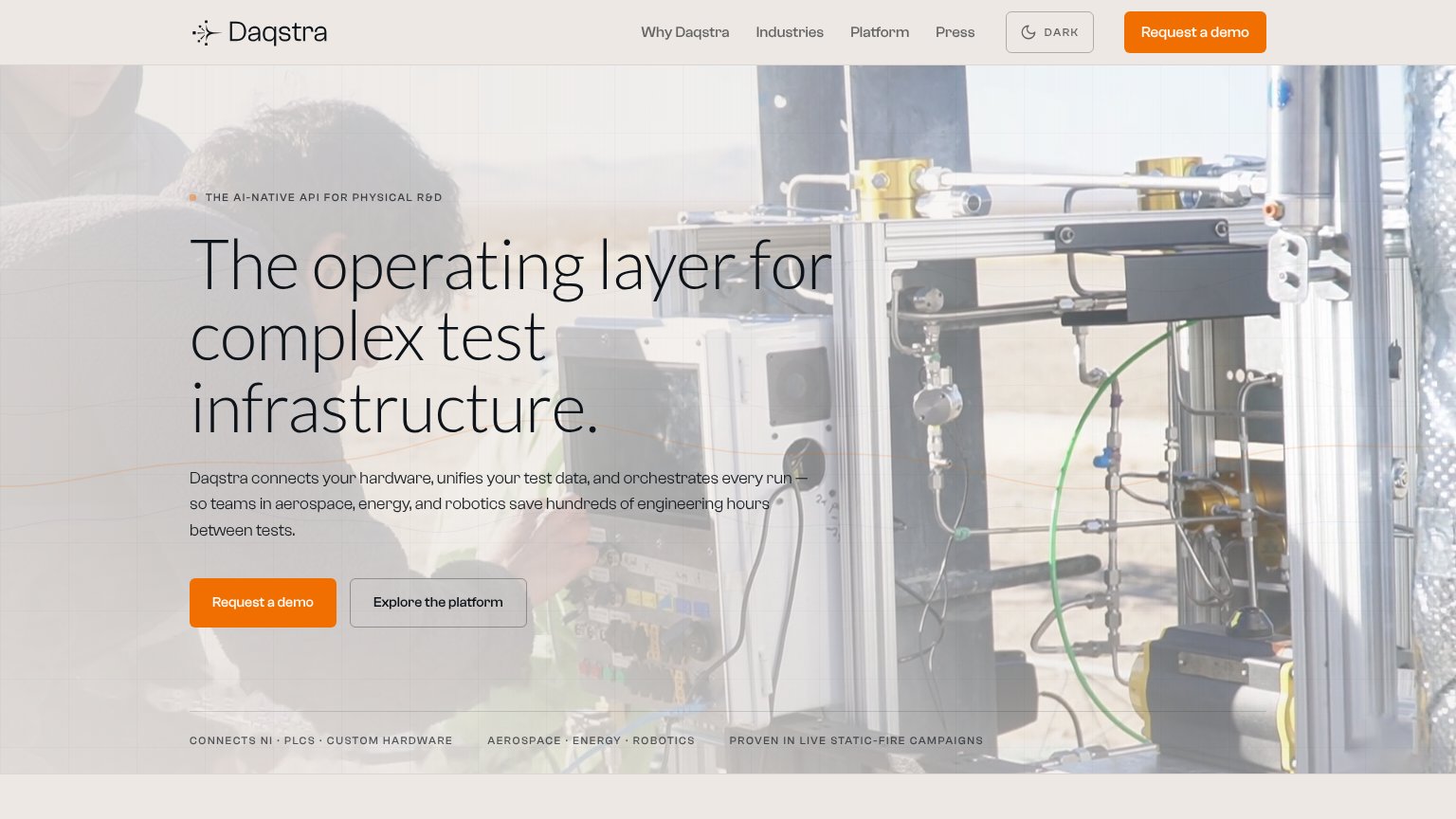
| Daqstra | PROVEN IN LIVE STATIC-FIRE CAMPAIGNS proof strip beneath the hero CTA |
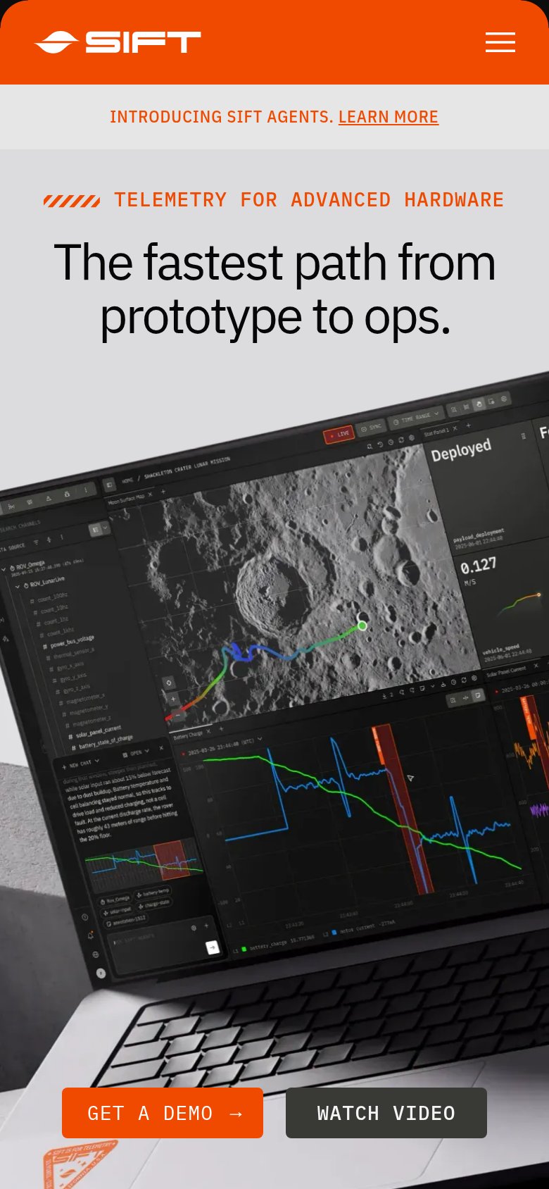
| Detailed telemetry dashboard screenshot showing a rover mission map, sensor channel list, deployment status, and battery | |
| "Engineering teams rely on Nominal to execute tests, analyze results in real time, collaborate across disciplines, and d | |
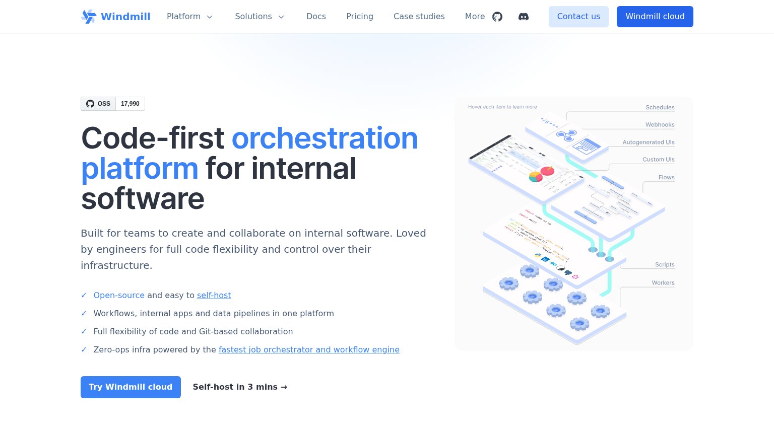
| GitHub OSS badge showing 17,990 stars |
CTA
72FairCopy, size, verb, cost-feel — does the primary CTA earn the click?
Problems
- 'Request' feels like asking permission
- click delivers a wait, not value
- secondary CTA promises more payoff
Mobile web
76FairThe phone experience as a first-class citizen.
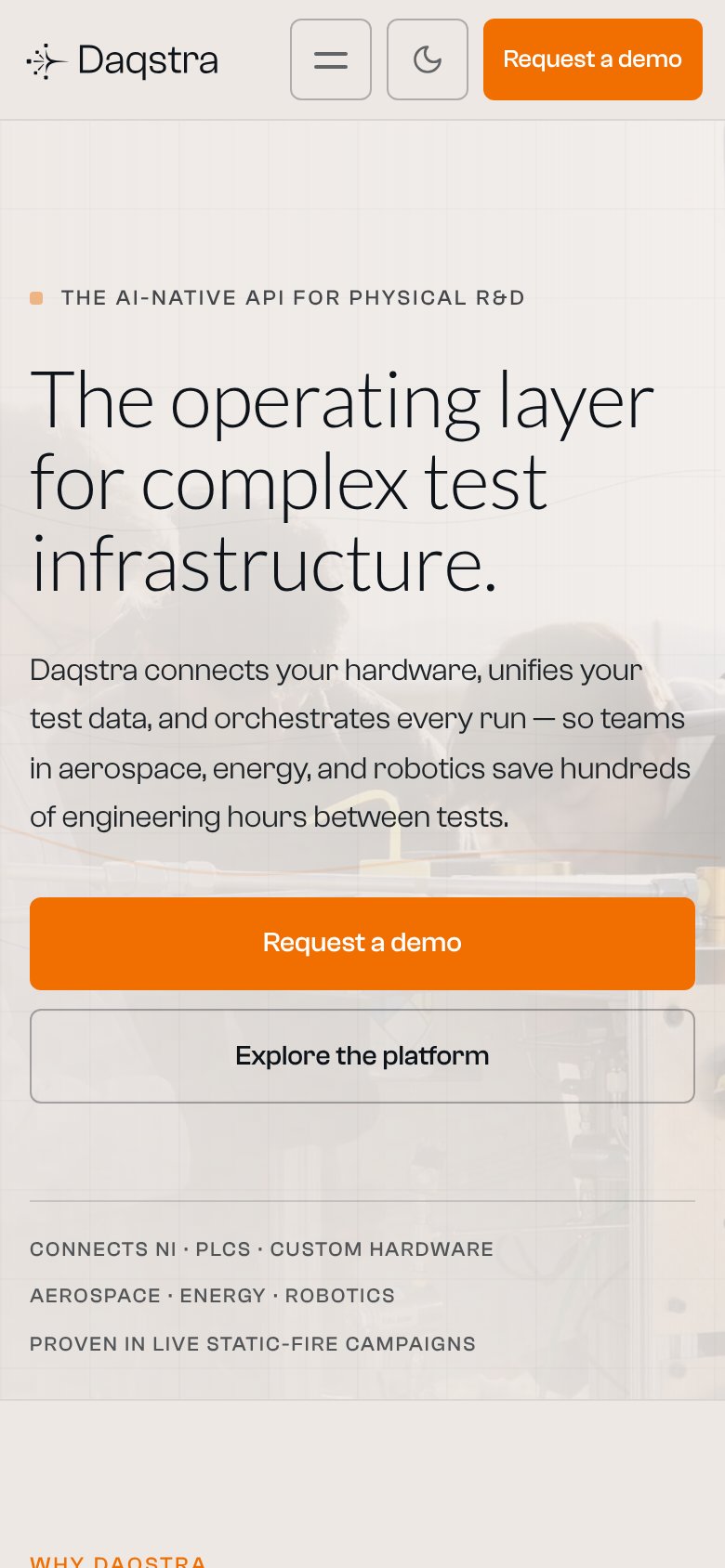 123
- Hero Request a demo — Pushed ~1000px down by the long headline and subheadline, likely below the first viewport on most phones.
- Four-line subheadline — Long paragraph delays the CTA; two tighter lines would move the tap target up.
- Header Request a demo — Duplicates the hero CTA in a small target, crowding the header alongside hamburger and dark-mode toggles.
Information hierarchy
78FairDoes the design help or inhibit what the page is trying to say?
1234- Duplicate demo buttons — Header 'Request a demo' repeats the hero CTA at identical weight, splitting the click target.
- Four-link nav row — Why Daqstra, Industries, Platform, and Press all sit above the hero CTA and leak attention before the pitch lands.
- Dark mode toggle — A prominent bordered 'DARK' control adjacent to the CTA adds a non-conversion interaction to the scan path.
- Headline over busy rig — 'The operating layer for' overlaps dense pipework with a light wash, reducing legibility at the line's right edge.
Value props
78FairTitle, subtitle, hero — do they sell the product's true value?
Daqstra’s headline sells
The operating layer for complex test infrastructure.
Daqstra connects your hardware, unifies your test data, and orchestrates every run — so teams in aerospace, energy, and robotics save hundreds of engineering hours between tests.
Working
- Subhead names verbs, verticals, outcome
- Proof chips cite NI, PLCs, static-fire
- Eyebrow sharpens the category claim
Could improve
- Hero photo decorates, doesn't demo
- "Hundreds of hours" is a soft number
- "Operating layer" is mildly abstract