CerenovusYC S26 landing page report.
← Back to YC S26

Your landing page’s weakest score is Trust.

How Cerenovus ranks

  1. 1.Rogo72
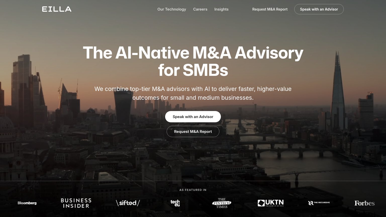
  2. 2.Eilla AI72
  3. 3.Hebbia71
  4. 4.Cerenovus65
  5. 5.Keye64
Fix Trust

Score over time

80757065605550Hebbia 68 on Apr 4 (Wayback)Hebbia 74 on Apr 25 (Wayback)Hebbia 59 on May 15 (Wayback)Hebbia 62 on Jul 11 (Wayback)Hebbia 61 on Aug 21 (Wayback)Hebbia 59 on Sep 8 (Wayback)Hebbia 71 on Sep 20 (Live)Rogo 72 on Sep 20 (Live)Keye 64 on Sep 20 (Live)Eilla AI 72 on Sep 20 (Live)Cerenovus 55 on Jul 9 (Wayback)Cerenovus 64 on Sep 11 (Wayback)Cerenovus 65 on Sep 20 (Live)Jul 9Sep 11Sep 20
Past reportsShow past reportsHide past reports
  1. Sep 20, 202665LiveOverall +1 · Mobile web −6 · CTA +4Viewing
  2. Sep 11, 202664Overall +9 · Mobile web +20 · Information hierarchy +16View →
  3. Jul 9, 202655First tracked report — strongest CTA 64, weakest Value props 42View →

Trust

44Poor

Proof that the product is real, competent, and safe to try.

Cerenovus
Rogo
Hebbia
Eilla AI
Trust read
CerenovusSources-to-insights diagram mapping CONTRACTS, LEDGERS, ERP, AP & AR to specific findings like "Working capital tied up
HebbiaCustomer logo row: Morgan Stanley, MetLife, Centerview, OHA (mobile capture)
RogoCustomer/partner logo strip: Tiger Global, Moelis, Nomura, Société Générale, Rothschild & Co, BNP Paribas, Raymond James
KeyeNo visible trust signal identified.
Eilla AI"AS FEATURED IN" press logo bar (Bloomberg, Business Insider, Sifted, Tech.eu, The Fintech Times, UKTN, The Recursive, F

Value props

62Fair

Title, subtitle, hero — do they sell the product's true value?

Cerenovus’s headline undersellsCompany ClarityDesigned for Private equity portfolio operations and consulting advisory services.

Working

  • Names exact audience: PE ops, consultants
  • Body copy lists concrete data sources
  • Hero diagram shows real insight outputs

Could improve

  • H1 is a slogan, not a value claim
  • No numbers or proof points in fold
  • Outcome buried in paragraph text

CTA

68Fair

Copy, size, verb, cost-feel — does the primary CTA earn the click?

Cerenovus
Rogo

Problems

  • demo booking feels costly
  • no low-commitment product path
  • click gives sales call, not value

Mobile web

72Fair

The phone experience as a first-class citizen.

Mobile web annotations on the mobile capture123
  1. Long body paragraph — Seven lines of copy push the primary CTA well below the first viewport.
  2. Book a demo button — Desktop-proportioned at ~40% column width instead of a full-bleed thumb target.
  3. Insights diagram labels — Desktop diagram shrunk into the phone column with tiny 01–05 labels and tangled lines.

Information hierarchy

78Fair

Does the design help or inhibit what the page is trying to say?

Information hierarchy annotations on the desktop capture1234
  1. Hero body paragraph — Six lines of same-weight prose delay the scan from headline to CTA and bloat the mobile fold.
  2. Nav link cluster — Four text links plus two dropdowns give five equal-weight exits before the visitor reaches the hero CTA.
  3. See how it works — Underlined secondary link sits at the same baseline as the primary CTA and splits the click.
  4. Benefit strip creep — Three-column section edges into the fold with truncated copy, adding a fourth competing message beat.

Competitors

inferred from product, audience, and value prop