
Your landing page’s weakest score is Trust.
How Bernard ranks
- 1.
Sameday AI82
- 2.
Avoca78
- 3.
Rilla72
- 4.
Bernard70
- 5.
Hatch70
70Growth scoreupdated
category scores
category scoresShowHide
Score over time
Trust
32PoorProof that the product is real, competent, and safe to try.
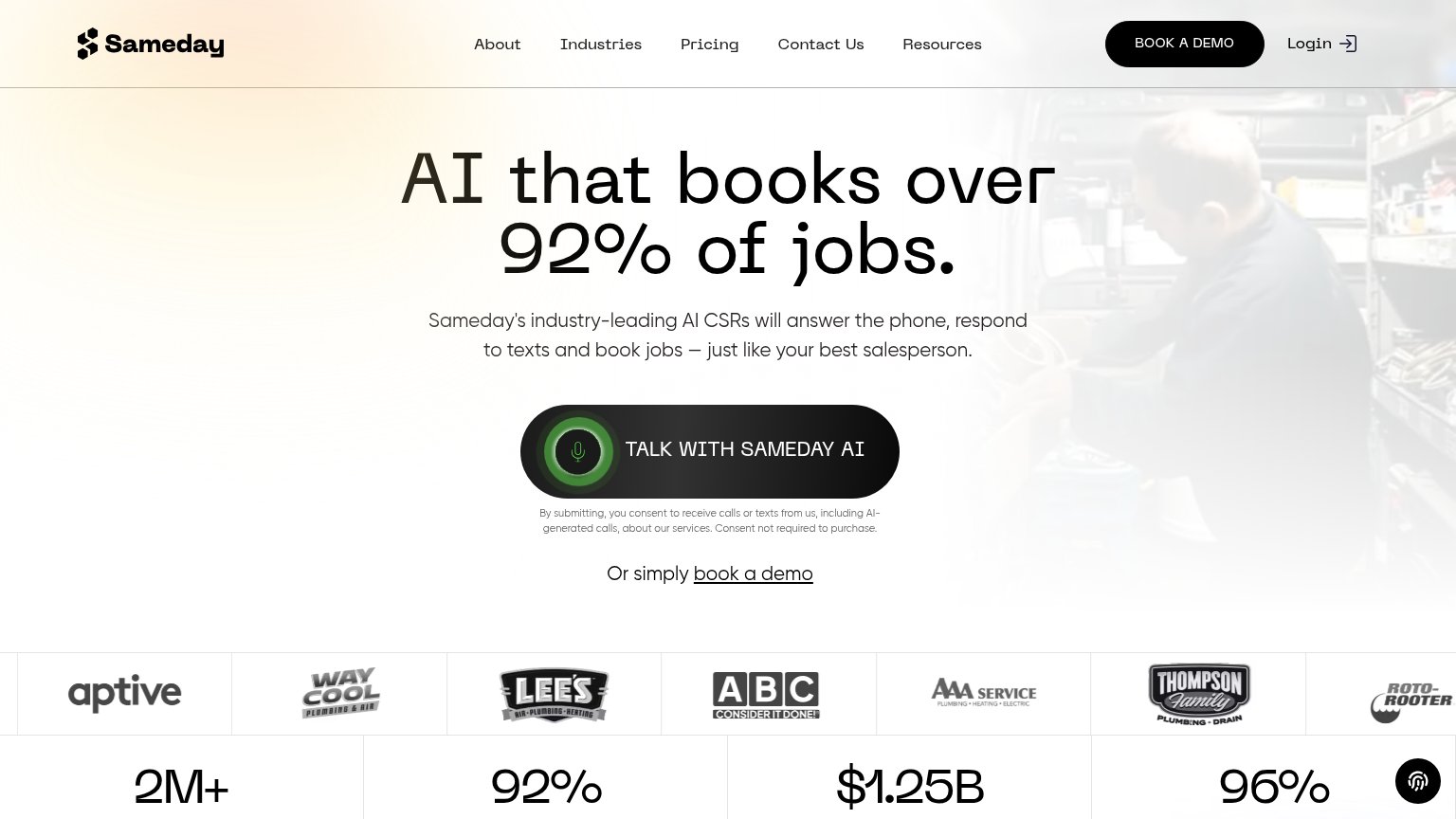
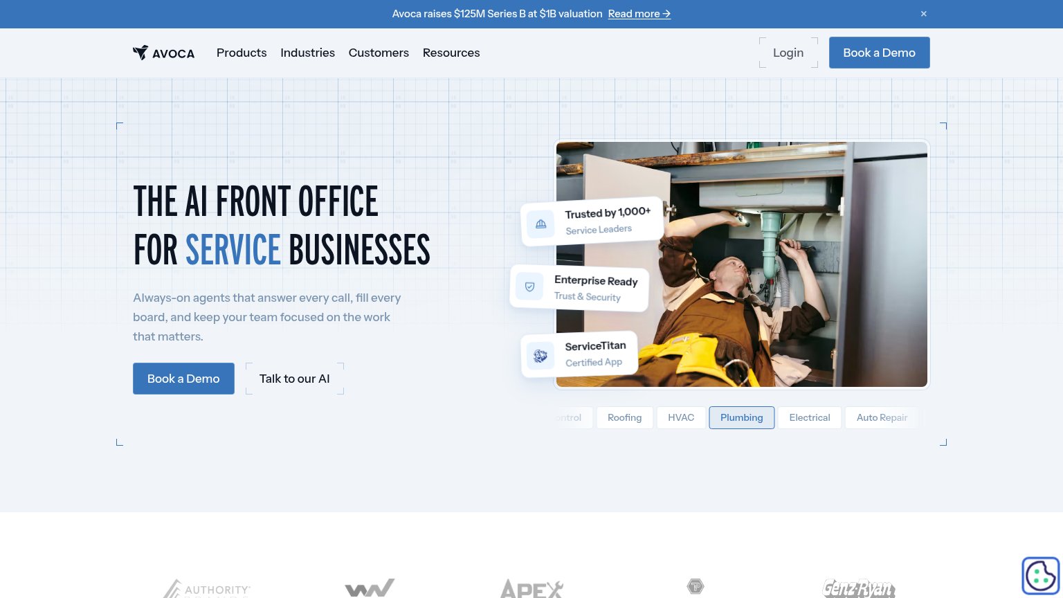

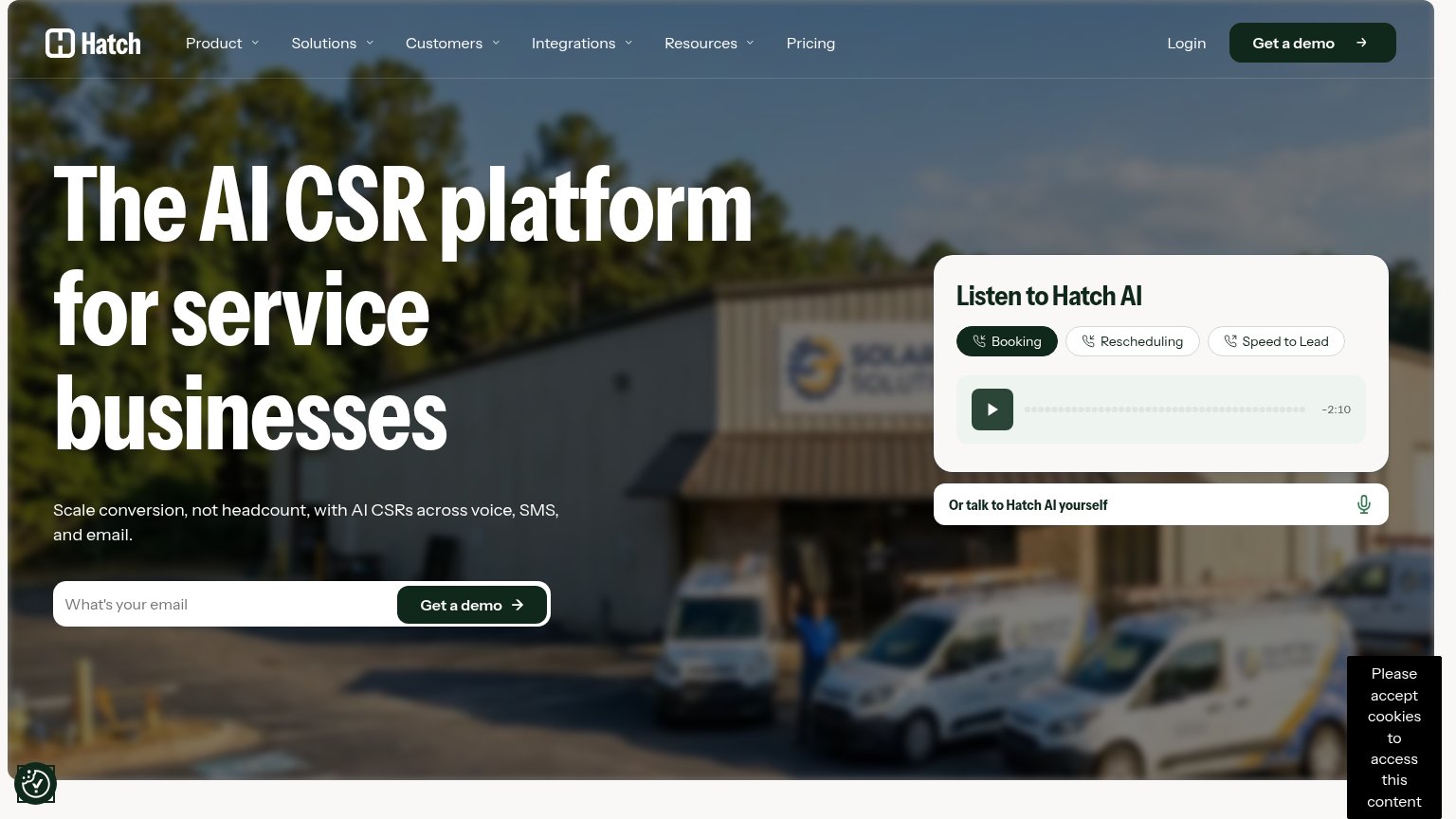
| Trust read | |
|---|---|
| Bernard | No visible trust signal identified. |
| "Trusted by 1,000+ Service Leaders" badge | |
| Stats bar: "2M+ Calls answered in the trades" and "92% Booking rate in most channels" beneath the customer logo strip | |
| Customer logo strip (Kohler, Neighborly, Groundworks) under "Trusted by leading sales teams in home improvement, home bu | |
| "Listen to Hatch AI" audio demo widget with Booking / Rescheduling / Speed to Lead sample calls |
Value props
72FairTitle, subtitle, hero — do they sell the product's true value?
Bernard’s headline sells
Capture every call. Plan every repair.
Fix the problem the first time, with a complete game plan for your tech before the truck ever rolls.
Working
- Outcome-led headline, not feature list
- "Before the truck ever rolls" nails the pain
- Trade-specific language signals the audience
Could improve
- Zero numbers or proof points in the fold
- Hero image decorates, never shows the product
- Doesn't say what Bernard actually is (AI? app?)
CTA
76FairCopy, size, verb, cost-feel — does the primary CTA earn the click?
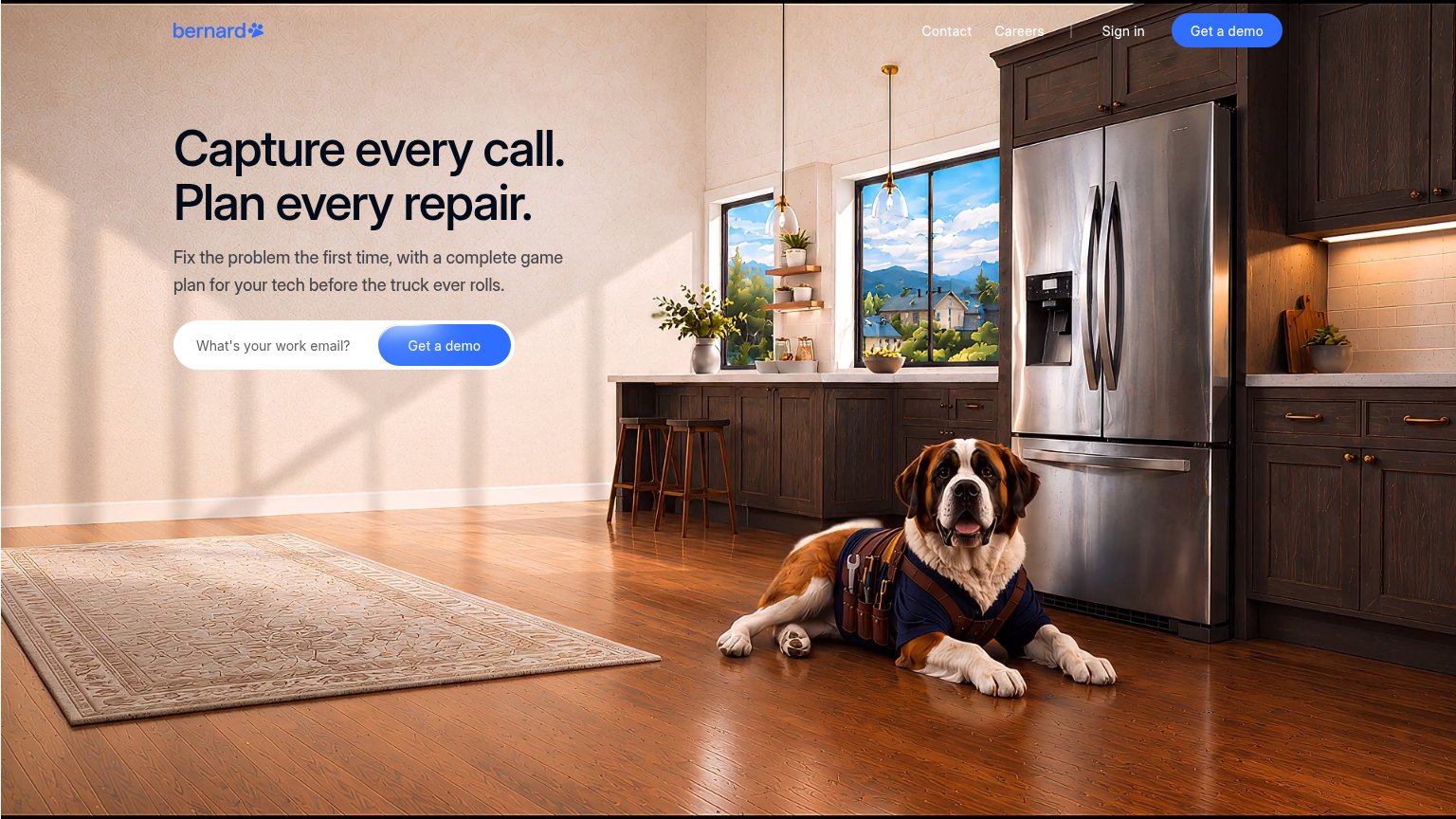
Problems
- demo ask feels sales-heavy
- work-email gate raises friction
- no lower-commitment alternative
Information hierarchy
84StrongDoes the design help or inhibit what the page is trying to say?
123- Header Get a demo — Duplicates the hero form's CTA at equal weight, splitting the one action into two competing blue buttons.
- Contact and Careers links — Two same-weight exit links plus Sign in sit directly beside the primary CTA in the scan path.
- Get a demo button — Blue-on-blue gradient button reads slightly low-contrast against the input pill compared to the header version.
Mobile web
88StrongThe phone experience as a first-class citizen.
 1
- Email input field — Placeholder-only labeling disappears on focus, leaving the field unexplained mid-typing.