
Your landing page’s weakest score is CTA.
How Axelrod ranks
- 1.
Mews72
- 2.
Apaleo71
- 3.
Cloudbeds59
- 4.
Axelrod36
36Growth scoreupdated
category scores
category scoresShowHide
Score over time
CTA
30PoorCopy, size, verb, cost-feel — does the primary CTA earn the click?
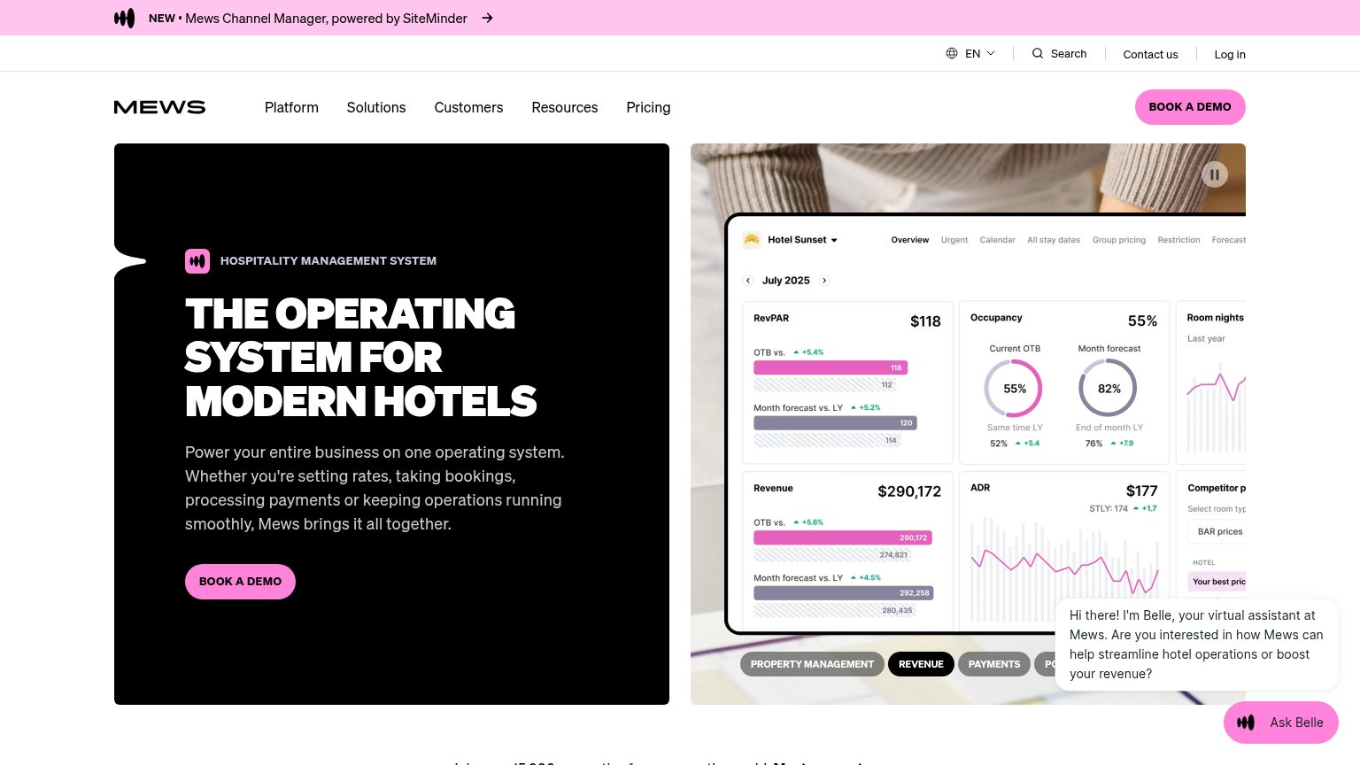


Problems
- no button or in-product action
- only link is inline body text
- no action verb or payoff
- tiny footprint, easy to miss
Value props
32PoorTitle, subtitle, hero — do they sell the product's true value?
Axelrod’s headline vague
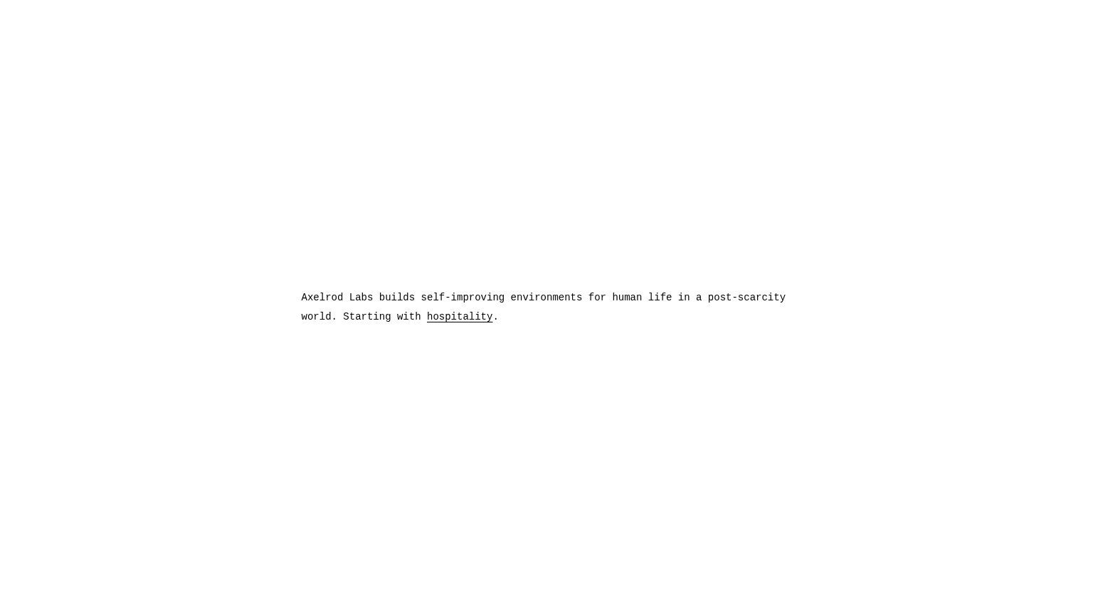
Axelrod Labs builds self-improving environments for human life in a post-scarcity world. Starting with hospitality.
Working
- Names the company and first market
- Minimalism signals confidence
- One link focuses attention
Could improve
- "Post-scarcity world" parses as sci-fi
- No concrete product or outcome named
- No proof, numbers, or visual demo
Trust
32PoorProof that the product is real, competent, and safe to try.
| Trust read | |
|---|---|
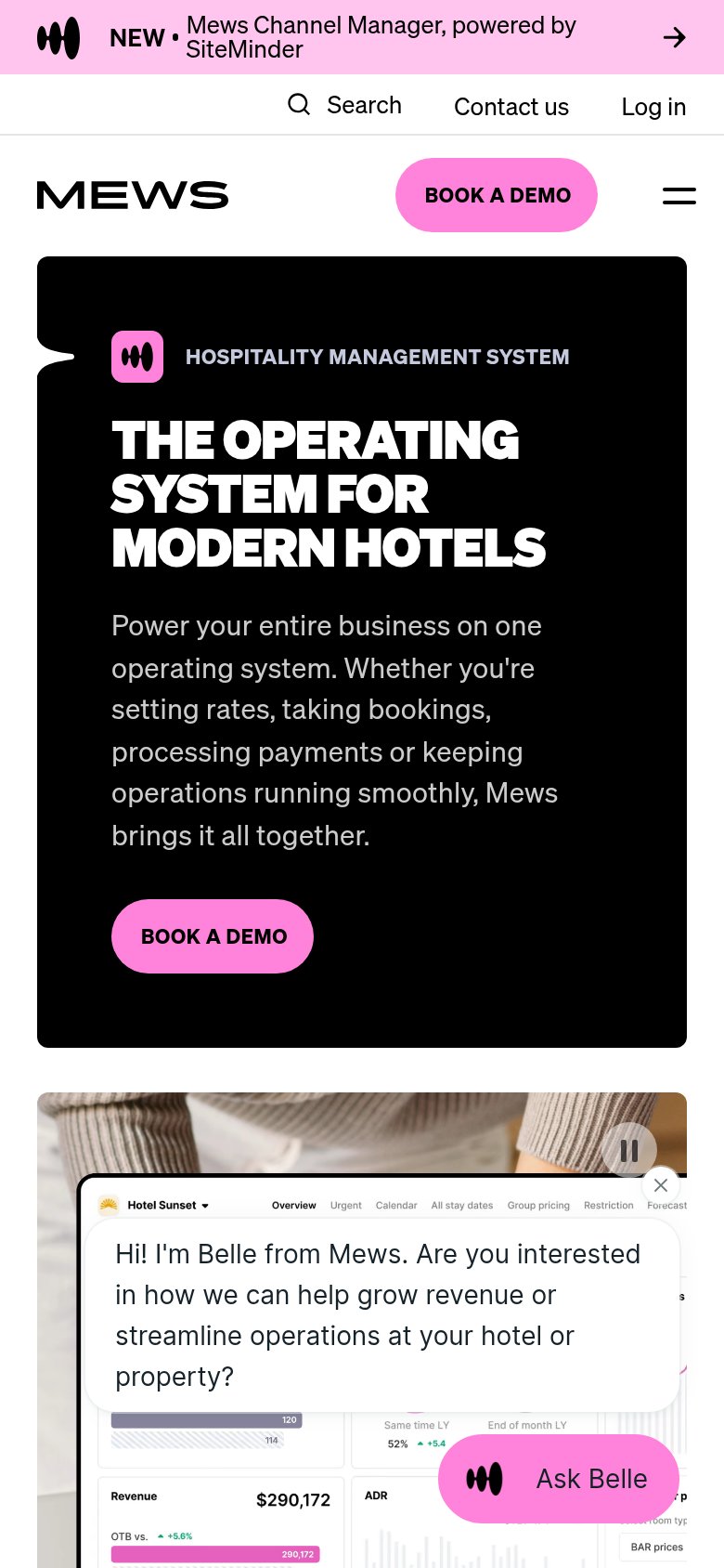
| Axelrod | No visible trust signal identified. |
| Product dashboard UI showing "Hotel Sunset" metrics: RevPAR $118, Occupancy 55%, Revenue $290,172 | |
| implicit context Cloudbeds may benefit from pre-existing familiarity among its target audience. | |
| Customer logo bar: citizenM, Numa, Valk Exclusief, Limehome, Mollie's, SMARTments, nestor, easyHotel |
Information hierarchy
42PoorDoes the design help or inhibit what the page is trying to say?
 12
- Inline hospitality link — The sole action is an underlined word inside the sentence — no CTA a visitor can find in one second.
- Mission statement text — The entire value prop is set at body-copy size with no headline weight, so the claim and qualifier read as one flat line.
Mobile web
42PoorThe phone experience as a first-class citizen.
 1
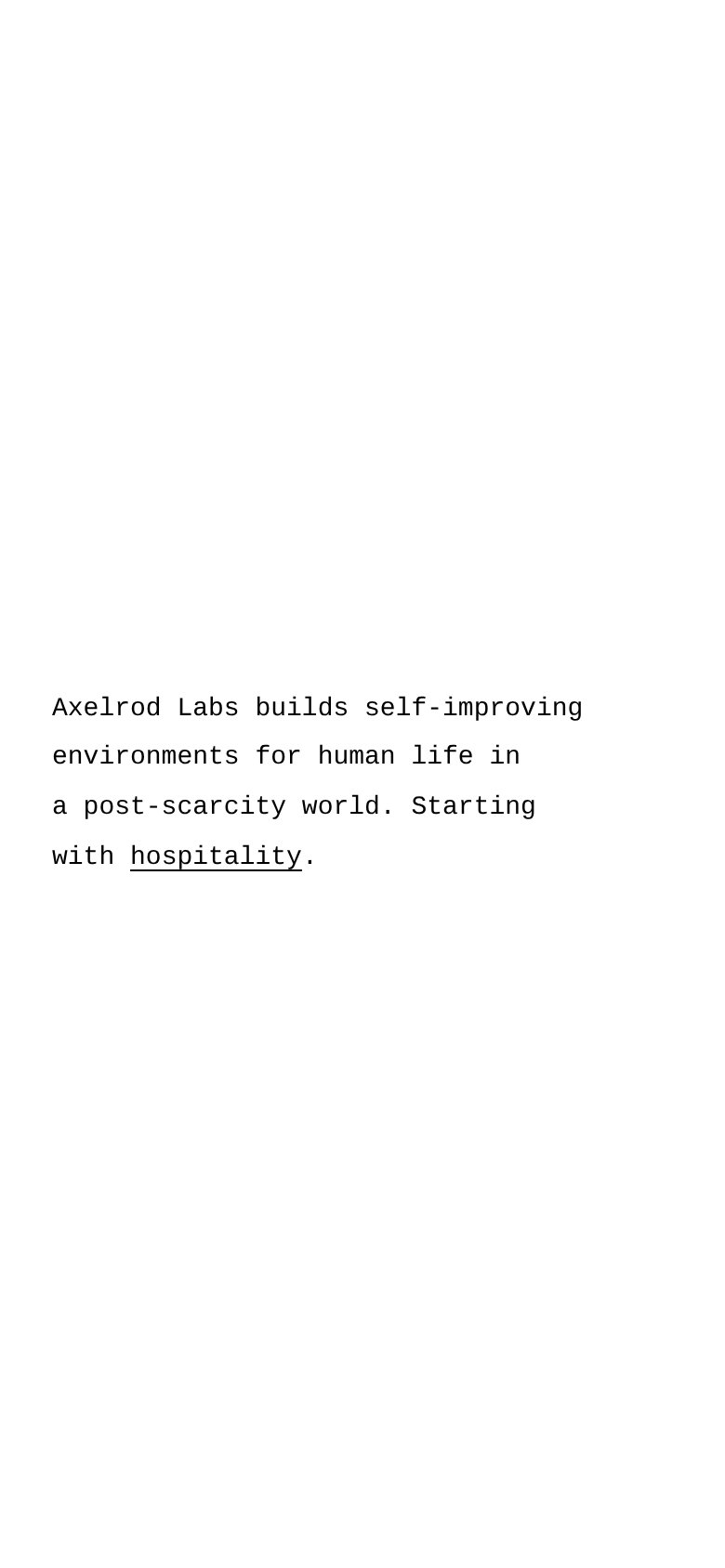
- Inline hospitality link — The only action on the page is a small underlined word — an undersized, easy-to-miss tap target instead of a proper CTA button.