
Your landing page’s weakest score is CTA.
How Theora ranks
58Growth scoreupdated
category scores
category scoresShowHide
Score over time
CTA
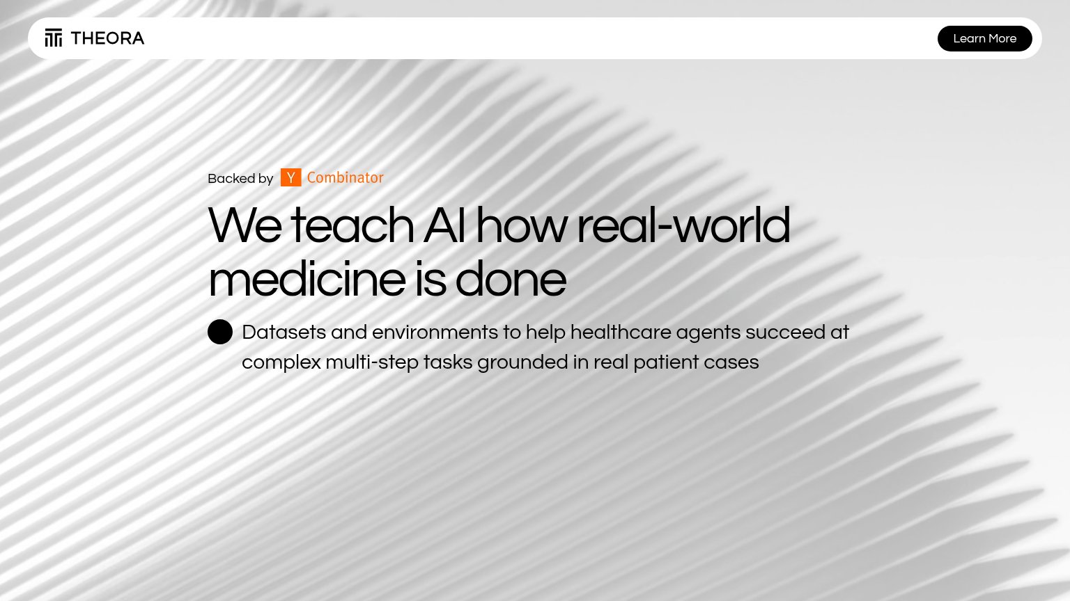
48PoorCopy, size, verb, cost-feel — does the primary CTA earn the click?



Problems
- absent from mobile fold
- tiny nav-corner footprint
- "Learn More" promises reading, not value
- no hero CTA under headline
Trust
48PoorProof that the product is real, competent, and safe to try.
| Trust read | |
|---|---|
| Theora | "Backed by Y Combinator" badge above the headline |
| Leaderboard cards with task completion counts, e.g. "Skin Lesion Classification — 2,847 COMPLETED" showing Centaur Aggre | |
| implicit context Mercor may benefit from pre-existing familiarity among its target audience. | |
| "New Frontier data and RL environments, off the shelf" announcement banner | |
| implicit context Scale AI may benefit from pre-existing familiarity among its target audience. |
Mobile web
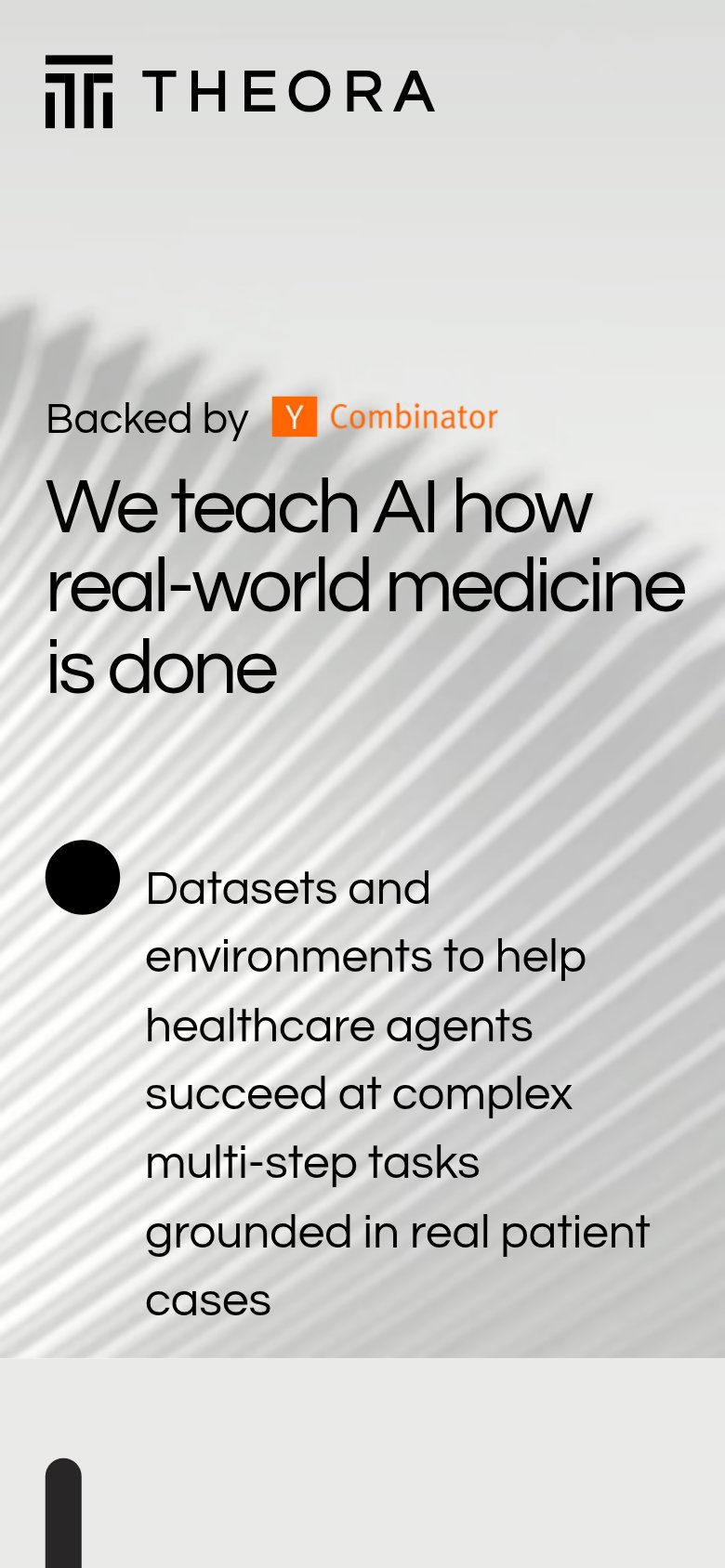
48PoorThe phone experience as a first-class citizen.
 12
- Oversized bullet marker — A huge black dot eats a column of width, squeezing the subheadline into eight cramped lines.
- Subheadline text block — Body copy wraps into eight short lines with loose spacing, making the value statement slow to scan.
Information hierarchy
72FairDoes the design help or inhibit what the page is trying to say?
123- Learn More button — Only CTA sits isolated in the top-right corner, outside the left-aligned scan path, with a vague label.
- Subtitle bullet dot — Oversized lone bullet reads as a rendering glitch and adds visual noise to the one supporting line.
- Y Combinator badge — The badge is the first element in the content stack, outranking the headline as the opening beat.
Value props
72FairTitle, subtitle, hero — do they sell the product's true value?
Theora’s headline sells
We teach AI how real-world medicine is done
Datasets and environments to help healthcare agents succeed at complex multi-step tasks grounded in real patient cases
Working
- Headline stakes a clear, differentiated claim
- Subhead names the actual product: datasets + envs
- YC badge adds early credibility
Could improve
- No numbers: dataset size, cases, benchmarks
- Hero image decorates, shows no product
- Buyer outcome (agent performance) left implicit