
Your landing page’s weakest score is CTA.
How Stockline ranks
- 1.
Cut+Dry72
- 2.
Pepper67
- 3.
Endeavor (Grubmarket)67
- 4.
Stockline52
52Growth scoreupdated
category scores
category scoresShowHide
Score over time
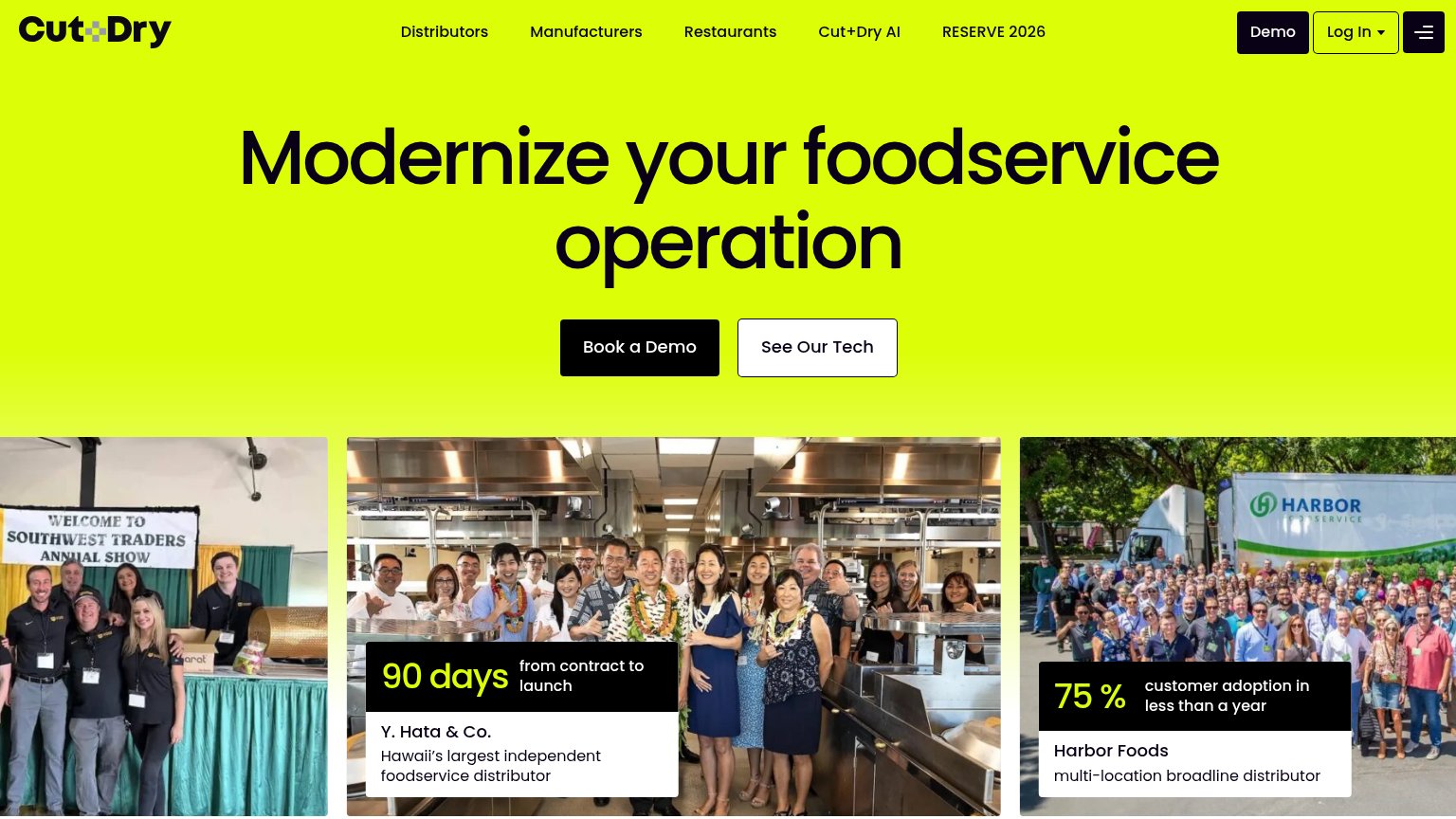
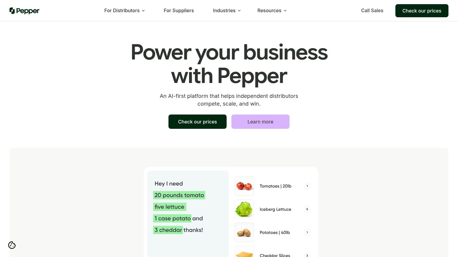
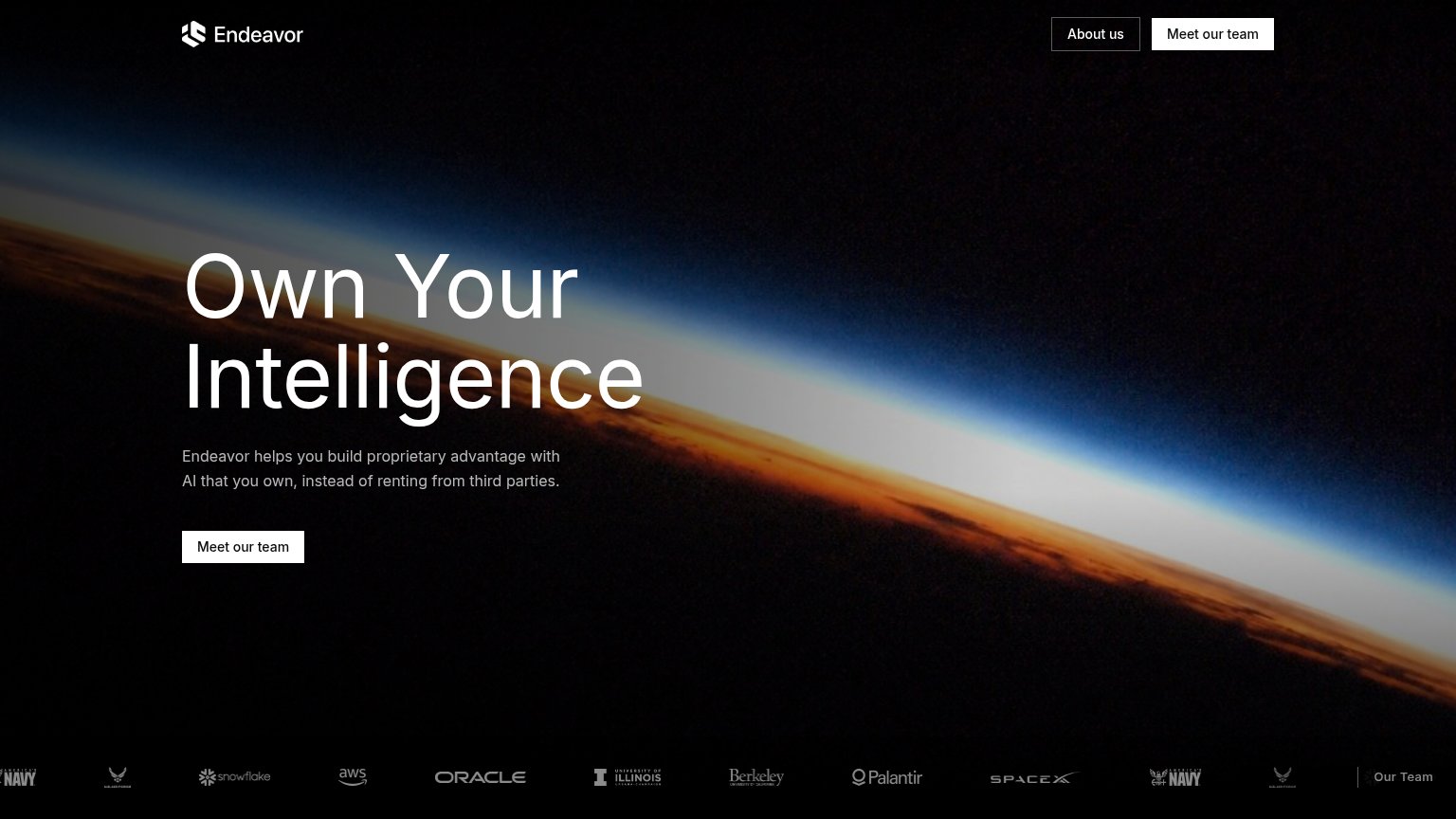
CTA
38PoorCopy, size, verb, cost-feel — does the primary CTA earn the click?
Problems
- no CTA anywhere in the fold
- badge styled like a button, no action
- nav 'Contact' is the only path to act
Trust
42PoorProof that the product is real, competent, and safe to try.
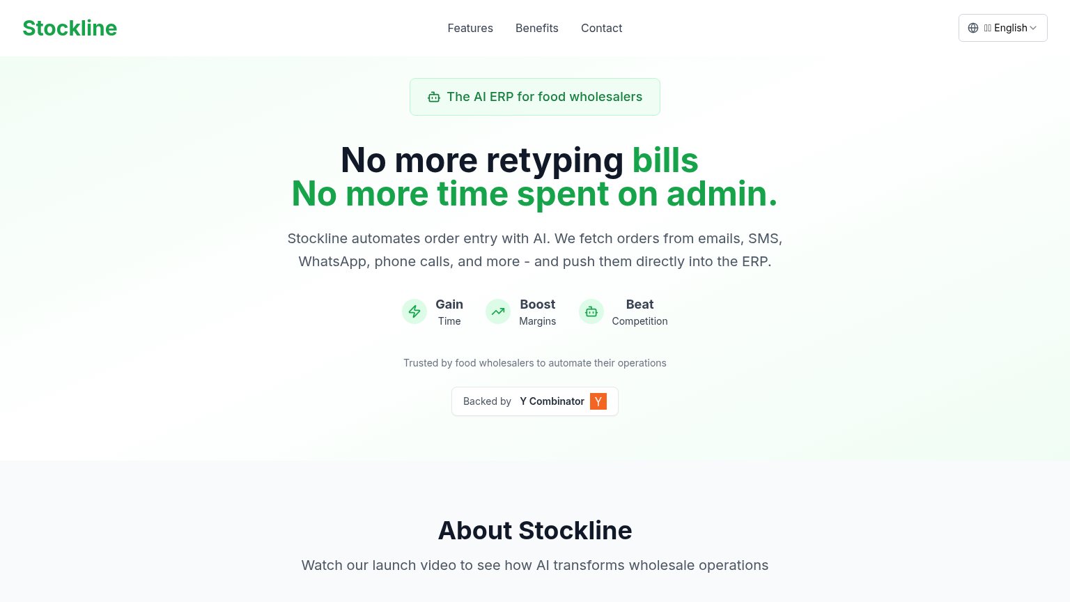
| Trust read | |
|---|---|
| Stockline | "Backed by Y Combinator" badge |
| Product demo parsing "Hey I need 20 pounds tomato…" into order line items (Tomatoes | 20lb, Iceberg Lettuce) | |
| Case card: "75% customer adoption in less than a year — Harbor Foods, multi-location broadline distributor" over a real | |
| Logo strip with U.S. Navy, U.S. Air Force, Snowflake, AWS, Oracle, Berkeley, Palantir, SpaceX |
Mobile web
52FairThe phone experience as a first-class citizen.
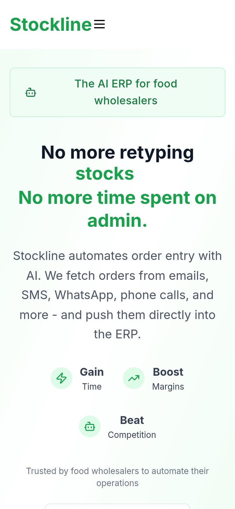 123
- Oversized headline block — The rotating headline wraps into four heavy lines, eating half the fold and pushing any CTA off-screen.
- Seven-line body paragraph — Desktop-length paragraph runs seven lines on mobile, adding scroll depth before any action appears.
- Wrapping badge pill — The 'AI ERP for food wholesalers' badge wraps to two lines with a misaligned icon, wasting fold space.
Information hierarchy
58FairDoes the design help or inhibit what the page is trying to say?
123- AI ERP pill badge — Green outlined pill is styled like a button but is inert, drawing clicks that go nowhere.
- Y Combinator badge — The only button-shaped, high-contrast element in the fold is a trust badge, not an action.
- Nav links row — Features, Benefits, Contact are the sole clickable paths, leaking attention with no conversion anchor to compete.
Value props
72FairTitle, subtitle, hero — do they sell the product's true value?
Stockline’s headline sells
No more retyping bills No more time spent on admin.
Stockline automates order entry with AI. We fetch orders from emails, SMS, WhatsApp, phone calls, and more - and push them directly into the ERP.
Working
- Names the exact pain: retyping and admin
- Subhead states mechanism and channels
- Badge targets food wholesalers precisely
Could improve
- No numbers anywhere in the fold
- No product visual demonstrating the AI
- Desktop says 'bills', mobile says 'stocks'