
Your landing page’s weakest score is Trust.
How Proliferate ranks
- 1.
Conductor81
- 2.
Proliferate78
- 3.
Vibe Kanban62
- 4.
Sculptor (Imbue)54
- 5.
Terragon49
78Growth scoreupdated
category scores
category scoresShowHide
Score over time
Trust
74FairProof that the product is real, competent, and safe to try.
| Trust read | |
|---|---|
| Proliferate | "Trusted by builders at companies including" logo wall (OpenAI, Meta, Ramp, Brex, Mercury, Rho, Scale) on mobile |
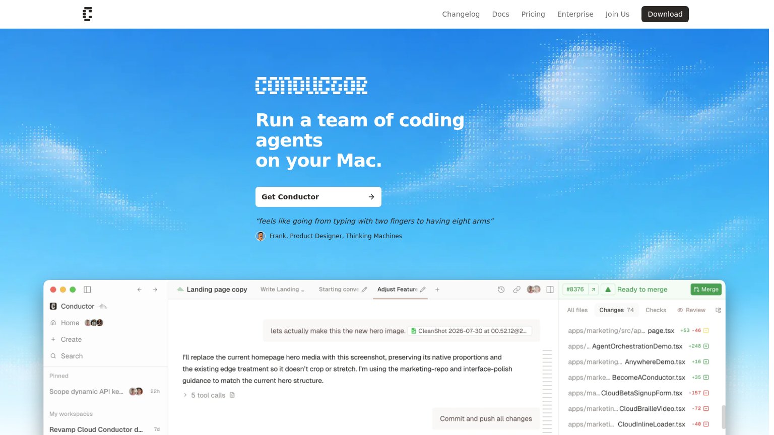
| "feels like going from typing with two fingers to having eight arms" — Frank, Product Designer, Thinking Machines | |
| No visible trust signal identified. | |
| No visible trust signal identified. | |
| "Works with" integration icon row showing recognizable AI tool logos (including OpenAI) beneath the CTA |
Value props
76FairTitle, subtitle, hero — do they sell the product's true value?
Proliferate’s headline sells
Run a team of coding agents
Claude Code, Codex, or any coding agent, each running in its own isolated workspace, or all working together.
Working
- Headline names the real differentiator: a team
- Subhead names Claude Code and Codex by name
- Hero screenshot shows agents actually working
Could improve
- No numbers or quantified outcome anywhere
- No emotional hook — flat, affectless copy
- Mobile typo: 'runningin' breaks the subhead
Information hierarchy
78FairDoes the design help or inhibit what the page is trying to say?
 1234
- Duplicate nav Download button — Black pill styled at the same weight as the hero CTA, splitting the primary action across two locations.
- GitHub and Discord links — Two outbound community links sit in the top-right scan path, leaking attention before the download decision.
- Announcement banner link — The topmost element is a clickable exit that outranks the headline in scan order without stating any benefit.
- Book a demo button — Equal size and placement beside Download for Mac dilutes the single-action focus of the hero.
CTA
78FairCopy, size, verb, cost-feel — does the primary CTA earn the click?
Problems
- nav says 'Download', hero differs
- no cost signal near the button
- Mac-only excludes other platforms
Mobile web
86StrongThe phone experience as a first-class citizen.
 123
- Download for Mac CTA — Primary action is a desktop-only download most phone visitors cannot complete on-device.
- Subheadline copy — Missing space renders as 'each runningin its own isolated workspace' — sloppy on the first thing read.
- Header Download pill — Duplicates the hero's Download CTA inches below it, adding a competing tap target.