
Your landing page’s weakest score is Trust.
How NOSO LABS ranks
69Growth scoreupdated
category scores
category scoresShowHide
Score over time
Trust
52FairProof that the product is real, competent, and safe to try.
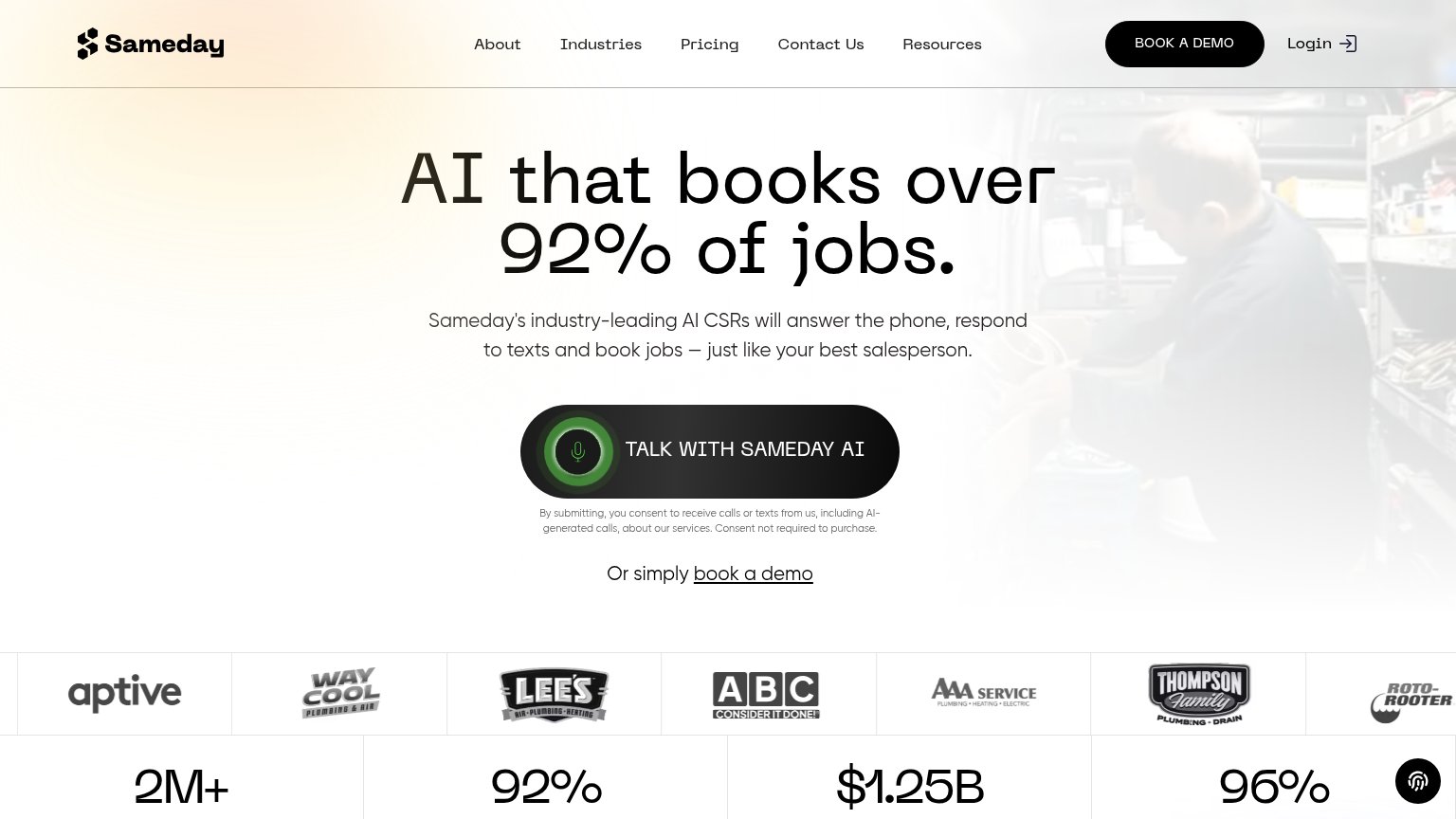
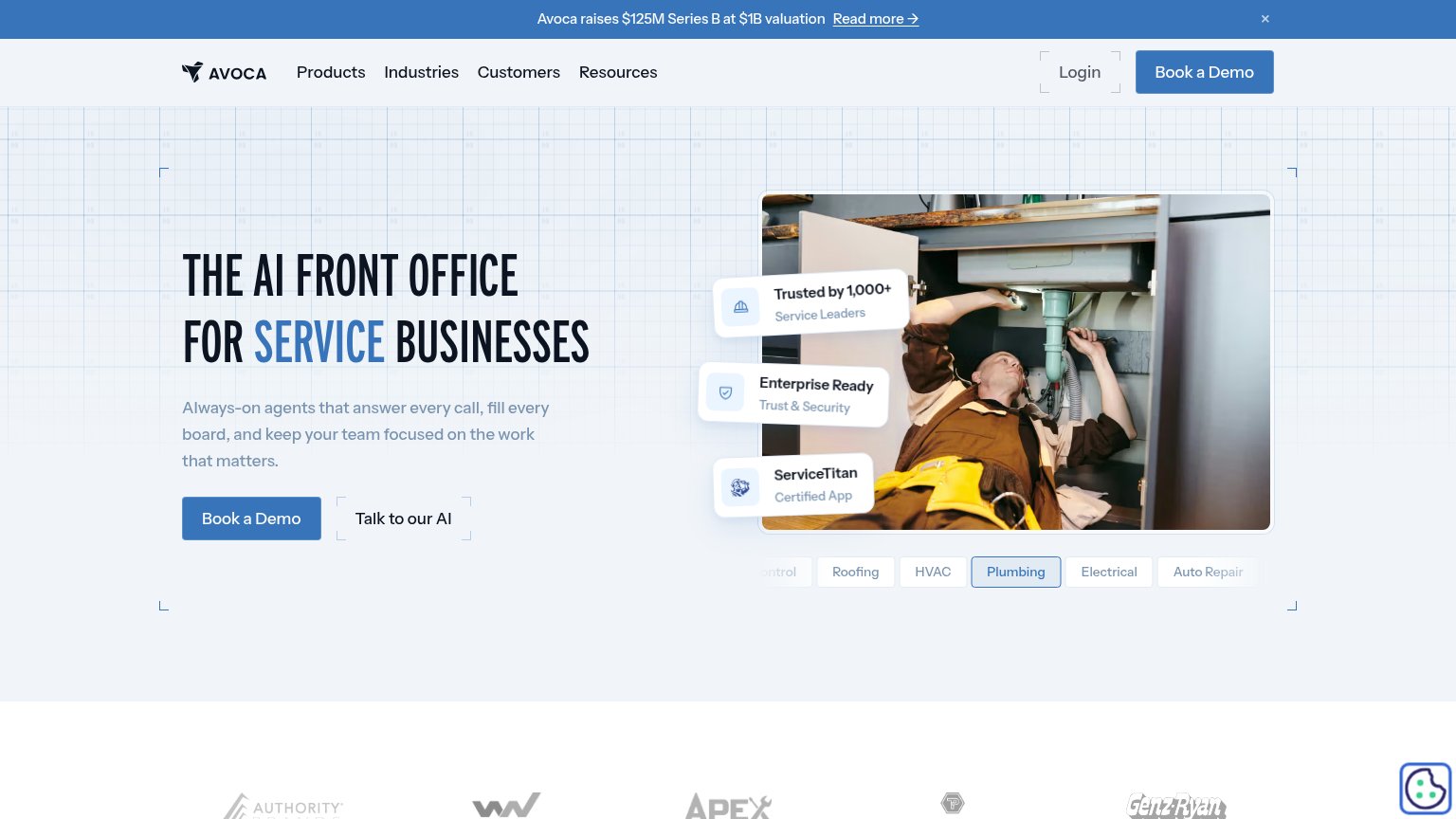
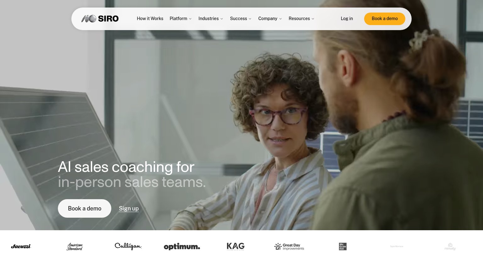

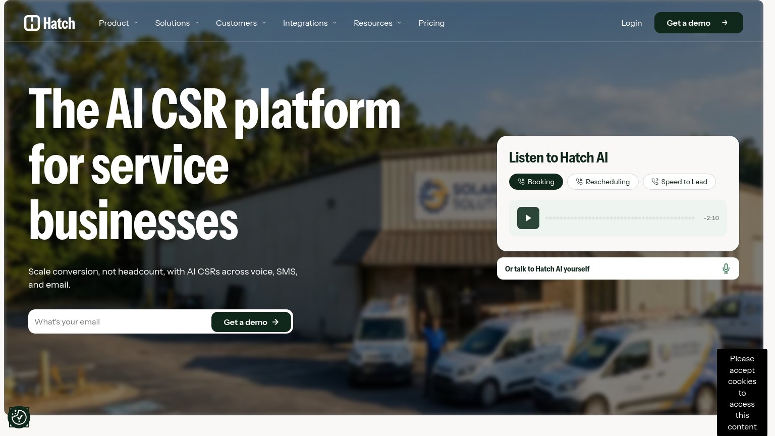
| Trust read | |
|---|---|
| NOSO LABS | No visible trust signal identified. |
| Customer logo strip (Kohler, Neighborly, Groundworks) under "Trusted by leading sales teams in home improvement, home bu | |
| "Trusted by 1,000+ Service Leaders" badge | |
| Stats bar: "2M+ Calls answered in the trades" and "92% Booking rate in most channels" beneath the customer logo strip | |
| "Listen to Hatch AI" audio demo widget with Booking / Rescheduling / Speed to Lead sample calls | |
| Customer logo strip: Jacuzzi, American Standard, Culligan, Optimum, KAG, Great Day Improvements, McGraw Hill |
CTA
68FairCopy, size, verb, cost-feel — does the primary CTA earn the click?
Problems
- click feels gated, not rewarding
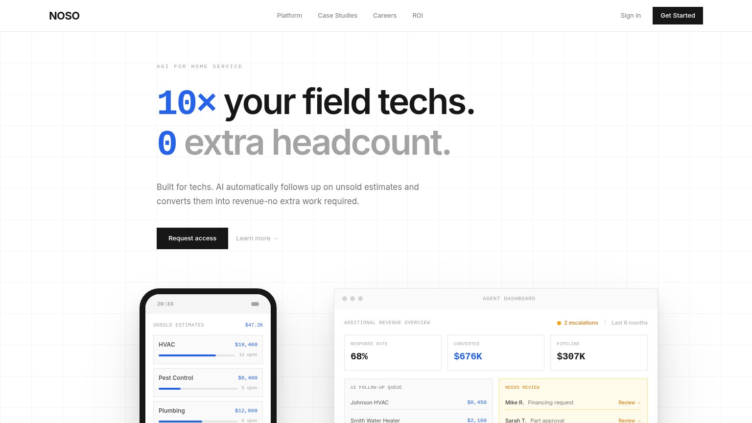
- nav says 'Get Started' — mismatch
- no payoff or value in the label
Mobile web
72FairThe phone experience as a first-class citizen.
 123
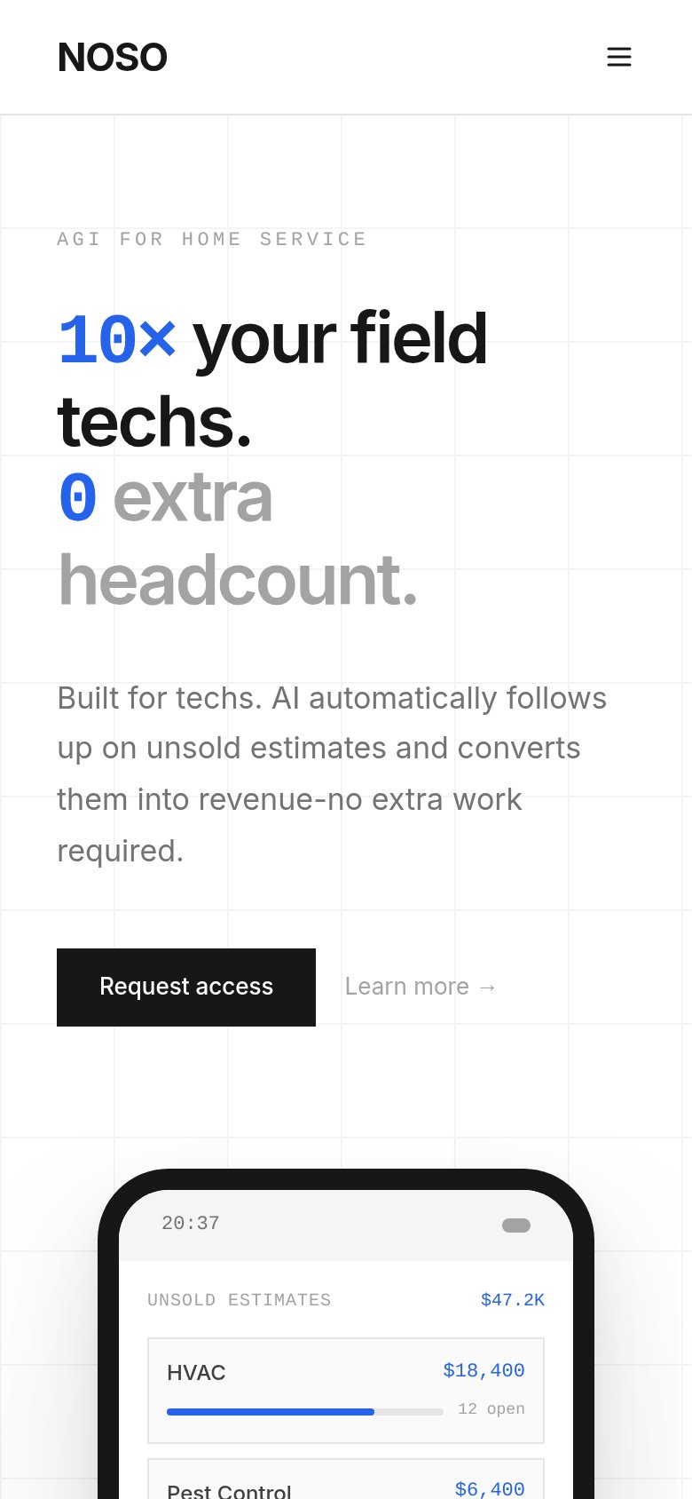
- Request access button — Desktop-proportioned at under half width; should be a full-bleed thumb-friendly tap target.
- Learn more link — Low-contrast gray link crammed beside the primary CTA, splitting the tap decision.
- Headline block — Headline wraps into four tall lines, pushing the product mockup proof below the fold.
Information hierarchy
76FairDoes the design help or inhibit what the page is trying to say?
123- Get Started vs Request access — Two black primary-weight CTAs with different labels ('Get Started' in nav, 'Request access' in hero) split the conversion path and confuse which action matters.
- Nav link row — Five exits (Platform, Case Studies, Careers, ROI, Sign in) sit at equal weight in the scan path before the visitor reaches the hero promise.
- Dashboard mockup crop — The agent dashboard's key proof stats ($676K converted, 68% response rate) are half-cut by the fold, weakening the strongest evidence panel.
Value props
78FairTitle, subtitle, hero — do they sell the product's true value?
NOSO LABS’s headline sells
10× your field techs. 0 extra headcount.
Built for techs. AI automatically follows up on unsold estimates and converts them into revenue-no extra work required.
Working
- Outcome-first: revenue without hiring
- Subhead names exact mechanism
- Dashboard shows $676K converted proof
Could improve
- 10× claim strains credibility
- 'AGI' eyebrow is buzzword overreach
- 'Built for techs' muddles the audience