
Your landing page’s weakest score is Trust.
How Monarcha ranks
72Growth scoreupdated
category scores
category scoresShowHide
Trust
54FairProof that the product is real, competent, and safe to try.
| Trust read | |
|---|---|
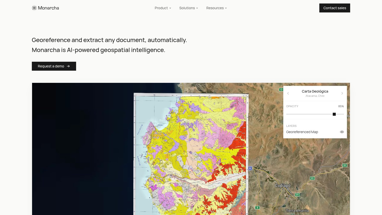
| Monarcha | Product demo UI showing a georeferenced geological map ("Carta Geológica — Atacama, Chile") with opacity slider and "Geo |
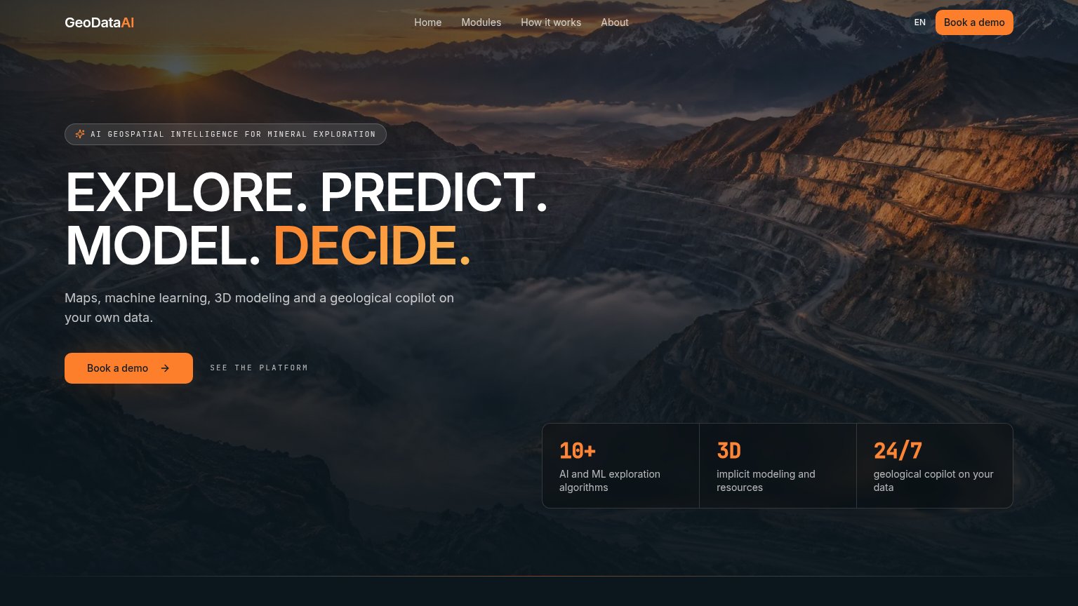
| "10+ AI and ML exploration algorithms" stat card |
CTA
68FairCopy, size, verb, cost-feel — does the primary CTA earn the click?
Problems
- 'Request' feels like asking permission
- click yields a sales call, not value
- two sales-gated CTAs, no self-serve path
- small footprint vs headline on desktop
Value props
72FairTitle, subtitle, hero — do they sell the product's true value?
Monarcha’s headline sells
Georeference and extract any document, automatically.
Monarcha is AI-powered geospatial intelligence.
Working
- Names the actual job: georeference + extract
- "Automatically" hits the manual-work pain
- Hero image demonstrates the product output
Could improve
- Subhead is a buzzword, adds no specifics
- No numbers or proof points in the fold
- No named outcome or time-saved claim
Information hierarchy
82StrongDoes the design help or inhibit what the page is trying to say?
123- Contact sales button — Same dark-block styling as "Request a demo" — two equal-weight CTAs split the visitor's one action.
- Nav dropdown row — Three dropdown menus (Product, Solutions, Resources) offer exit paths before the demo CTA is reached.
- Request a demo CTA — Small footprint relative to the headline; easy to skim past against the equally dark header button.
Mobile web
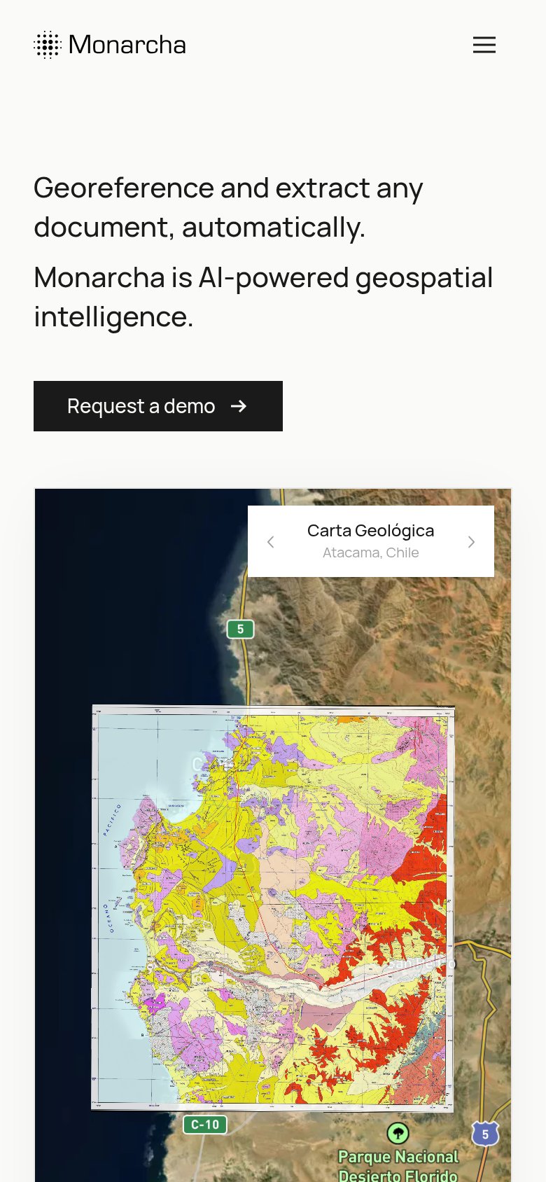
84StrongThe phone experience as a first-class citizen.
 1
- Request a demo button — Desktop-proportioned button floats at roughly half width instead of stretching near full-bleed for the thumb.