
Your landing page’s weakest score is CTA.
How MangoDesk ranks
47Growth scoreupdated
category scores
category scoresShowHide
Score over time
CTA
32PoorCopy, size, verb, cost-feel — does the primary CTA earn the click?
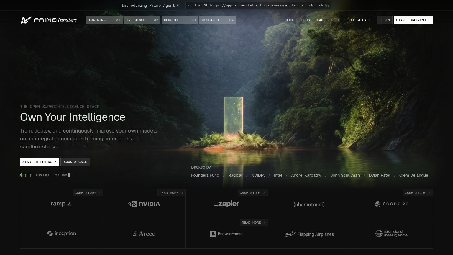
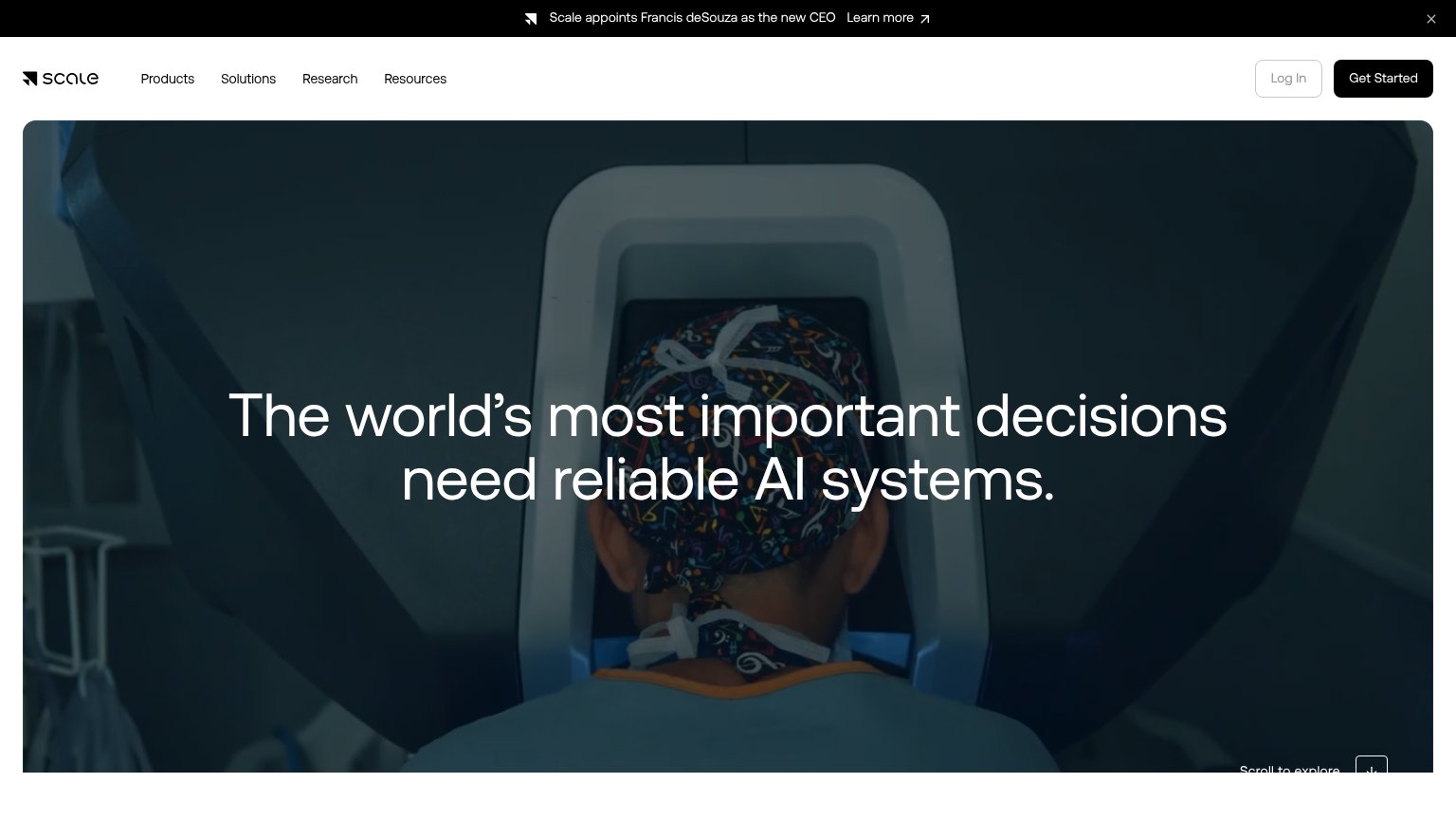

Problems
- no hero CTA at all
- email line not a button or link
- nav 'Contact us' is ghost-styled
- no action path for the hero promise
Trust
44PoorProof that the product is real, competent, and safe to try.
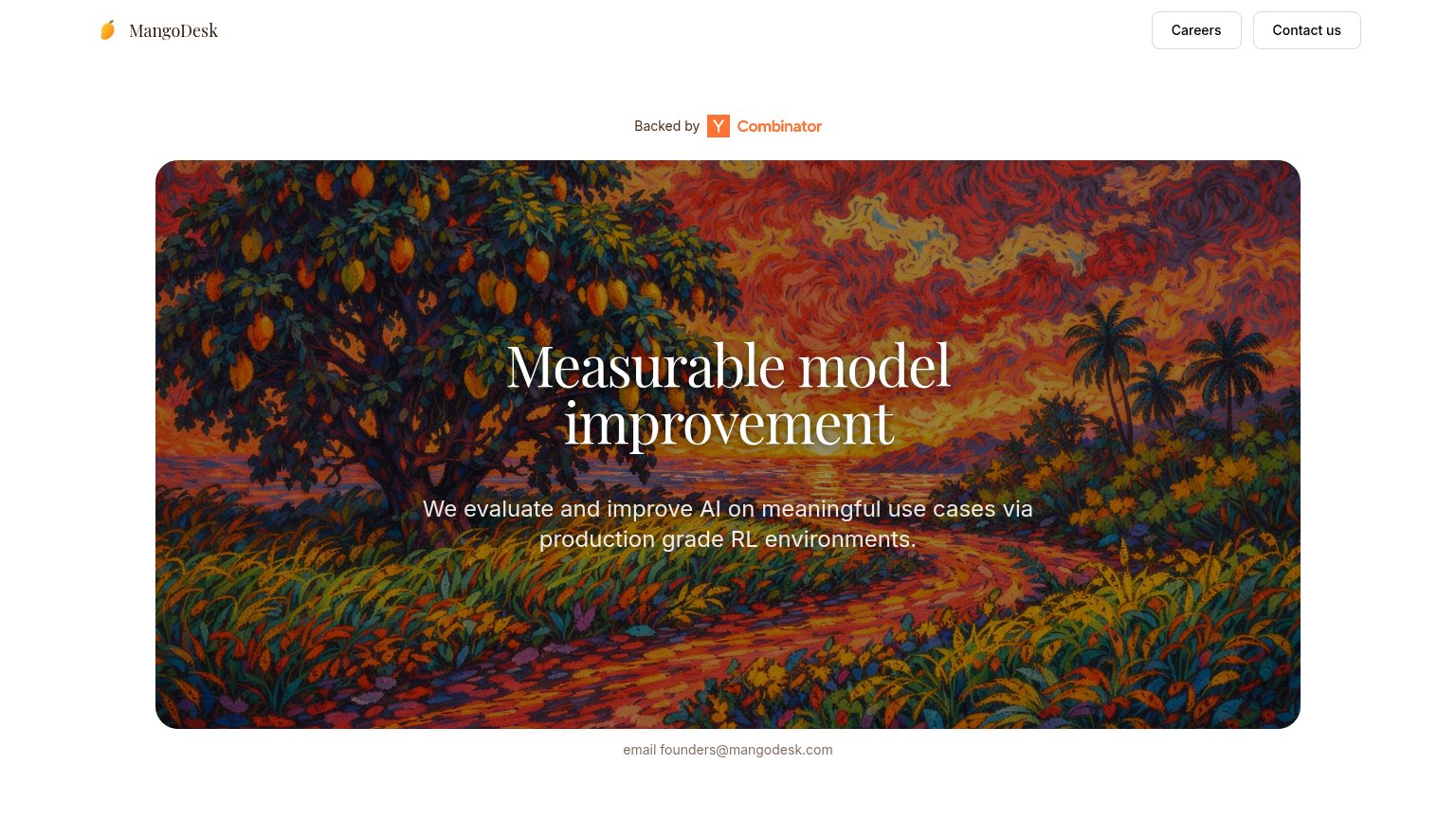
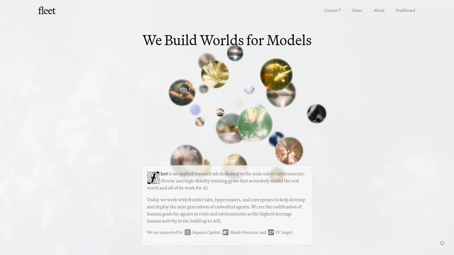
| Trust read | |
|---|---|
| MangoDesk | "Backed by Y Combinator" badge above the hero |
| Customer logo grid with CASE STUDY links: ramp, NVIDIA, Zapier, character.ai, Goodfire, Arcee, Browserbase | |
| implicit context Mercor may benefit from pre-existing familiarity among its target audience. | |
| "New Frontier data and RL environments, off the shelf" announcement banner | |
| implicit context Scale AI may benefit from pre-existing familiarity among its target audience. | |
| "We are supported by Sequoia Capital, Menlo Ventures, and SV Angel." |
Mobile web
48PoorThe phone experience as a first-class citizen.
 12
- Email contact line — "email founders@mangodesk.com" is small, unstyled body text, not a tappable button — the page's only conversion path is easy to miss.
- Cramped hero headline — "Measurable model improvement" wraps to three lines inside the busy illustration, eating most of the first viewport.
Value props
52FairTitle, subtitle, hero — do they sell the product's true value?
MangoDesk’s headline undersells
Measurable model improvement
We evaluate and improve AI on meaningful use cases via production grade RL environments.
Working
- Outcome-oriented headline
- Subhead names RL environments
- YC badge adds credibility
Could improve
- Zero numbers behind 'measurable'
- 'Meaningful use cases' is vague
- Hero art decorates, not demonstrates
Information hierarchy
58FairDoes the design help or inhibit what the page is trying to say?
123- Headline contrast inside art — "Measurable model improvement" sits on a busy, high-saturation painting; the swirling reds and oranges fight the white serif for attention.
- Careers and Contact buttons — The two equal-weight nav buttons are the most button-like elements on the page, routing attention away from any conversion path.
- Email contact line — "email founders@mangodesk.com" is small gray text, not a link or button — the sole conversion path is nearly invisible.