
Your landing page’s weakest score is Trust.
How Kestroll ranks
68Growth scoreupdated
category scores
category scoresShowHide
Score over time
Trust
52FairProof that the product is real, competent, and safe to try.

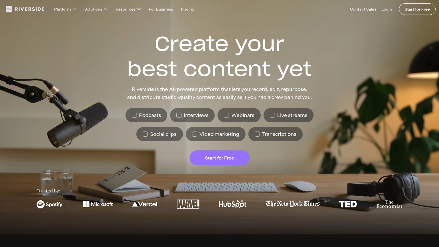
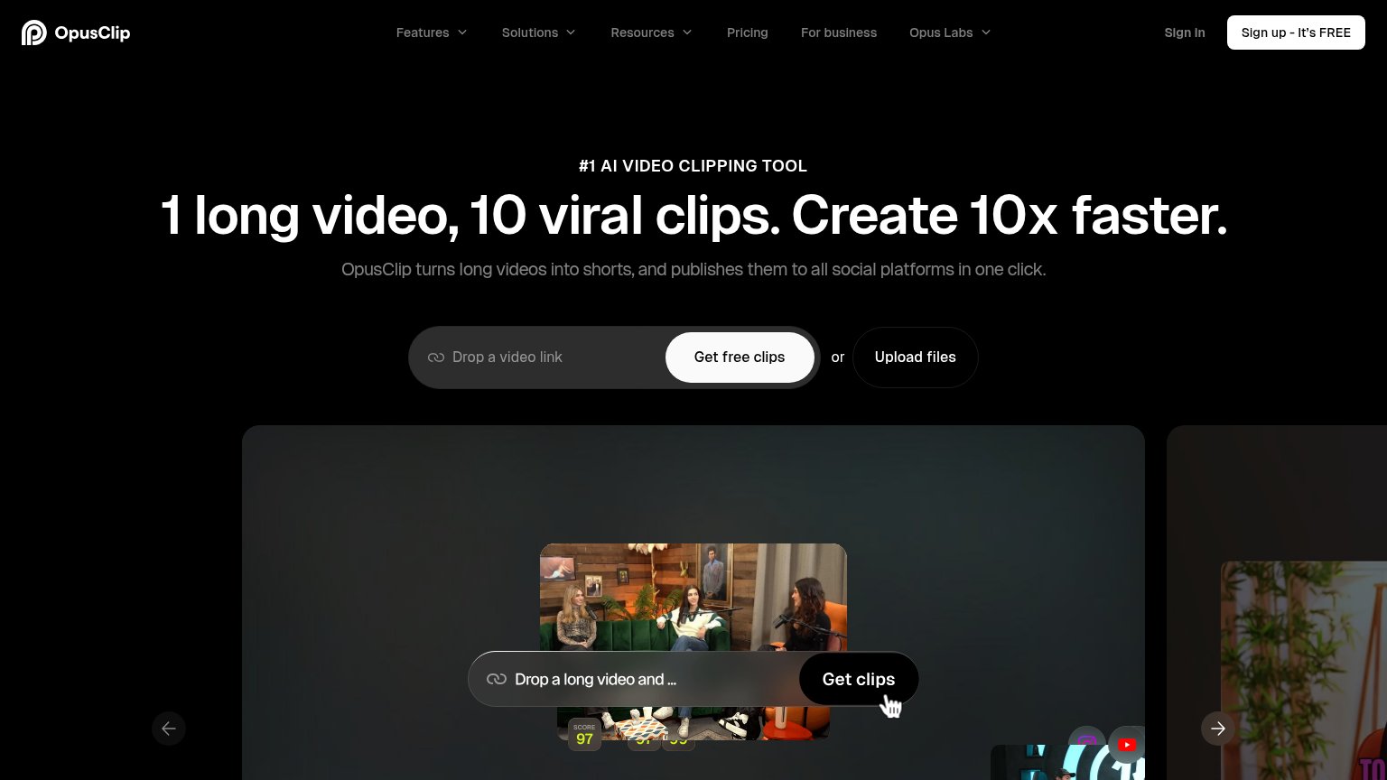
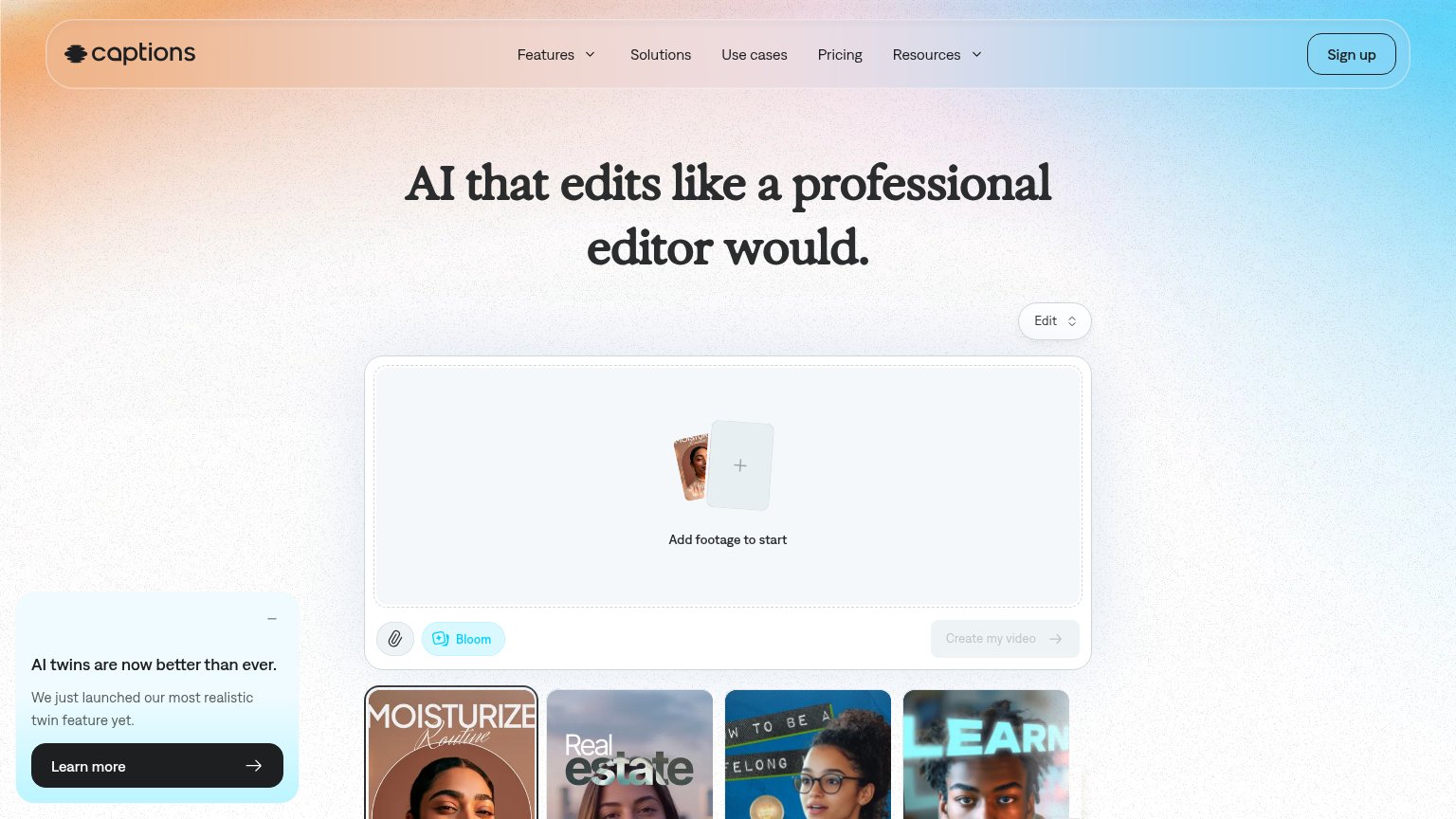

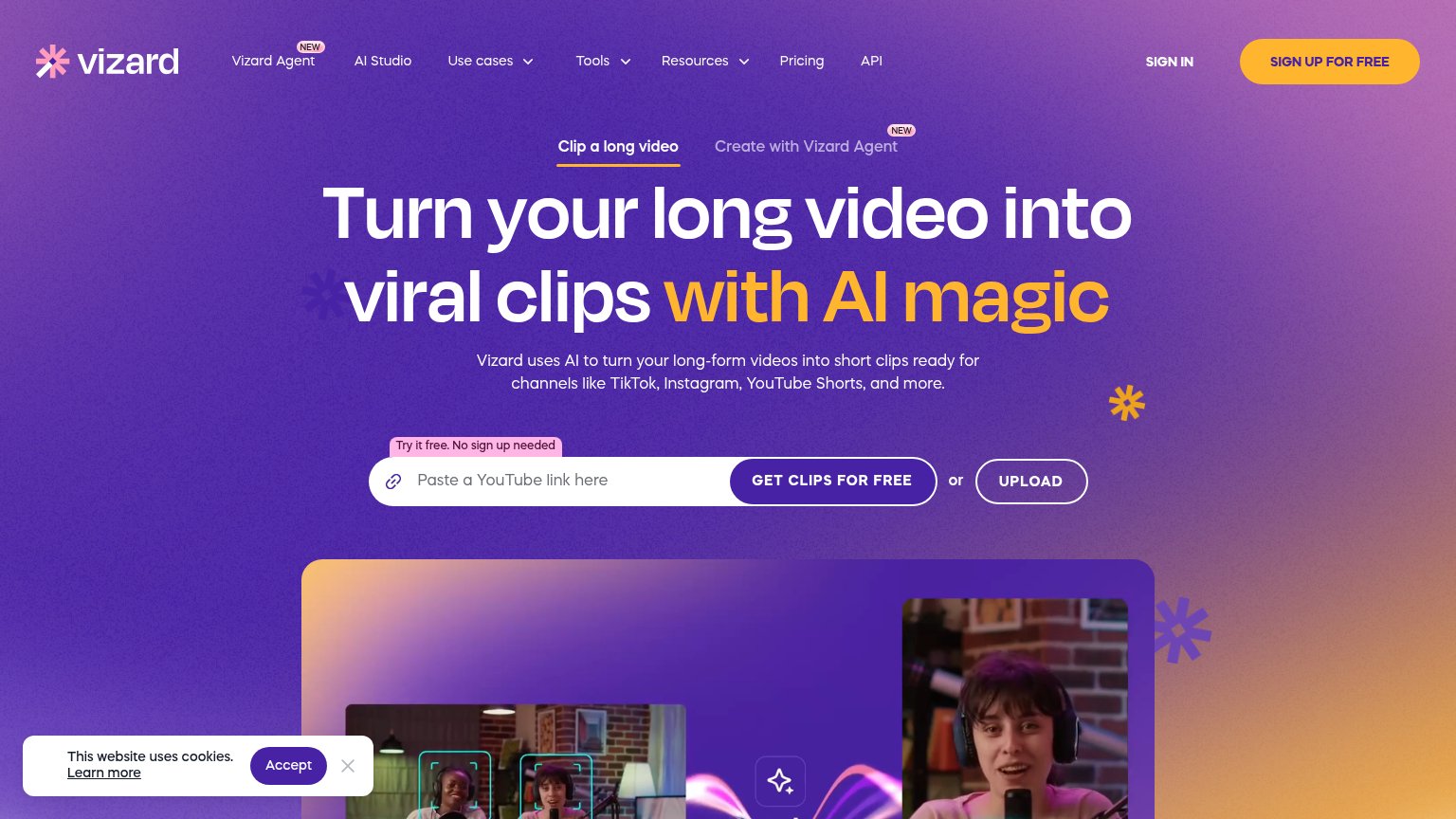
| Trust read | |
|---|---|
| Kestroll | Product screenshot of the editing workspace with AI agent log: "Analyzed 4 camera angles — Synced all four cameras again |
| Underlord AI chat panel showing a real editing workflow: "I see there are some repeated takes and long pauses. I'll remo | |
| Product demo showing a long video converted into scored short clips ("SCORE 97") with social platform icons | |
| "Trusted by:" logo strip with Spotify, Microsoft, Vercel, Marvel, HubSpot, The New York Times, TED, and The Economist | |
| Embedded editor widget: "Add footage to start" with "Create my video" button and example output thumbnails | |
| "Speaker Detection" feature UI shown over real podcast footage in the product demo image |
Value props
54FairTitle, subtitle, hero — do they sell the product's true value?
Kestroll’s headline vague
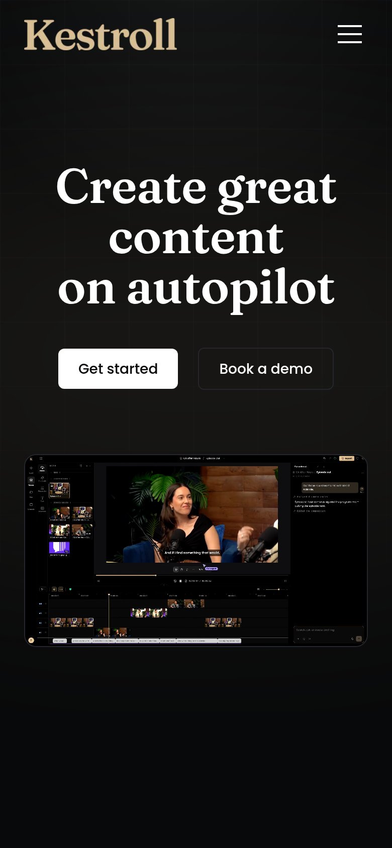
Create great content on autopilot
Working
- "Autopilot" hints at hands-off automation
- Hero screenshot shows real multicam editing
- Agent log proves the AI actually cuts episodes
Could improve
- Headline fits any product; no medium named
- No subhead to add specifics or proof
- Zero numbers or concrete outcomes in copy
CTA
74FairCopy, size, verb, cost-feel — does the primary CTA earn the click?
Problems
- generic label, no product payoff
- no headline echo
- outcome after click unclear
Information hierarchy
78FairDoes the design help or inhibit what the page is trying to say?
123- Book a demo duplicate — "Book a demo" appears twice in the fold (nav and hero), splitting attention with "Get started" at near-equal weight.
- Hero headline vagueness — "Create great content on autopilot" gets the entire fold's real estate but names no category, so the layout amplifies an unanchored message.
- Product screenshot cropped — The editor UI is cut off at the fold with dense, tiny panels that are illegible at this size, so its explanatory payload is lost.
Mobile web
82StrongThe phone experience as a first-class citizen.
 12
- Split CTA pair — "Get started" and "Book a demo" sit side-by-side at half-width; the primary action loses the full-bleed tap target mobile allows.
- Landscape product screenshot — The desktop editor UI is shrunk to phone width, rendering its panels and timeline illegibly small — a mobile-cropped view would carry the proof.