JuxtaYC S25 landing page report.
← Back to YC S25

Your landing page’s weakest score is Trust.

Fix Trust

Score over time

7065605550TrackingPoint / Blackline GPS alternatives excluded — TDSi 59 on Jul 16 (Wayback)TrackingPoint / Blackline GPS alternatives excluded — TDSi 63 on Sep 22 (Live)Juxta 56 on Apr 28 (Wayback)Juxta 57 on May 20 (Wayback)Juxta 60 on Jun 4 (Wayback)Juxta 58 on Jun 13 (Wayback)Juxta 56 on Jul 10 (Wayback)Juxta 60 on Jul 23 (Wayback)Juxta 60 on Sep 22 (Live)Apr 28May 20Jun 4Jun 13Jul 10Jul 23Sep 22
Past reportsShow past reportsHide past reports
  1. Sep 22, 202660LiveValue props +8 · Information hierarchy −6Viewing
  2. Jul 23, 202660Overall +4 · Information hierarchy +14 · Value props +10View →
  3. Jul 10, 202656Overall −2 · Trust −10 · Mobile web +2View →
  4. Jun 13, 202658Overall −2 · CTA −8 · Value props −6View →
  5. Jun 4, 202660Overall +3 · Value props +6 · CTA +4View →
  6. May 20, 202657Overall +1 · Mobile web +8View →
  7. Apr 28, 202656First tracked report — strongest CTA 62, weakest Trust 42View →

Trust

44Poor

Proof that the product is real, competent, and safe to try.

Trust read
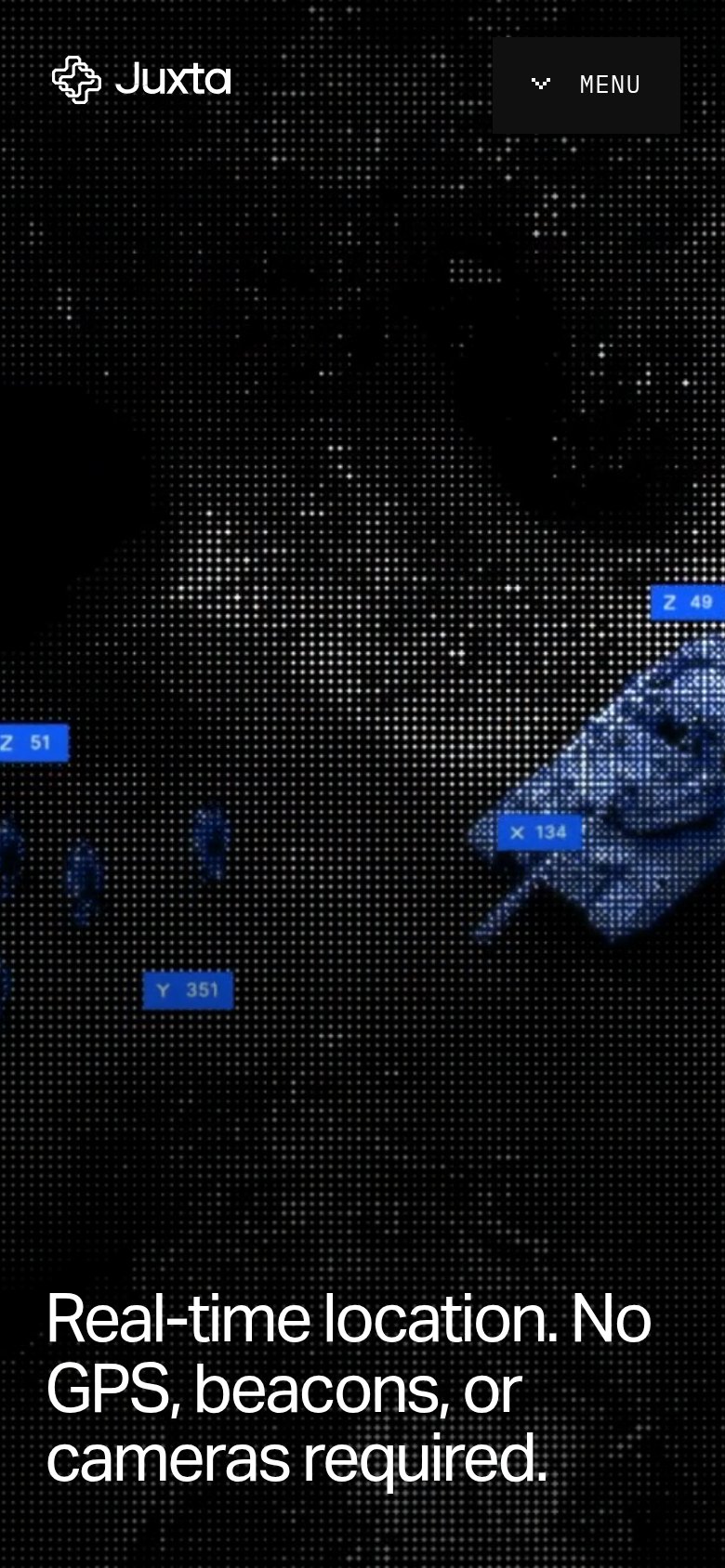
JuxtaMobile hero tracking overlay with coordinate tags ("Z 49", "X 134", "Y 351") suggesting real localization output
TrackingPoint / Blackline GPS alternatives excluded — TDSi"Featured Products" section with real hardware product photos at the fold edge

CTA

54Fair

Copy, size, verb, cost-feel — does the primary CTA earn the click?

Juxta
TrackingPoint / Blackline GPS alternatives excluded — TDSi

Problems

  • click feels like cost, not value
  • no CTA in hero, nav only
  • no CTA visible on mobile fold
  • 'our' talks about company

Mobile web

58Fair

The phone experience as a first-class citizen.

Mobile web annotations on the mobile capture1
  1. Headline crowds bottom edge — 'Real-time location. No GPS, beacons, or cameras required.' sits pinned to the very bottom of the viewport, wrapping into four lines with no CTA beneath it.

Information hierarchy

66Fair

Does the design help or inhibit what the page is trying to say?

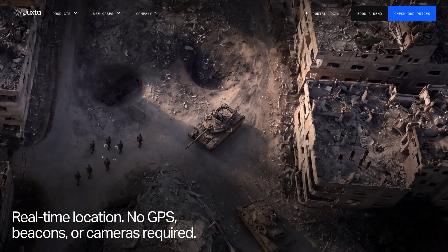
Information hierarchy annotations on the desktop capture1234
  1. Book a Demo button — Second button styled at near-equal weight beside 'Check Our Prices' splits the primary action and slows the one-second CTA scan.
  2. Hero headline — Low-contrast grey text pinned to the bottom-left corner over busy rubble imagery; the fold's core promise is the last thing the eye reaches.
  3. Portal Login link — An account-holder utility sits in the prospect scan path directly beside the conversion buttons, adding an exit before the CTA.
  4. Nav dropdown row — Three dropdown menus (Products, Use Cases, Company) open branching exit paths before the visitor has read the value prop.

Value props

76Fair

Title, subtitle, hero — do they sell the product's true value?

Juxta’s headline sellsReal-time location. No GPS, beacons, or cameras required.

Working

  • Outcome-first: real-time location
  • Preempts objections: no GPS/beacons/cameras
  • Hero footage shows tracking in action

Could improve

  • No subhead explaining how it works
  • Zero numbers: accuracy, latency, scale
  • Audience/use case unnamed in fold

Competitors

inferred from product, audience, and value prop