
Your landing page’s weakest score is Trust.
How Flywheel AI ranks
50Growth scoreupdated
category scores
category scoresShowHide
Trust
32PoorProof that the product is real, competent, and safe to try.
| Trust read | |
|---|---|
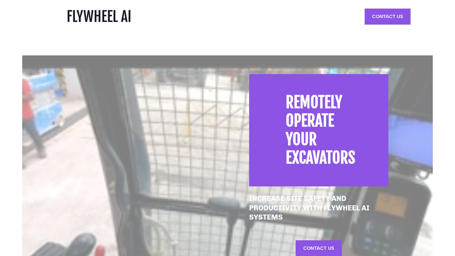
| Flywheel AI | Hero photo of a real excavator cab interior with control levers |
| "No spam. Just a heads up when we launch." reassurance under the email form | |
| No visible trust signal identified. | |
| No visible trust signal identified. | |
| implicit context Doosan Bobcat MaxControl-style remote ops (HD Hyundai XiteSolution) may benefit from pre-existing familiarity among its target audience. |
Mobile web
38PoorThe phone experience as a first-class citizen.
 1234
- Clipped subheadline text — "INCREASE SITE SAFETY AND PRODUCTIVITY" runs off the left edge and sits on a busy photo, making it nearly unreadable.
- Wrapped header CTA — "CONTACT US" breaks into three cramped lines ("CONT / ACT / US") inside a desktop-sized purple block that eats the header.
- Mid-page Contact button — The primary "CONTACT US" CTA sits below the first viewport at desktop proportions instead of near-full-width where the thumb lands.
- Oversized hero headline — "REMOTELY OPERATE Flywheel AI's EXCAVATORS" scales down too little, wrapping into four tall lines that push the CTA out of the fold.
CTA
55FairCopy, size, verb, cost-feel — does the primary CTA earn the click?
Problems
- no action verb, reads costly
- no value promise in label
- wraps to 3 lines on mobile
- same generic label everywhere
Information hierarchy
58FairDoes the design help or inhibit what the page is trying to say?
123- Subheadline over photo — White text sits directly on a busy cab photo with no overlay, making the value prop hard to read.
- Purple headline panel — One-word line breaks and a heavy floating block make the headline read as four fragments, not one promise.
- Second Contact Us button — Duplicates the header CTA at equal weight and sits half-cropped at the fold edge, splitting attention.
Value props
66FairTitle, subtitle, hero — do they sell the product's true value?
Flywheel AI’s headline sells
REMOTELY OPERATE YOUR EXCAVATORS
INCREASE SITE SAFETY AND PRODUCTIVITY WITH FLYWHEEL AI SYSTEMS
Working
- Headline states the literal product in 4 words
- Names the right buyer pains: safety, productivity
- No abstraction stack — parseable in one glance
Could improve
- No numbers: hours saved, retrofit time, incidents
- Hero shows a cab, not remote operation happening
- Subhead is generic; any equipment vendor could say it