DoeYC S25 landing page report.
← Back to YC S25

Your landing page’s weakest score is Trust.

How Doe ranks

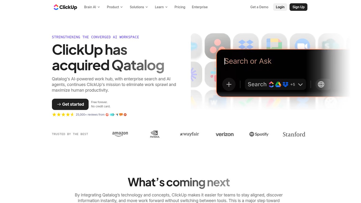
  1. 1.Qatalog76
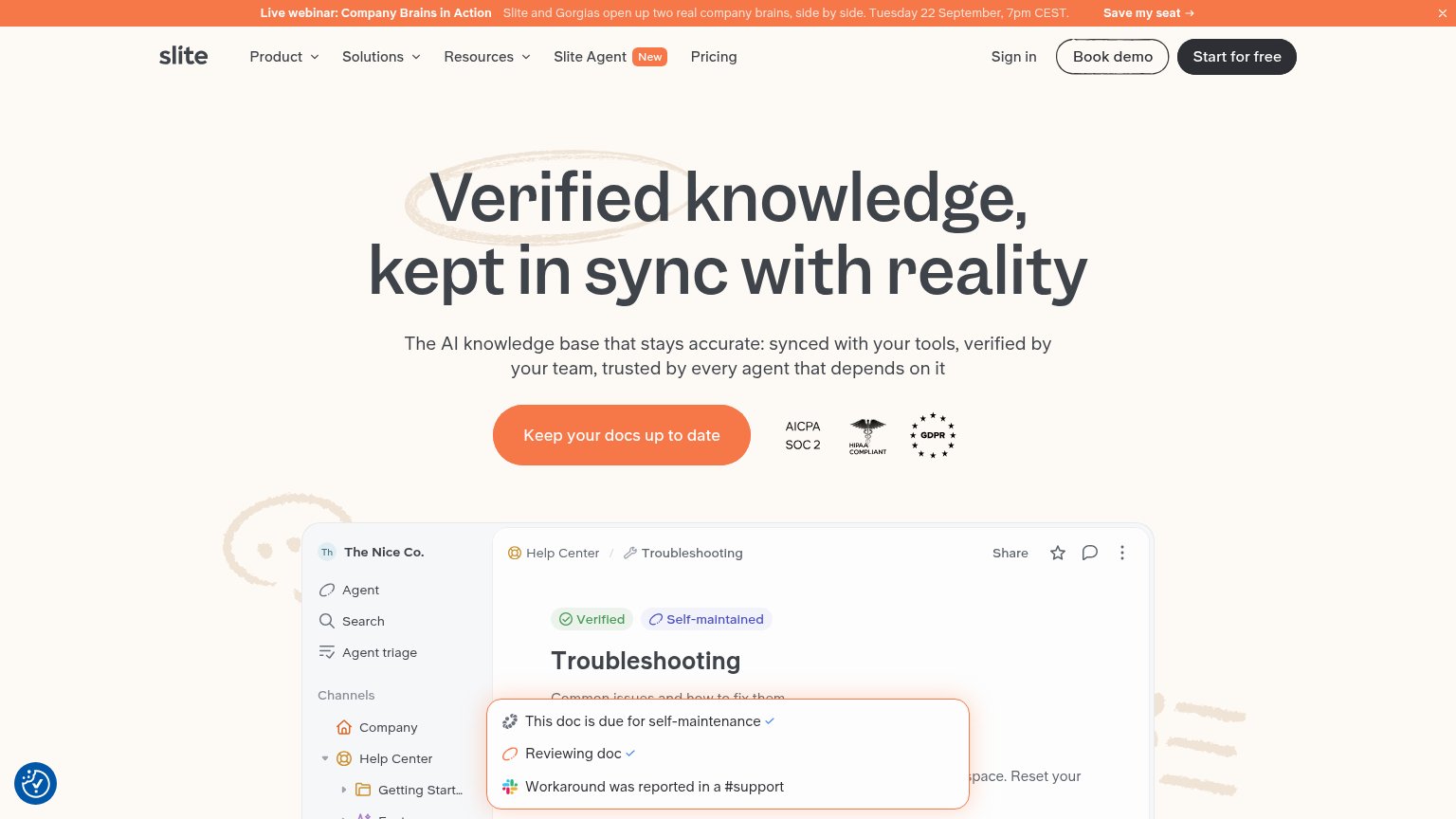
  2. 2.Slite72
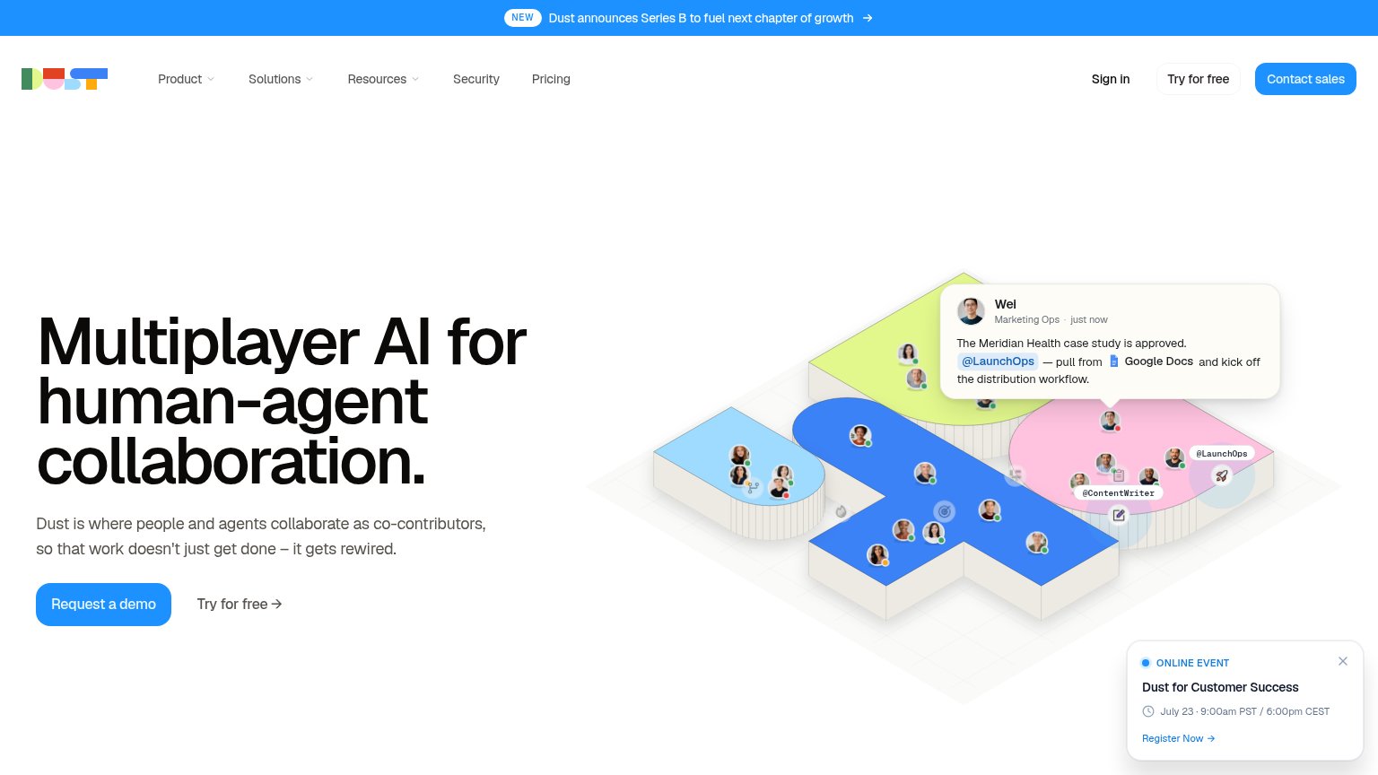
  3. 3.Dust66
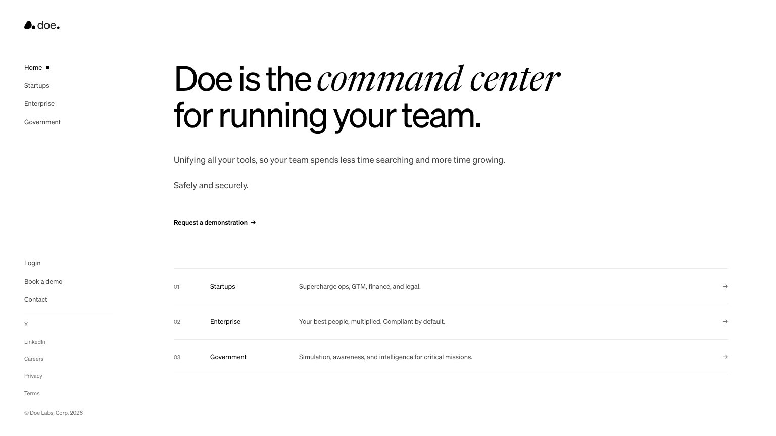
  4. 4.Doe56
Fix Trust

Score over time

80706050Qatalog 76 on Jul 28 (Live)Dust 65 on May 5 (Wayback)Dust 62 on May 21 (Wayback)Dust 62 on Jul 6 (Wayback)Dust 66 on Jul 17 (Live)Dust 63 on Aug 5 (Wayback)Dust 62 on Aug 29 (Wayback)Dust 58 on Oct 3 (Wayback)Slite 71 on Jun 16 (Wayback)Slite 71 on Jul 3 (Wayback)Slite 69 on Jul 21 (Wayback)Slite 71 on Jul 29 (Wayback)Slite 73 on Aug 5 (Wayback)Slite 71 on Aug 30 (Wayback)Slite 72 on Sep 22 (Live)Doe 66 on Mar 28 (Wayback)Doe 69 on Apr 12 (Wayback)Doe 59 on Jul 20 (Wayback)Doe 56 on Sep 22 (Live)Mar 28Apr 12Jul 20Sep 22
Past reportsShow past reportsHide past reports
  1. Sep 22, 202656LiveOverall −3 · CTA −20 · Mobile web +14Viewing
  2. Jul 20, 202659Overall −10 · Value props −24 · Mobile web −20View →
  3. Apr 12, 202669Overall +3 · CTA +8 · Value props +4View →
  4. Mar 28, 202666First tracked report — strongest Mobile web 76, weakest Trust 42View →

Trust

32Poor

Proof that the product is real, competent, and safe to try.

Qatalog
Slite
Trust read
DoeNo visible trust signal identified.
Qatalog"25,000+ reviews from" with 4.5-star rating and G2/review-site badges under the Get started CTA
DustNo visible trust signal identified.
SliteAICPA SOC 2, HIPAA Compliant, and GDPR badges next to the primary CTA

CTA

58Fair

Copy, size, verb, cost-feel — does the primary CTA earn the click?

Doe
Qatalog
Dust
Slite

Problems

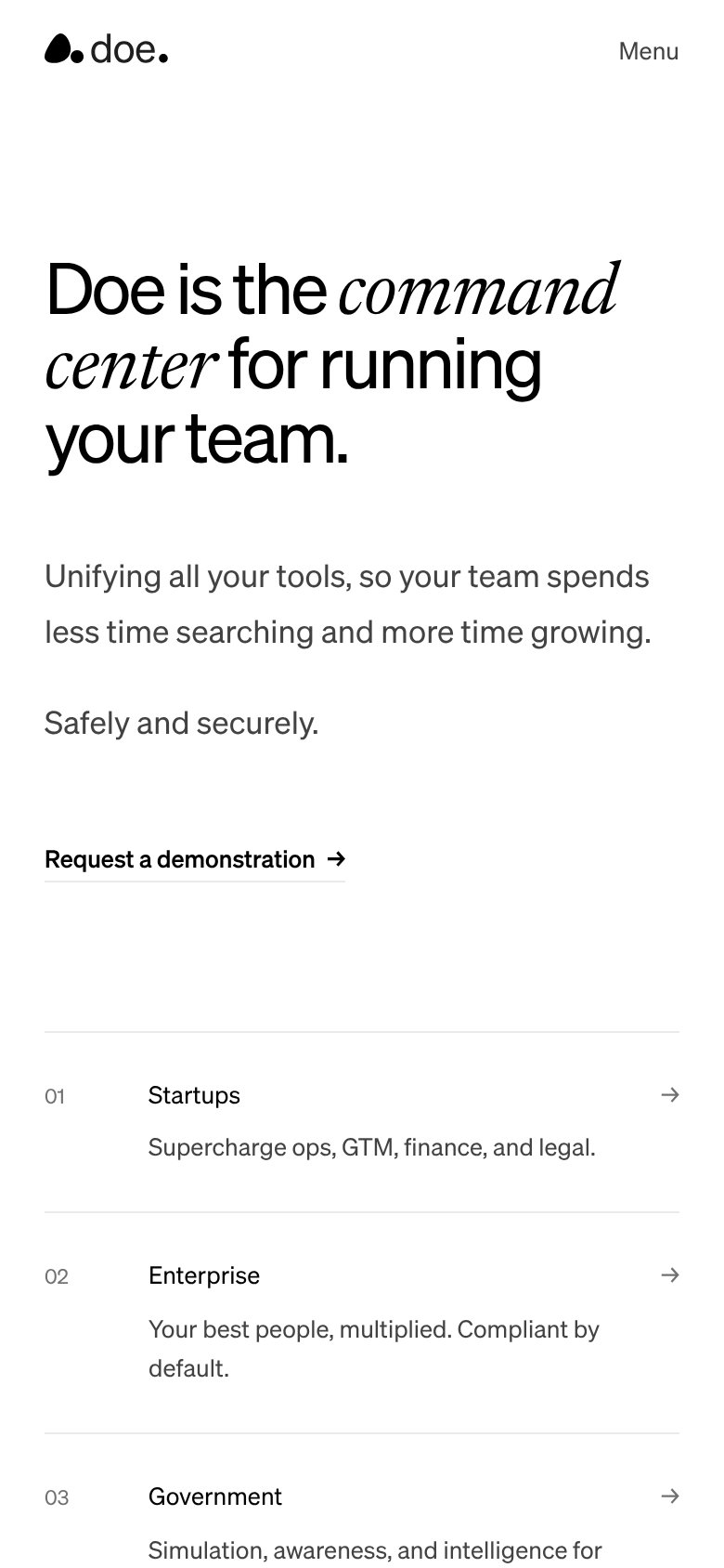
  • styled as text link, no button weight
  • 'Request' feels slow and costly
  • label conflicts with 'Book a demo'
  • 'demonstration' is heavier than 'demo'

Value props

58Fair

Title, subtitle, hero — do they sell the product's true value?

Doe’s headline vagueDoe is the command center for running your team.Unifying all your tools, so your team spends less time searching and more time growing. Safely and securely.

Working

  • Memorable 'command center' framing
  • Subhead names real mechanism: unifying tools
  • Segment rows add audience-specific detail

Could improve

  • No numbers or concrete proof anywhere
  • 'Command center' fits any ops tool
  • No visual showing the product working

Information hierarchy

62Fair

Does the design help or inhibit what the page is trying to say?

Information hierarchy annotations on the desktop capture123
  1. Request a demonstration link — Primary CTA styled as small underlined text link — same visual weight as the sidebar Login/Book a demo links, invisible at a glance.
  2. Left sidebar link stack — Twelve stacked exits (nav, Login, Book a demo, Contact, socials, legal) sit in the fold, with 'Book a demo' duplicating the primary CTA at equal weight.
  3. Segment rows with arrows — Three arrowed rows (Startups, Enterprise, Government) pull the eye off the page before the demo request registers as the action.

Mobile web

72Fair

The phone experience as a first-class citizen.

Mobile web annotations on the mobile capture1
  1. Request a demonstration link — Primary CTA is a thin underlined text link, not a thumb-friendly full-width button.

Competitors

inferred from product, audience, and value prop