
Your landing page’s weakest score is Trust.
How Cyberdesk ranks
69Growth scoreupdated
category scores
category scoresShowHide
Score over time
Trust
48PoorProof that the product is real, competent, and safe to try.
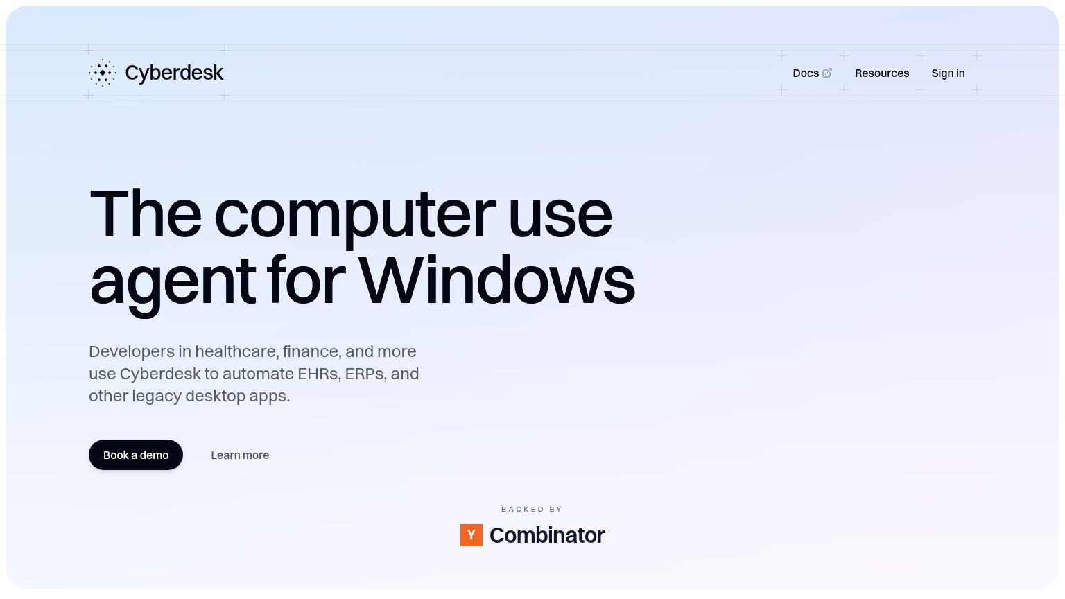

| Trust read | |
|---|---|
| Cyberdesk | "BACKED BY Y Combinator" badge |
| No visible trust signal identified. | |
| No visible trust signal identified. | |
| implicit context E2B may benefit from pre-existing familiarity among its target audience. | |
| Logo wall with Anthropic, Apple, Datadog, DeepMind, DHL, FedEx, Flexport, Google |
CTA
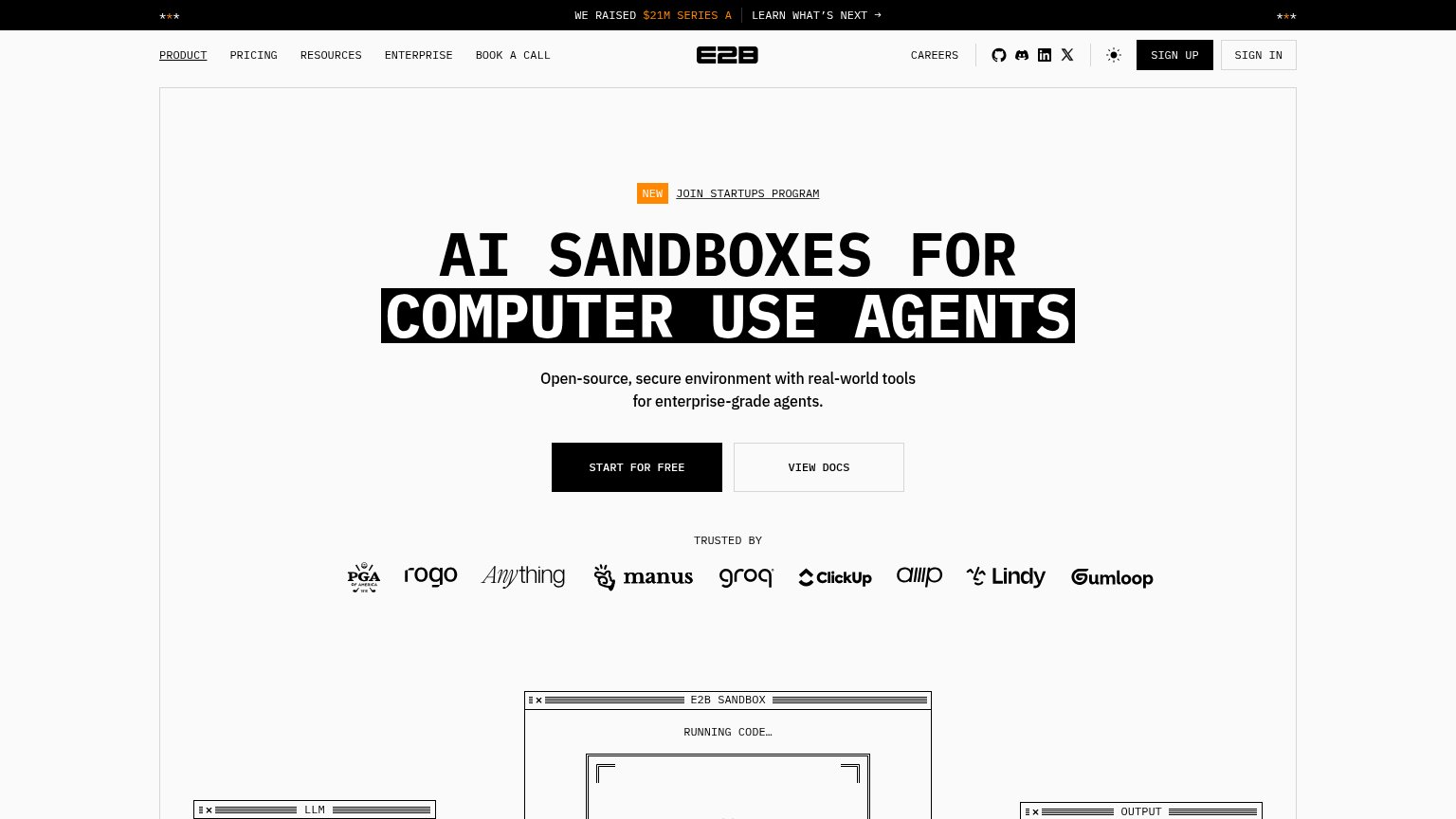
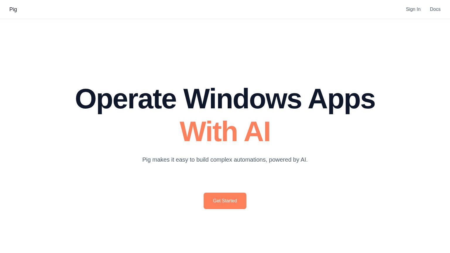
64FairCopy, size, verb, cost-feel — does the primary CTA earn the click?
Problems
- demo booking = high-commitment click
- small vs. huge headline on desktop
- no self-serve or try path visible
- 'Learn more' secondary is weak
Value props
68FairTitle, subtitle, hero — do they sell the product's true value?
Cyberdesk’s headline sells
The computer use agent for Windows
Developers in healthcare, finance, and more use Cyberdesk to automate EHRs, ERPs, and other legacy desktop apps.
Working
- Concrete nouns: EHRs, ERPs, legacy apps
- Names the exact buyer: developers
- Clear category claim, no buzzwords
Could improve
- No numbers or proof points in fold
- Hero is empty gradient, shows nothing
- No emotional hook or named outcome
Information hierarchy
78FairDoes the design help or inhibit what the page is trying to say?
123- Learn more link — Secondary text link sits beside 'Book a demo' with no visual subordination cue beyond weight, offering an exit at the decision point.
- Docs external link — Nav's first item routes visitors off-site (external-link icon) before they reach the demo CTA; there is no CTA echo in the nav.
- Y Combinator badge — The 'Backed by' block floats centered and disconnected from the left-aligned hero column, breaking the scan path instead of reinforcing the CTA.
Mobile web
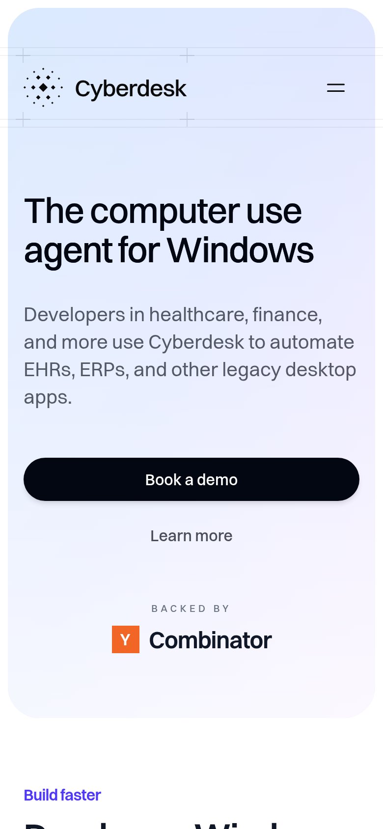
88StrongThe phone experience as a first-class citizen.
No specific callouts
Cyberdesk's mobile fold is close to textbook: one headline ("The computer use agent for Windows"), one supporting paragraph, and a full-width, high-contrast "Book a demo" button visible and tappable in the first viewport. The nav collapses to a clean hamburger next to the logo, the headline scales down to two comfortable lines, and there are no pop-ups, banners, or chat bubbles between the visitor and the tap. The "Learn more" text link and the Y Combinator badge sit below the CTA without competing with it. The biggest remaining lever is small: the "Backed by Y Combinator" block is the only proof element in the fold, so tightening the subhead's line count or adding a sharper customer signal would strengthen the fold further.