burntYC S25 landing page report.
← Back to YC S25

Your landing page’s weakest score is Trust.

Fix Trust

Score over time

757065605550Silo 63 on Sep 22 (Live)Pepper 55 on May 17 (Wayback)Pepper 61 on Jun 7 (Wayback)Pepper 61 on Jul 3 (Wayback)Pepper 58 on Aug 10 (Wayback)Pepper 62 on Aug 29 (Wayback)Pepper 62 on Sep 12 (Wayback)Pepper 67 on Sep 20 (Live)Cut+Dry 61 on Apr 22 (Wayback)Cut+Dry 62 on May 8 (Wayback)Cut+Dry 62 on May 20 (Wayback)Cut+Dry 64 on Jun 6 (Wayback)Cut+Dry 72 on Sep 20 (Live)Produce Pro Software 56 on Sep 22 (Live)burnt 68 on Apr 21 (Wayback)burnt 68 on Jun 4 (Wayback)burnt 64 on Sep 22 (Live)Apr 21Jun 4Sep 22
Past reportsShow past reportsHide past reports
  1. Sep 22, 202664LiveOverall −4 · Mobile web −24 · Value props +4Viewing
  2. Jun 4, 202668Mobile web +6 · Value props −4View →
  3. Apr 21, 202668First tracked report — strongest Information hierarchy 78, weakest Trust 44View →

Trust

42Poor

Proof that the product is real, competent, and safe to try.

burnt
Cut+Dry
Produce Pro Software
Pepper
Trust read
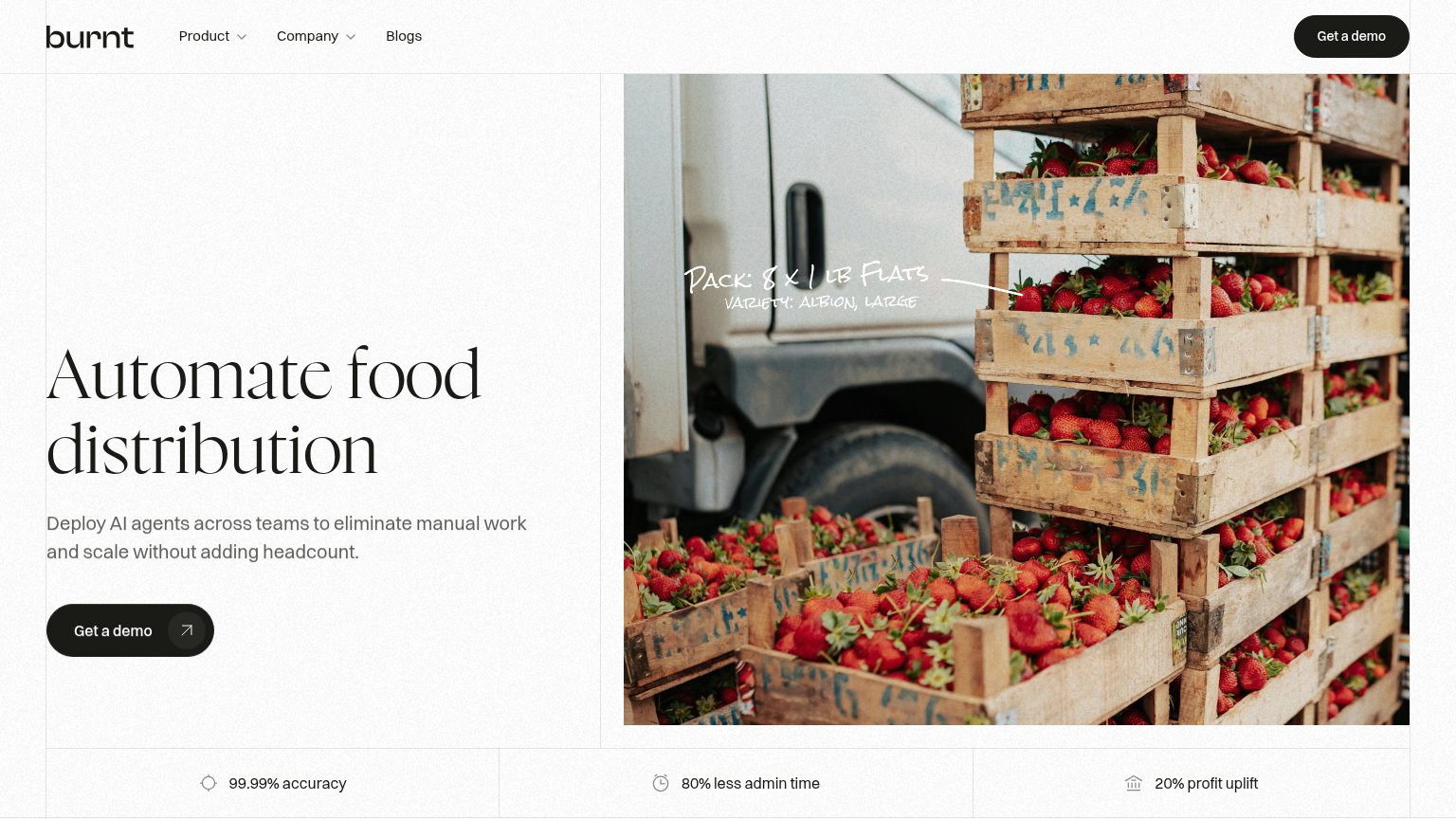
burntMetric strip: "99.99% accuracy · 80% less admin time · 20% profit uplift"
Silo"FSMA 204 Compliance" nav item signaling regulatory readiness
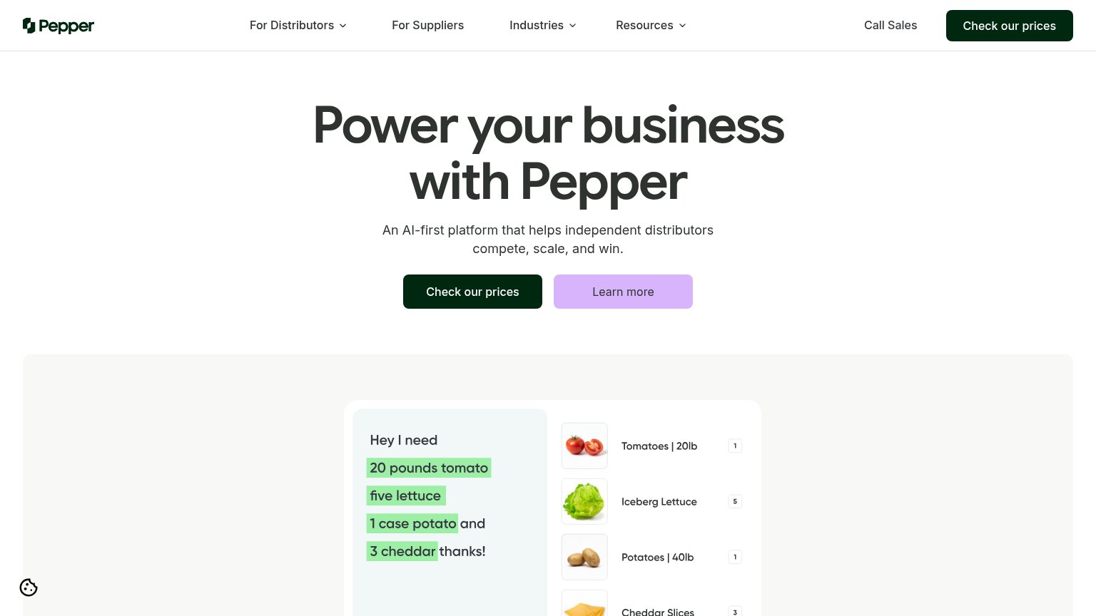
PepperProduct demo parsing "Hey I need 20 pounds tomato…" into order line items (Tomatoes | 20lb, Iceberg Lettuce)
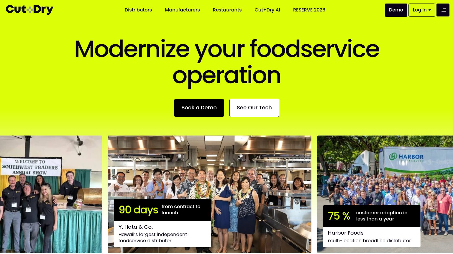
Cut+DryCase card: "75% customer adoption in less than a year — Harbor Foods, multi-location broadline distributor" over a real
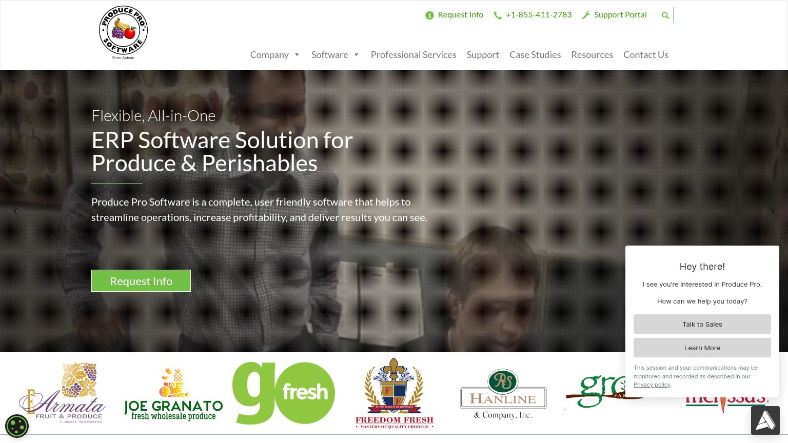
Produce Pro SoftwareCustomer logo strip (Armata Fruit & Produce, Joe Granato, GoFresh, Freedom Fresh, Hanline & Company)

Mobile web

54Fair

The phone experience as a first-class citizen.

Mobile web annotations on the mobile capture12
  1. Get a demo button — Primary CTA is a compact pill occupying under half the column width instead of a full-bleed, thumb-friendly button.
  2. Duplicate header CTA — A second "Get a demo" pill sits in the header inches above the identical hero CTA, adding redundancy without new function.

CTA

72Fair

Copy, size, verb, cost-feel — does the primary CTA earn the click?

burnt

Problems

  • demo click feels costly/sales-y
  • no secondary low-commitment path
  • no urgency or payoff in label

Value props

72Fair

Title, subtitle, hero — do they sell the product's true value?

burnt’s headline sellsAutomate food distributionDeploy AI agents across teams to eliminate manual work and scale without adding headcount.

Working

  • Names a specific vertical in 3 words
  • Hard numbers: 99.99%, 80%, 20%
  • Hero image shows the industry, annotated

Could improve

  • 'Manual work' is vague — name the tasks
  • Mobile fold drops the headline entirely
  • Stats sit half-cut at the fold edge

Information hierarchy

78Fair

Does the design help or inhibit what the page is trying to say?

Information hierarchy annotations on the desktop capture12
  1. Duplicate header demo button — A second high-contrast "Get a demo" pill in the nav splits attention with the identical hero CTA below it.
  2. Handwritten photo annotation — "Pack: 8 x 1 lb Flats" is small, low-contrast script over a busy photo — the product-story detail is nearly illegible.