
Your landing page’s weakest score is Trust.
How Bitrig ranks
78Growth scoreupdated
category scores
category scoresShowHide
Trust
64FairProof that the product is real, competent, and safe to try.
| Trust read | |
|---|---|
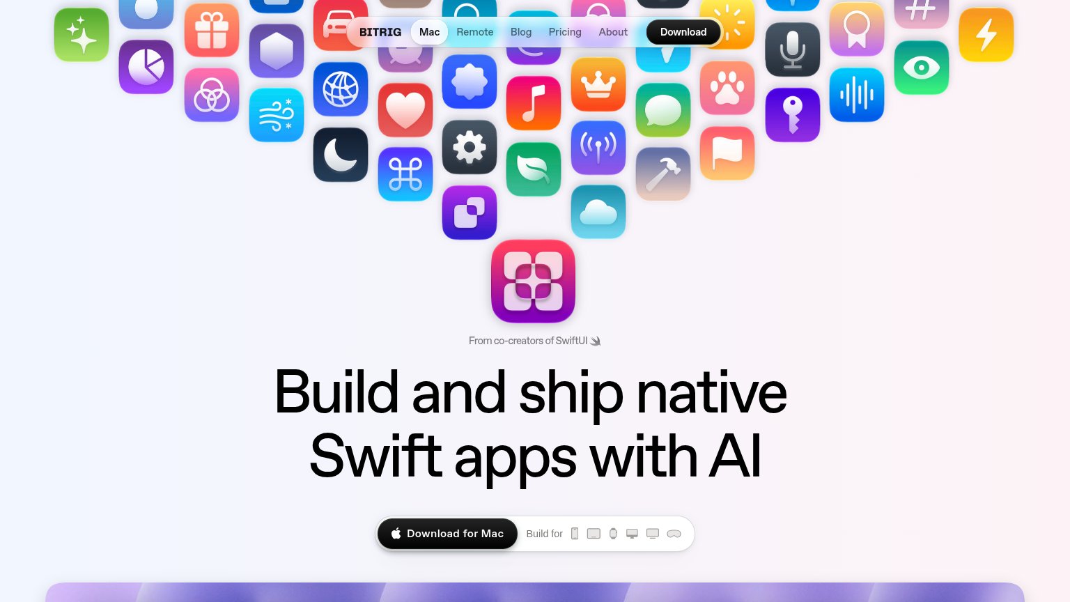
| Bitrig | "From co-creators of SwiftUI" credential line above the headline |
| No visible trust signal identified. |
Value props
76FairTitle, subtitle, hero — do they sell the product's true value?
Bitrig’s headline sells
Build and ship native Swift apps with AI
From co-creators of SwiftUI
Working
- Concrete outcome: ship native Swift apps
- SwiftUI co-creator credibility is rare proof
- Device icon row shows platform breadth
Could improve
- No true subhead adding specifics
- Zero numbers or time-to-app claims
- Desktop hero decorates; demo hidden below fold
CTA
78FairCopy, size, verb, cost-feel — does the primary CTA earn the click?
Problems
- 'Download' implies install cost
- nav label differs: 'Download'
- no free signal if it's free
Information hierarchy
86StrongDoes the design help or inhibit what the page is trying to say?
123- Nav Download button — Second black pill at the same weight as the hero CTA splits the one action into two.
- Nav link row — Five links (Mac, Remote, Blog, Pricing, About) offer exits before the headline lands.
- Nav bar over icons — Translucent nav floats over the icon cloud, blurring links against busy colorful artwork.
Mobile web
86StrongThe phone experience as a first-class citizen.
 123
- Demo screenshot text — The chat transcript in the demo panel renders at unreadably small type on a phone.
- Header icon clutter — The app-icon wall bleeds through the translucent sticky header, making the BITRIG logo and hamburger hard to parse.
- Download for Mac button — The primary CTA floats at partial width instead of the near-full-bleed tap target mobile allows.