
Your landing page’s weakest score is Trust.
How Avent ranks
- 1.
Endeavor AI67
- 2.
Avent66
- 3.
Axion AI53
66Growth scoreupdated
category scores
category scoresShowHide
Trust
38PoorProof that the product is real, competent, and safe to try.
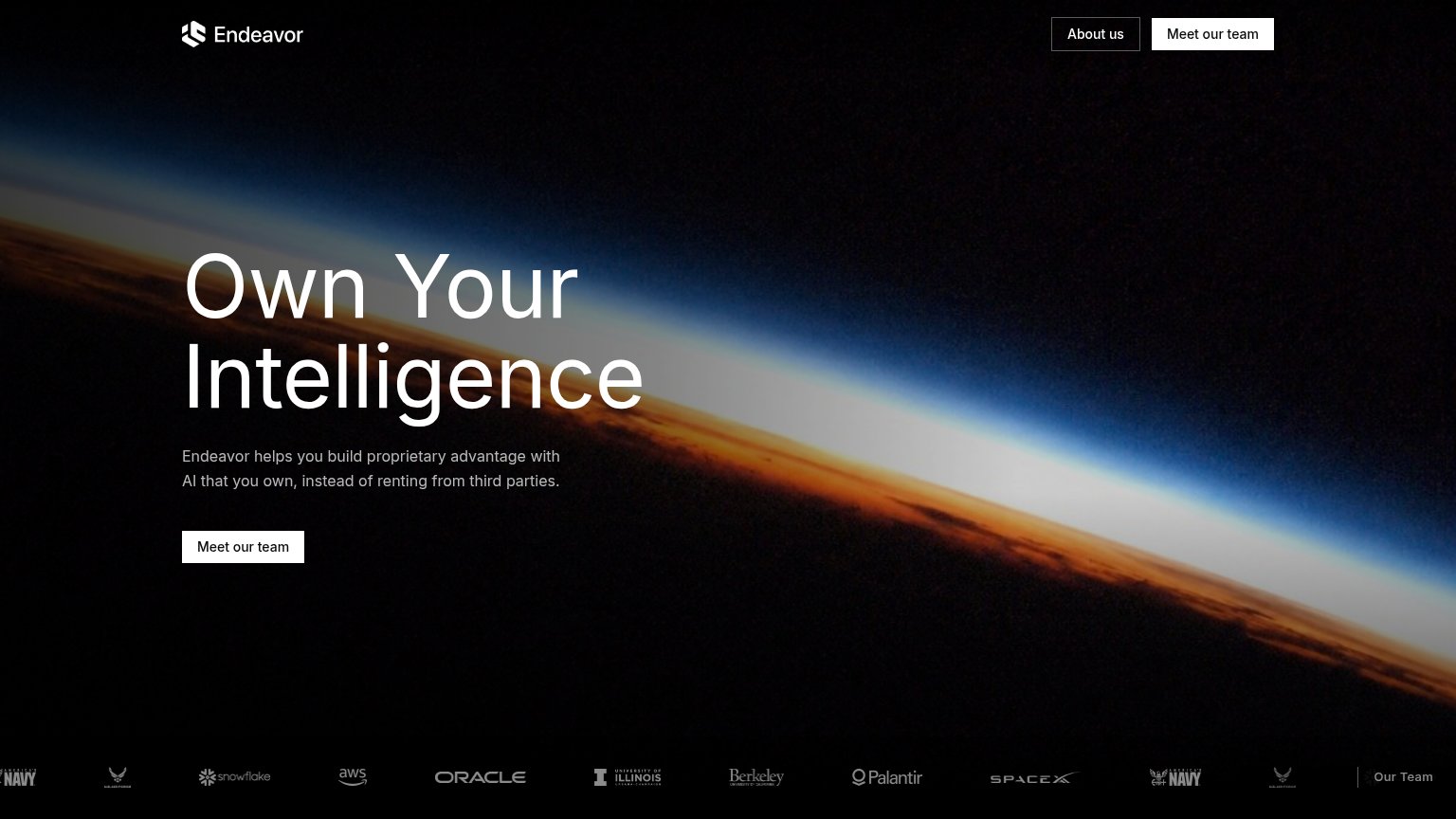
| Trust read | |
|---|---|
| Avent | No visible trust signal identified. |
| Logo strip with U.S. Navy, U.S. Air Force, Snowflake, AWS, Oracle, Berkeley, Palantir, SpaceX | |
| No visible trust signal identified. |
Value props
68FairTitle, subtitle, hero — do they sell the product's true value?
Avent’s headline sells
AI Workforce for Distribution
Automate quote-to-cash and beyond–with defined rules, AI and human judgment. Give your team more time for customers on one connected platform.
Working
- Names the audience: distribution
- Quote-to-cash anchors a real workflow
- Outcome named: more time for customers
Could improve
- Zero numbers or proof anywhere in fold
- Hero image never shows the product working
- "AI Workforce" reads as buzzword abstraction
Information hierarchy
72FairDoes the design help or inhibit what the page is trying to say?
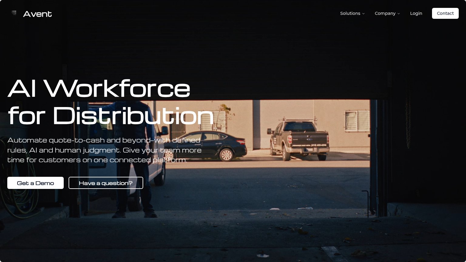 123
- Hero text over photo — White outline type sits on the bright garage opening; headline and subhead lose contrast mid-sentence.
- Paired hero buttons — 'Have a question?' matches 'Get a Demo' in size and weight, splitting the primary action.
- White Contact button — Nav Contact is styled brighter than the hero CTA, competing with 'Get a Demo' for the eye.
CTA
72FairCopy, size, verb, cost-feel — does the primary CTA earn the click?
Problems
- demo click feels like a sales call
- button small vs. huge headline
- no instant value on first click
Mobile web
78FairThe phone experience as a first-class citizen.
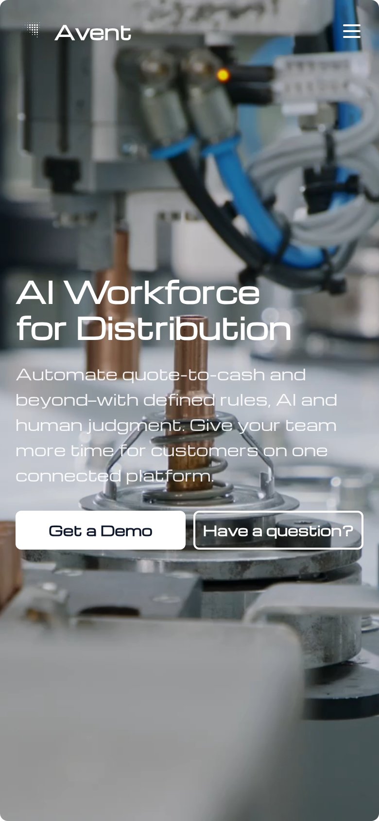 12
- Body copy contrast — Light thin paragraph text sits over a busy machinery image, hurting legibility at arm's length.
- Have a question button — Transparent secondary button competes at equal size with the primary CTA and its outline fades into the photo.