
Your landing page’s weakest score is Trust.
How Synphony ranks
57Growth scoreupdated
category scores
category scoresShowHide
Score over time
Trust
42PoorProof that the product is real, competent, and safe to try.

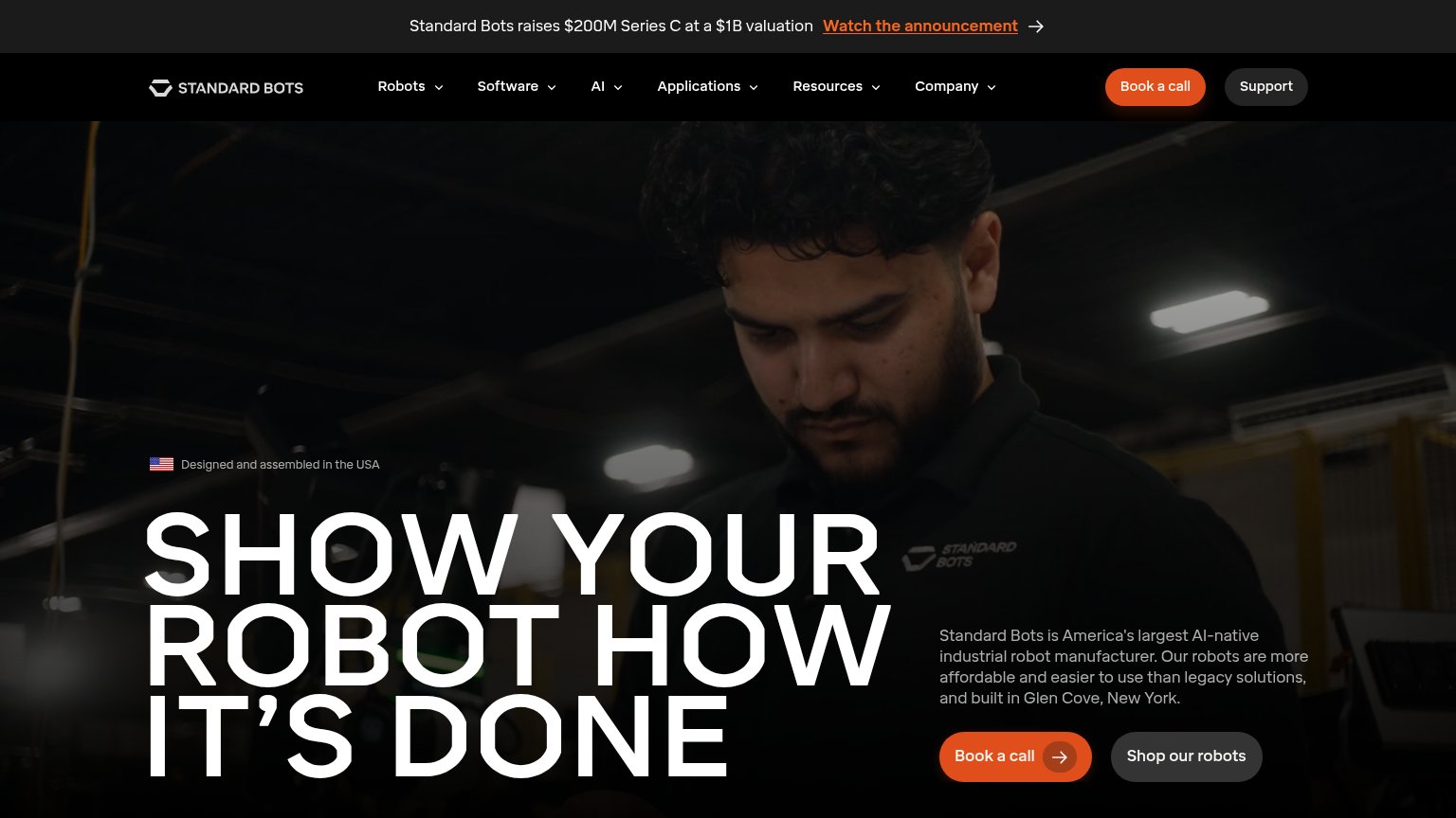
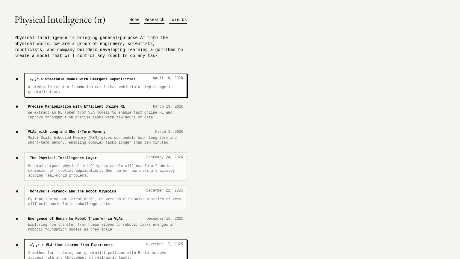
| Trust read | |
|---|---|
| Synphony | "YC P26" badge in the header indicating Y Combinator backing |
| Dated research timeline, e.g. "π0.7: a Steerable Model with Emergent Capabilities — April 16, 2026" | |
| No visible trust signal identified. | |
| "Standard Bots raises $200M Series C at a $1B valuation" announcement bar | |
| No visible trust signal identified. |
Value props
48PoorTitle, subtitle, hero — do they sell the product's true value?
Synphony’s headline vague
synphony / ROBOTICS
Run your entire physical business in Forte.
Working
- Bold, memorable brand presentation
- Eyebrow hints at AI robot training
- Distinctive blueprint framing device
Could improve
- Headline is a logo, not a claim
- "Physical business" is undefined
- Zero numbers or proof points
Mobile web
62FairThe phone experience as a first-class citizen.
 123
- Uncollapsed nav link row — Desktop link row crammed in as a second header band; 'Lucas Benchma…' truncates off-screen instead of collapsing to a hamburger.
- Clipped title block table — The 'TITLE / FORTE / PHYSICAL AI…' drawing-block row runs off the right edge, signaling an unadapted desktop component.
- Stacked duplicate CTAs — 'LUCAS BENCHMARK' sits full-width directly under the primary button at equal weight, splitting the single tap decision.
Information hierarchy
64FairDoes the design help or inhibit what the page is trying to say?
1234- Two same-weight CTAs — "LUCAS BENCHMARK" sits beside "EXPLORE THE FORTE PLATFORM" at near-equal size and prominence, splitting the fold's single action.
- Nav link row — Five nav links plus Login and a boxed CONTACT button give seven exits before the visitor reaches the hero CTA.
- Blueprint spec strip — The UNIT/TITLE/DWG NO./SCALE row adds six labeled metadata cells the visitor must parse without advancing the argument.
- Giant wordmark hero — The oversized "synphony" logotype dominates the fold while the actual value line "Run Synphony's entire physical business in Forte" is a fraction of its size.
CTA
68FairCopy, size, verb, cost-feel — does the primary CTA earn the click?
Problems
- 4 words, past one-fixation length
- leans on unfamiliar brand jargon
- leads to reading, not product value
- secondary CTA has no verb