
Your landing page’s weakest score is Trust.
How Stage ranks
75Growth scoreupdated
category scores
category scoresShowHide
Score over time
Trust
62FairProof that the product is real, competent, and safe to try.

| Trust read | |
|---|---|
| Stage | Detailed product screenshot showing real agent session UI with branch names like dean/trust-constraints and status messa |
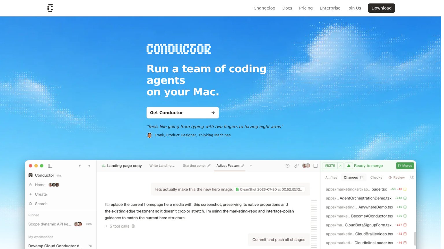
| "feels like going from typing with two fingers to having eight arms" — Frank, Product Designer, Thinking Machines | |
| No visible trust signal identified. | |
| "Works with" integration icon row showing recognizable AI tool logos (including OpenAI) beneath the CTA |
Value props
76FairTitle, subtitle, hero — do they sell the product's true value?
Stage’s headline sells
Your AI Engineering Manager.
Luke watches your coding agent sessions and notifies you when they need your attention.
Working
- Subhead states the job in one plain sentence
- Hero screenshot shows real flagged sessions
- "AI Engineering Manager" frames the role instantly
Could improve
- No numbers or proof points anywhere
- No emotional hook for agent-babysitting pain
- Supported coding agents not named
Information hierarchy
78FairDoes the design help or inhibit what the page is trying to say?
 123
- View on GitHub button — Secondary button sits at near-equal size and weight beside the primary CTA, splitting the click between download and an exit to GitHub.
- GitHub nav icon — Duplicates the hero's GitHub exit in the top-right corner, adding a second outbound path before the fold's one action.
- Product screenshot crop — The app window is cut mid-list at the fold, so the 'Ask Luke' input and the demo's payoff are truncated on desktop.
CTA
78FairCopy, size, verb, cost-feel — does the primary CTA earn the click?
Problems
- no 'free' despite open-source cues
- names platform, not payoff
- no echo of the headline promise
Mobile web
82StrongThe phone experience as a first-class citizen.
12- Download for macOS button — Sits at roughly half the column width instead of near-full-bleed, shrinking the thumb target.
- View on GitHub button — Mismatched width against the primary CTA above it makes the button stack look uneven.