
Your landing page’s weakest score is Trust.
How Savant ranks
- 1.
Qatalog76
- 2.
GoSearch67
- 3.
Savant65
- 4.
Dashworks61
65Growth scoreupdated
category scores
category scoresShowHide
Score over time
Trust
48PoorProof that the product is real, competent, and safe to try.
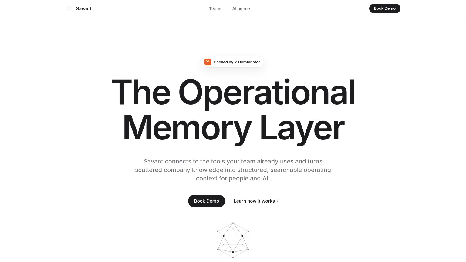
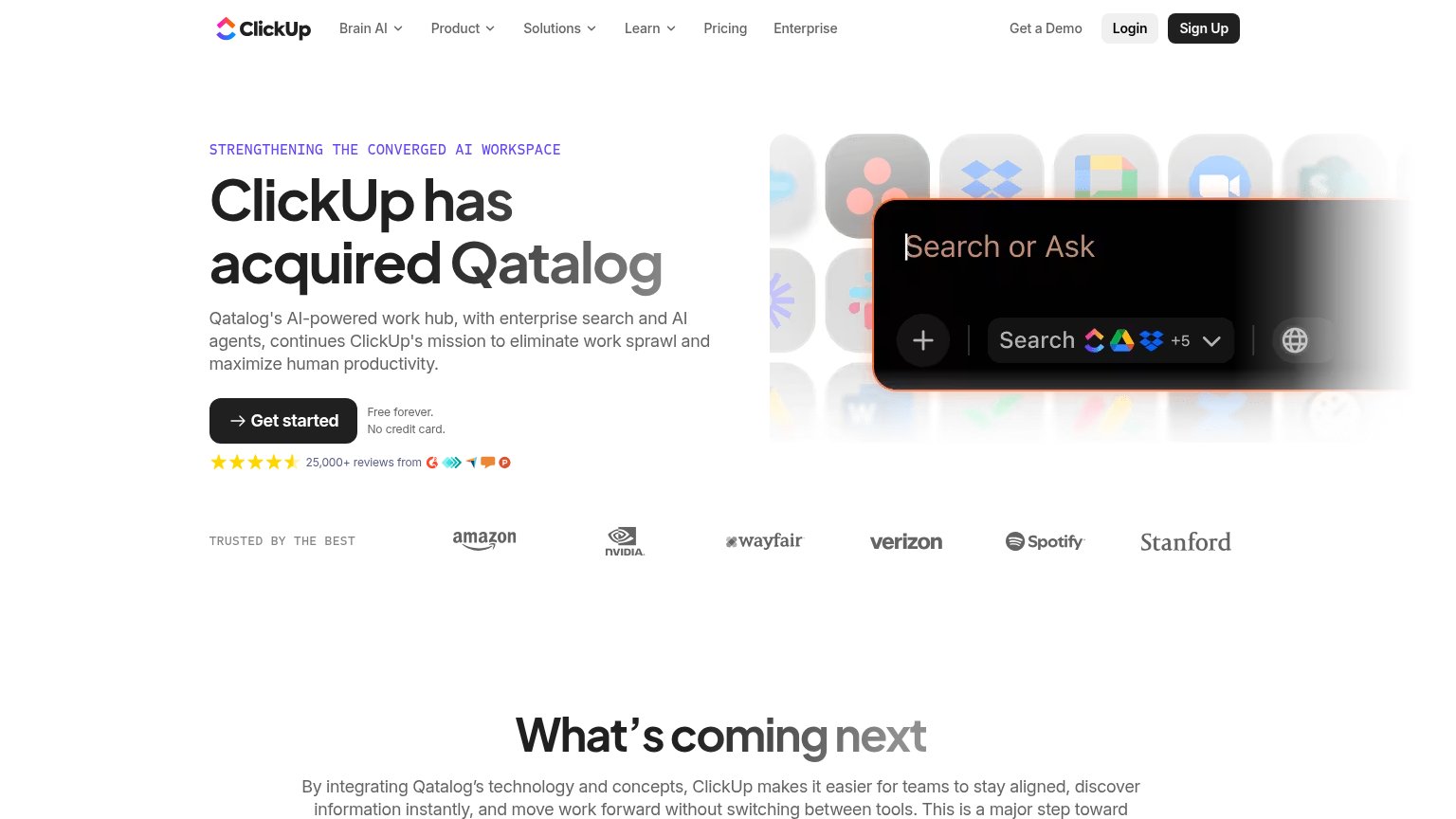
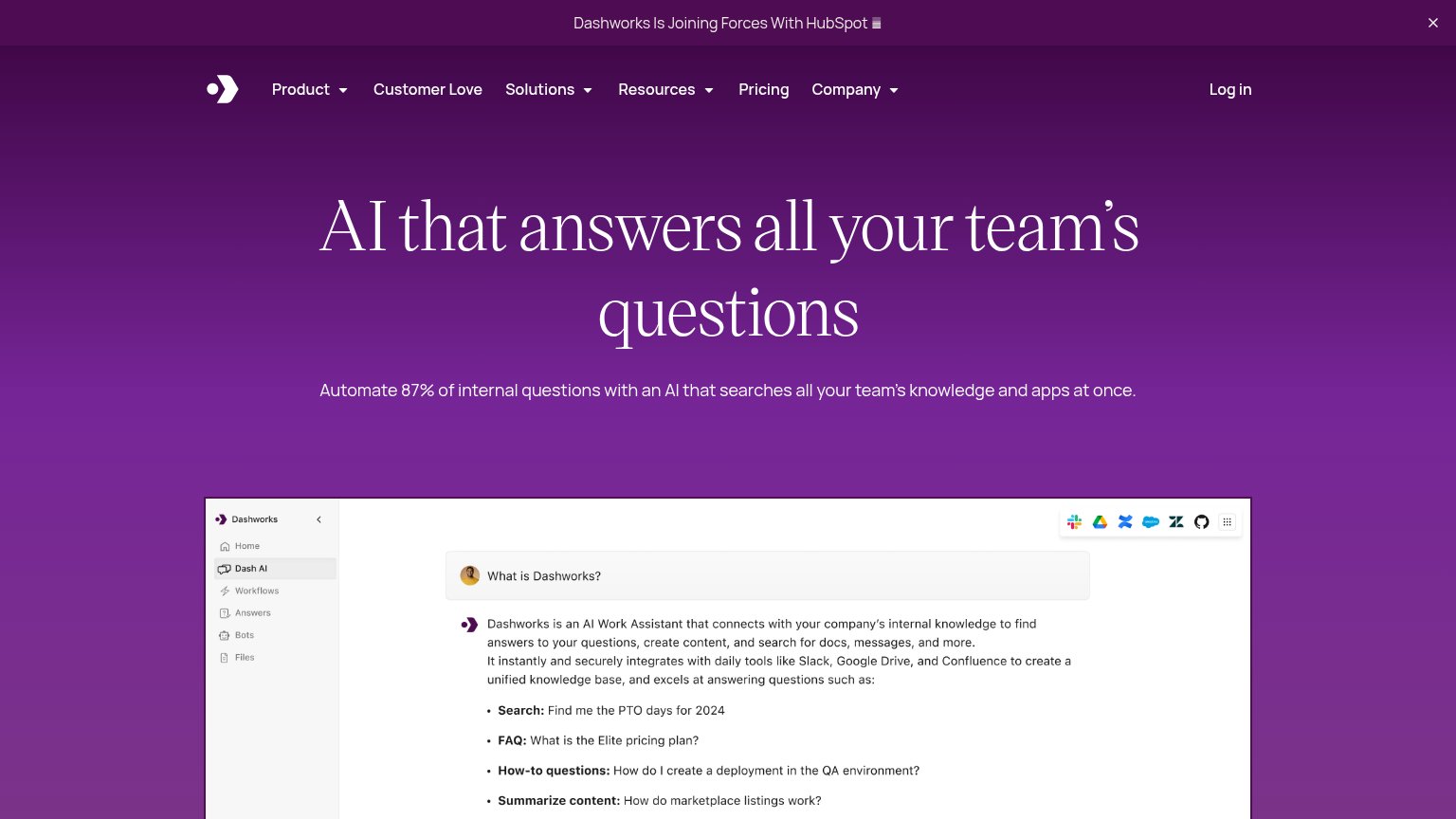
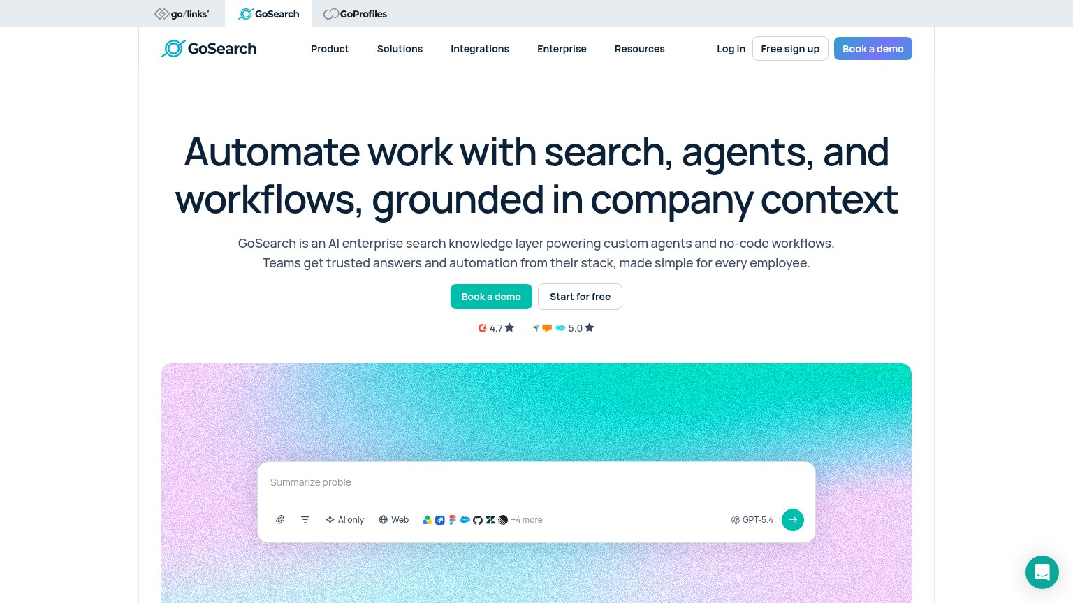
| Trust read | |
|---|---|
| Savant | "Backed by Y Combinator" badge above the headline |
| Announcement bar: "Dashworks Is Joining Forces With HubSpot" | |
| "25,000+ reviews from" with 4.5-star rating and G2/review-site badges under the Get started CTA | |
| Review rating badges "4.7 ★" and "5.0 ★" directly beneath the hero CTAs |
Value props
58FairTitle, subtitle, hero — do they sell the product's true value?
Savant’s headline vague
The Operational Memory Layer
Savant connects to the tools your team already uses and turns scattered company knowledge into structured, searchable operating context for people and AI.
Working
- Subhead names the scattered-knowledge pain
- Mentions both people and AI as beneficiaries
- YC badge adds credibility
Could improve
- H1 is insider jargon, not a value claim
- No named tools, numbers, or outcomes
- Hero graphic decorates, demonstrates nothing
CTA
68FairCopy, size, verb, cost-feel — does the primary CTA earn the click?
Problems
- demo click feels costly/committal
- no self-serve or low-friction path
- no payoff framing around the demo
Mobile web
68FairThe phone experience as a first-class citizen.
 123
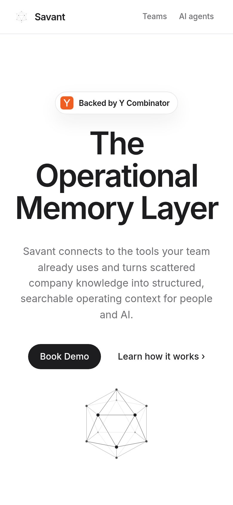
- Uncollapsed nav links — "Teams" and "AI agents" remain as a desktop link row instead of a hamburger, and the header loses its "Book Demo" CTA on mobile.
- Book Demo button — Primary CTA sits at desktop proportions, roughly 40% width, sharing its row with "Learn how it works" instead of going full-bleed.
- Oversized hero headline — "The Operational Memory Layer" wraps into three very large lines, pushing the subhead and CTA deep into the fold.
Information hierarchy
83StrongDoes the design help or inhibit what the page is trying to say?
123- Icosahedron hero graphic — Faint, small, and cropped at the fold — the only brand visual carries no emotional or product meaning at this size.
- Duplicate Book Demo buttons — Nav and hero CTAs share identical black-pill styling and label, splitting attention between two equal-weight targets.
- Learn how it works — Text link sits at the same baseline as the primary CTA and offers an exit before the demo action.