
Your landing page’s weakest score is Trust.
How Reason Machines ranks
76Growth scoreupdated
category scores
category scoresShowHide
Score over time
Trust
58FairProof that the product is real, competent, and safe to try.
| Trust read | |
|---|---|
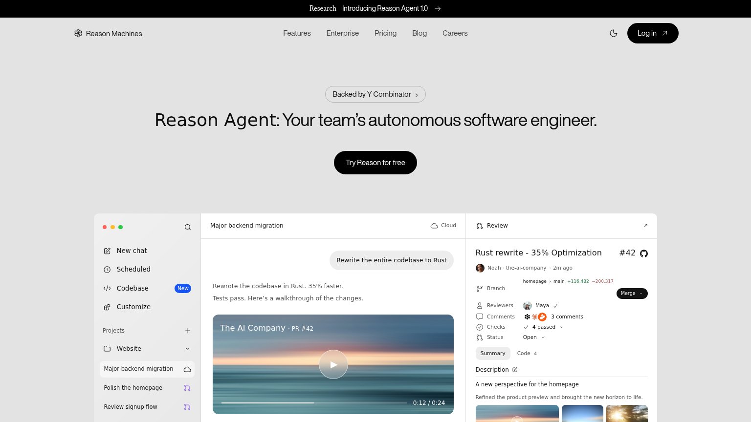
| Reason Machines | "Backed by Y Combinator" badge above the hero headline |
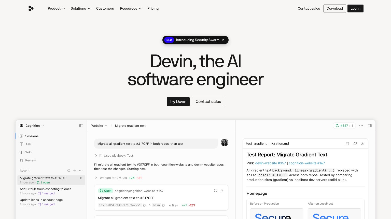
| Embedded Devin session demo showing the task "Migrate all gradient text to #317CFF in both repos, then test" with real P | |
| No visible trust signal identified. | |
| Terminal demo running 'codegen search "summarize a PR"' with real directory results | |
| implicit context OpenAI Codex may benefit from pre-existing familiarity among its target audience. | |
| Detailed 'Cursor Desktop' product UI showing the 'Plan Mission Control' agent workflow and Cursor CLI output |
Value props
76FairTitle, subtitle, hero — do they sell the product's true value?
Reason Machines’s headline sells
Reason Agent: Your team's autonomous software engineer.
Working
- Headline names true value in one line
- Hero demo shows real PR with diff stats
- "Backed by Y Combinator" adds credibility
Could improve
- No subhead — zero specifics in the copy
- Numbers live in screenshot, not headline
- No emotional or outcome-based hook
Information hierarchy
78FairDoes the design help or inhibit what the page is trying to say?
1234- Announcement banner arrow — The 'Introducing Reason Agent 1.0' banner is a full-width exit path sitting above the headline, competing with the fold's one action.
- Nav links row — Five equal-weight nav links plus a high-contrast 'Log in' button give attention six exits before the hero CTA.
- Product screenshot detail — The three-pane app capture is packed with micro-copy (branch stats, reviewers, checks) that reads as noise at fold scale rather than a single legible outcome.
- Backed by YC pill — The clickable 'Backed by Y Combinator ›' chip sits directly above the headline in the scan path, inviting an exit before the value prop lands.
Mobile web
84StrongThe phone experience as a first-class citizen.
 12
- Shrunken desktop screenshot — Three-pane desktop UI scaled to phone width renders all its text illegibly small.
- Try Reason CTA — Button floats at roughly half column width instead of the full-bleed tap target mobile allows.
CTA
86StrongCopy, size, verb, cost-feel — does the primary CTA earn the click?
Problems
- four words, just over ideal length
- no payoff echo of headline promise