
Your landing page’s weakest score is Trust.
How OpenWork ranks
68Growth scoreupdated
category scores
category scoresShowHide
Score over time
Trust
58FairProof that the product is real, competent, and safe to try.


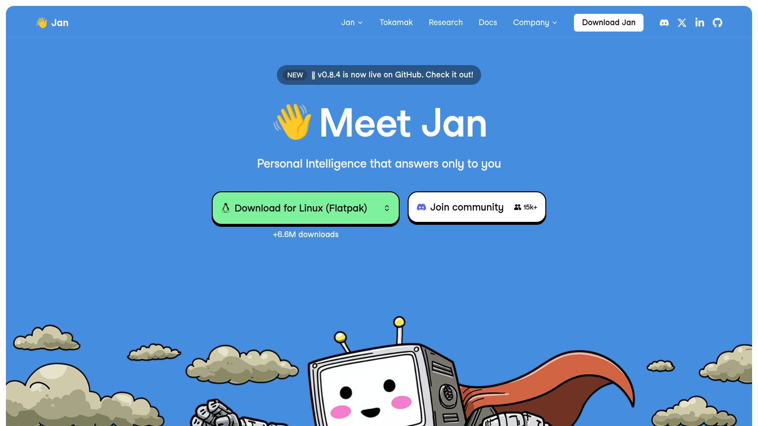
| Trust read | |
|---|---|
| OpenWork | GitHub star count "23.7K" in the header |
| implicit context Claude Cowork may benefit from pre-existing familiarity among its target audience. | |
| Photographed terminal screenshot showing a real session log: "Ran Set-Location ... +6 lines (no output)" | |
| "66k+ Stars" GitHub badge next to the Download Free CTA | |
| "+6.6M downloads" beneath the download CTA |
CTA
68FairCopy, size, verb, cost-feel — does the primary CTA earn the click?

Problems
- no 'free' despite free app line
- labels differ desktop vs mobile vs nav
- 'for Linux' excludes macOS/Windows
Information hierarchy
72FairDoes the design help or inhibit what the page is trying to say?
1234- Copy prompt card — A second dark CTA panel intrudes into the fold corner, competing at equal weight with 'Download for Linux' and splitting the action path.
- Header Download button — Duplicates the hero CTA in the same dark pill style, giving the fold three same-weight dark buttons instead of one primary action.
- Download for Linux CTA — OS-specific label mismatches the header's generic 'Download' and forces non-Linux visitors to hunt the small platform text below.
- Six-item nav row — Product, Connect, Cloud, Enterprise, Docs, Pricing plus a GitHub star chip create eight exits before the pitch is read.
Value props
72FairTitle, subtitle, hero — do they sell the product's true value?
OpenWork’s headline sells
Your AI workspace. Without vendor lock-in.
An open-source alternative to Claude Cowork, built for knowledge workers who want the freedom to choose their AI.
Working
- Positions vs a named competitor
- Lock-in angle hits real anxiety
- Names the audience explicitly
Could improve
- No concrete capability or outcome
- Hero art decorates, never demos
- Zero numbers or proof in copy
Mobile web
72FairThe phone experience as a first-class citizen.
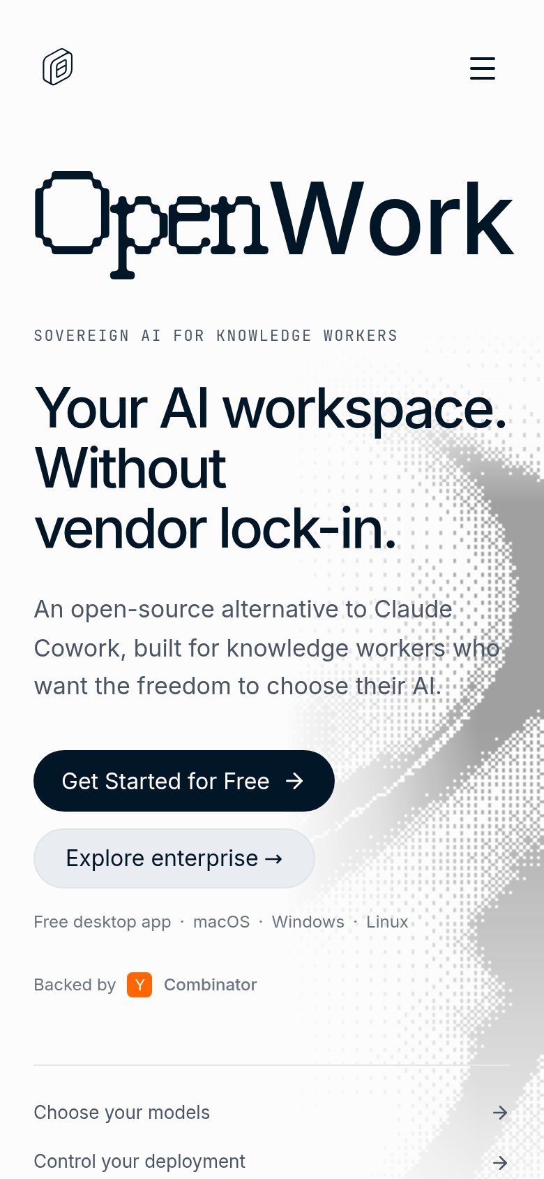 123
- Get Started button — Primary CTA lands below the first viewport and is only ~55% width instead of thumb-friendly full-bleed.
- Explore enterprise pill — Near-identical pill directly under the primary CTA splits the tap decision at the key moment.
- Decorative wordmark graphic — The oversized "OpenWork" wordmark eats a quarter of the fold and pushes the CTA down the page.