
Your landing page’s weakest score is Trust.
How OpenProse ranks
- 1.
DSPy75
- 2.
OpenProse72
- 3.
BAML (BoundaryML)64
72Growth scoreupdated
category scores
category scoresShowHide
Score over time
Trust
62FairProof that the product is real, competent, and safe to try.
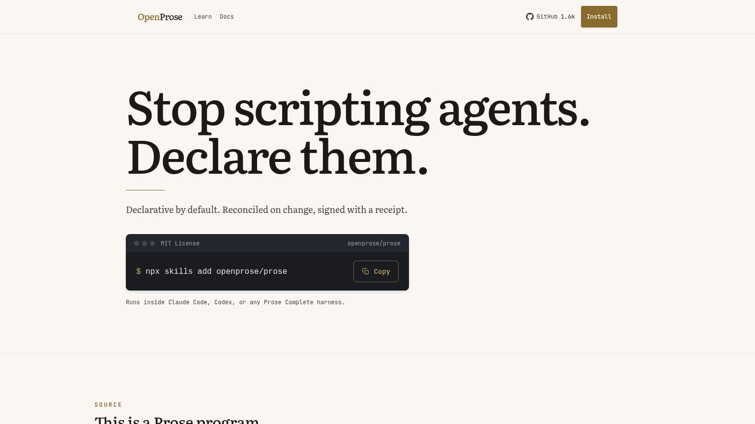
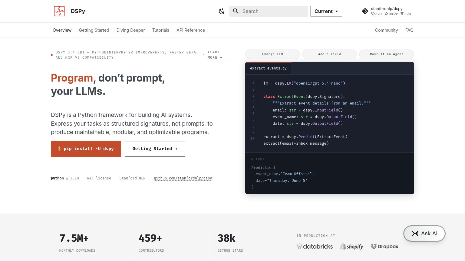
| Trust read | |
|---|---|
| OpenProse | "GitHub 1.6k" star count in the navigation |
| GitHub star count "9,199" in the navigation bar | |
| "7.5M+ MONTHLY DOWNLOADS" stat with "IN PRODUCTION AT" Databricks, Shopify, Dropbox logos |
CTA
72FairCopy, size, verb, cost-feel — does the primary CTA earn the click?
Problems
- 'Install' vs 'Copy' split the action
- no 'free' despite MIT License badge
- 'Copy' promises no payoff
- hero has no button, only nav CTA
Value props
72FairTitle, subtitle, hero — do they sell the product's true value?
OpenProse’s headline sells
Stop scripting agents. Declare them.
Declarative by default. Reconciled on change, signed with a receipt.
Working
- Sharp before/after contrast in headline
- Subhead cites real mechanics, not fluff
- Install command demonstrates the product
Could improve
- Jargon assumes declarative-infra fluency
- No concrete outcome or benefit named
- No proof numbers beyond GitHub 1.6k
Mobile web
72FairThe phone experience as a first-class citizen.
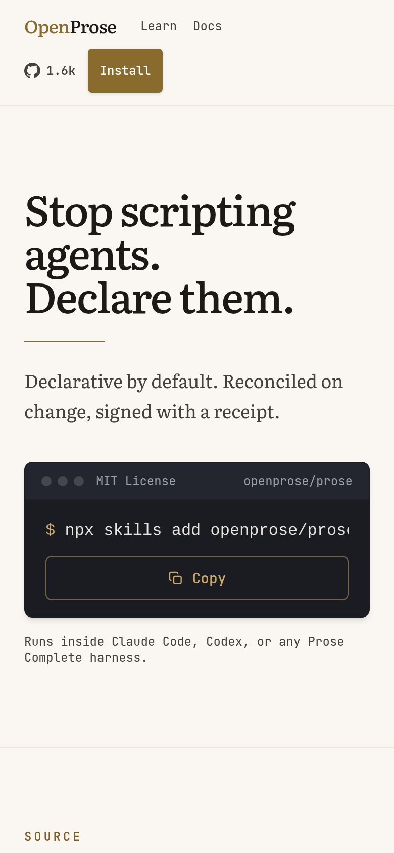 12
- Double-decker header — Nav never collapses — links, star count, and Install stack into two rows eating the top of the fold.
- Clipped install command — "npx skills add openprose/pros…" overflows the card edge, so visitors can't verify what Copy grabs.
Information hierarchy
84StrongDoes the design help or inhibit what the page is trying to say?
123- Nav Install button — Competes at equal weight with the terminal Copy action, splitting the primary CTA into two same-purpose paths.
- Copy button contrast — Outlined dark-on-dark styling makes the fold's real action visually weaker than the nav's filled Install button.
- GitHub 1.6k link — Outbound exit sits adjacent to the Install CTA in the scan path, leaking attention right before the action.