MountYC P26 landing page report.
← Back to YC P26

Your landing page’s weakest score is Trust.

Fix Trust

Score over time

807060504030Armilla AI 62 on Mar 7 (Wayback)Armilla AI 63 on May 20 (Wayback)Armilla AI 66 on Jul 8 (Wayback)Armilla AI 66 on Jul 28 (Live)Testudo 69 on Jul 28 (Live)Vouch 42 on Jun 9 (Wayback)Vouch 58 on Jul 15 (Wayback)Vouch 58 on Aug 6 (Wayback)Vouch 57 on Aug 22 (Wayback)Vouch 69 on Sep 20 (Live)Relm Insurance 59 on Mar 1 (Wayback)Relm Insurance 59 on Apr 17 (Wayback)Relm Insurance 68 on Jul 28 (Live)Mount 68 on Jun 13 (Wayback)Mount 65 on Sep 2 (Wayback)Mount 72 on Sep 20 (Live)Jun 13Sep 2Sep 20
Past reportsShow past reportsHide past reports
  1. Sep 20, 202672LiveOverall +7 · Trust +20 · Value props +10Viewing
  2. Sep 2, 202665Overall −3 · Value props −10 · Trust −8View →
  3. Jun 13, 202668First tracked report — strongest Mobile web 80, weakest Trust 46View →

Trust

58Fair

Proof that the product is real, competent, and safe to try.

Trust read
Mount"SECURING AI BY THE WORLD'S TOP PROVIDERS" logo strip (LangChain, Cursor, Anthropic) on mobile
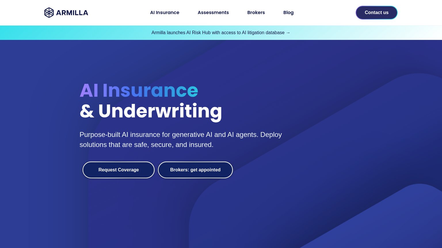
Armilla AIAnnouncement banner: "Armilla launches AI Risk Hub with access to AI litigation database →"
TestudoUNDERWRITTEN AT LLOYD'S
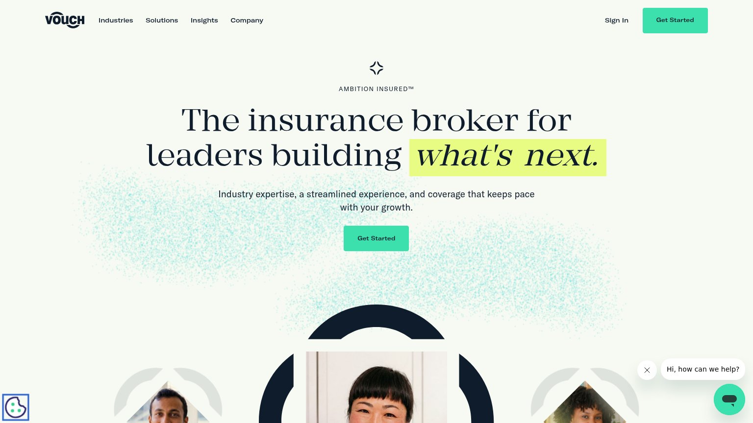
VouchNo visible trust signal identified.
Relm InsuranceNo visible trust signal identified.

CTA

68Fair

Copy, size, verb, cost-feel — does the primary CTA earn the click?

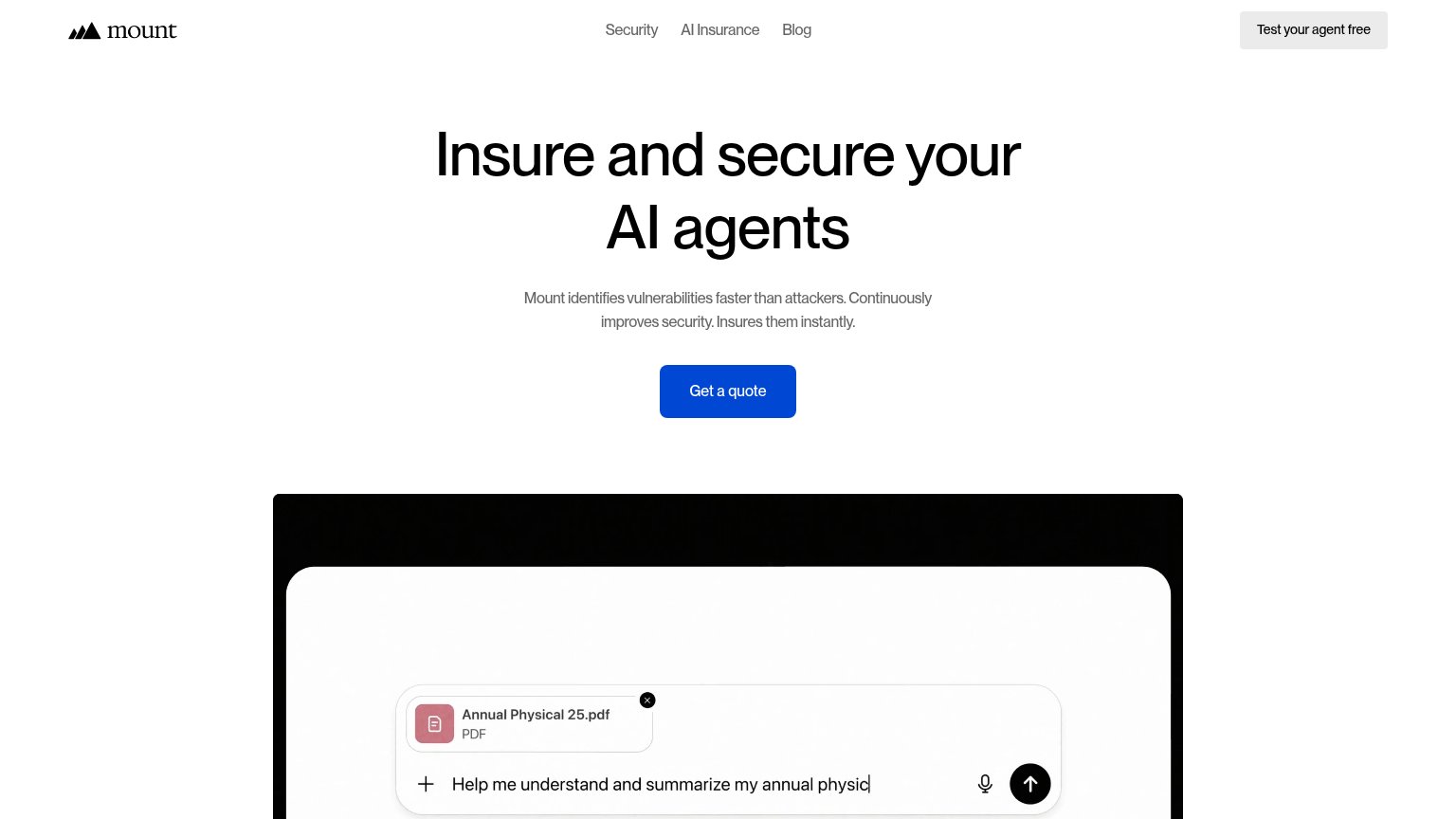
Mount
Vouch
Armilla AI

Problems

  • 'quote' feels like a sales cycle
  • 'free' offer buried in the nav
  • two CTAs split the first click

Value props

72Fair

Title, subtitle, hero — do they sell the product's true value?

Mount’s headline sellsInsure and secure your AI agentsMount identifies vulnerabilities faster than attackers. Continuously improves security. Insures them instantly.

Working

  • Dual value (secure + insure) named plainly
  • "Faster than attackers" adds urgency
  • Mobile fold shows real AI-failure stakes

Could improve

  • No concrete numbers anywhere in the fold
  • Desktop hero shows a generic chat mock
  • "Instantly" claim lacks proof or detail

Information hierarchy

78Fair

Does the design help or inhibit what the page is trying to say?

Information hierarchy annotations on the desktop capture12
  1. Test Mount's agent button — Filled header button competes at near-equal weight with 'Get a quote', splitting the fold's one decision.
  2. Cropped demo panel — The product demo is cut mid-interface at the fold line, so its context and payoff are unreadable at first glance.

Mobile web

82Strong

The phone experience as a first-class citizen.

Mobile web annotations on the mobile capture123
  1. Get a quote button — Desktop-proportioned at half column width; should be near full-bleed for thumb taps.
  2. Header test pill — Second CTA in the header competes with the hero's 'Get a quote' before the pitch lands.
  3. Forbes press card — Article headlines and thumbnails shrink to illegible sizes on the phone column.

Competitors

inferred from product, audience, and value prop