
Your landing page’s weakest score is Trust.
How Linzumi ranks
66Growth scoreupdated
category scores
category scoresShowHide
Score over time
Trust
38PoorProof that the product is real, competent, and safe to try.
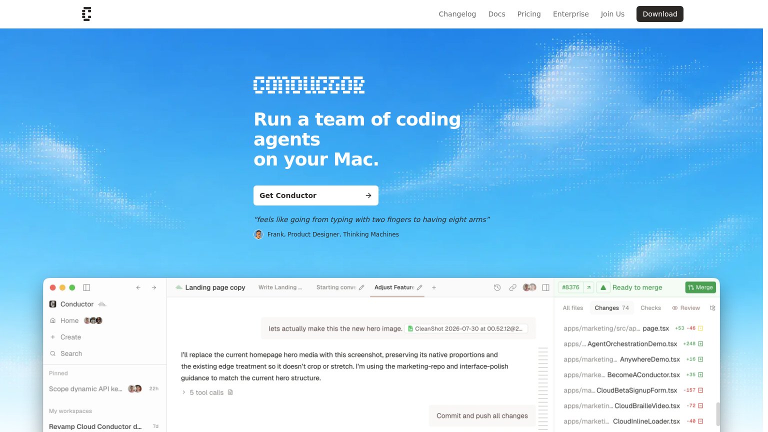
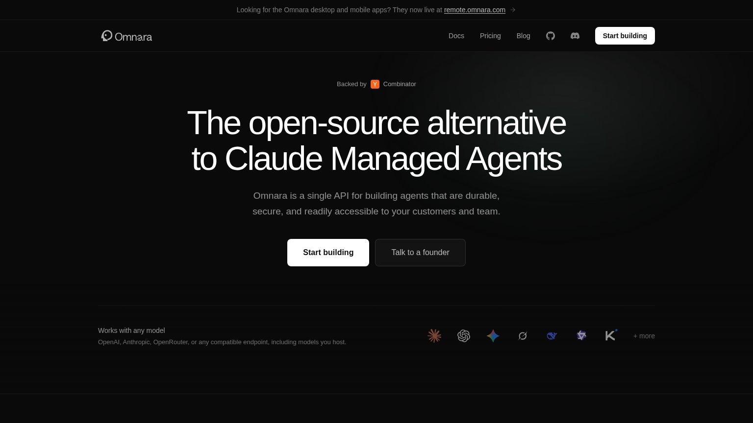
| Trust read | |
|---|---|
| Linzumi | No visible trust signal identified. |
| "feels like going from typing with two fingers to having eight arms" — Frank, Product Designer, Thinking Machines | |
| No visible trust signal identified. | |
| "Backed by Y Combinator" badge above the headline | |
| "Works with" integration icon row showing recognizable AI tool logos (including OpenAI) beneath the CTA | |
| No visible trust signal identified. |
Mobile web
68FairThe phone experience as a first-class citizen.
 123
- Serif hero headline — Headline wraps into four tall lines and eats most of the first viewport, pushing both CTAs below the fold.
- Subheadline paragraph — Eight lines of body copy stack under the headline, further displacing the primary CTA off-screen.
- Download for macOS button — Primary CTA sits around half the column width instead of near-full-bleed, leaving a smaller tap target than mobile allows.
Information hierarchy
72FairDoes the design help or inhibit what the page is trying to say?
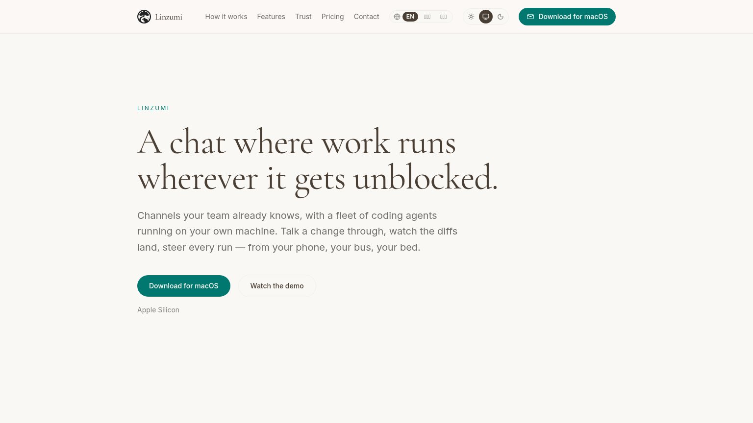 1234
- Duplicate download CTA — Header "Download for macOS" repeats the hero primary at equal weight, splitting the fold's single action into two targets.
- Language switcher cluster — Three-option locale pill with tofu glyphs sits at nav level, adding a broken-looking control to the scan path before the CTA.
- Theme toggle group — Three-state light/dark widget occupies prime header real estate and competes with navigation for attention without serving conversion.
- Five-link nav row — How it works / Features / Trust / Pricing / Contact all leak attention away from the download action before the headline is read.
Value props
72FairTitle, subtitle, hero — do they sell the product's true value?
Linzumi’s headline undersells
A chat where work runs wherever it gets unblocked.
Channels your team already knows, with a fleet of coding agents running on your own machine. Talk a change through, watch the diffs land, steer every run — from your phone, your bus, your bed.
Working
- "phone, bus, bed" paints vivid freedom
- Subhead names agents + own machine
- "watch the diffs land" is concrete
Could improve
- Headline unclear without subhead
- No hero image demonstrating product
- Zero numbers or proof points in fold
CTA
78FairCopy, size, verb, cost-feel — does the primary CTA earn the click?
Problems
- download feels heavier than a trial
- no cost reassurance near button
- modest size vs huge headline