Lab0YC P26 landing page report.
← Back to YC P26

Score over time

7570656055Cognition (SI-focused AI, formerly with ERP delivery focus) — Gluon by Rierino 58 on Apr 3 (Wayback)Cognition (SI-focused AI, formerly with ERP delivery focus) — Gluon by Rierino 64 on Sep 20 (Live)X 60 on Apr 19 (Wayback)X 59 on Aug 28 (Live)Lab0 71 on Apr 9 (Wayback)Lab0 70 on Apr 18 (Wayback)Lab0 68 on Sep 20 (Live)Apr 9Apr 18Sep 20
Past reportsShow past reportsHide past reports
  1. Sep 20, 202668LiveOverall −2 · Value props −20 · Mobile web +10Viewing
  2. Apr 18, 202670Overall −1 · Information hierarchy −4 · CTA −4View →
  3. Apr 9, 202671First tracked report — strongest Information hierarchy 82, weakest Trust 54View →

Trust

52Fair

Proof that the product is real, competent, and safe to try.

Trust read
Lab0"Backed by Y Combinator" badge
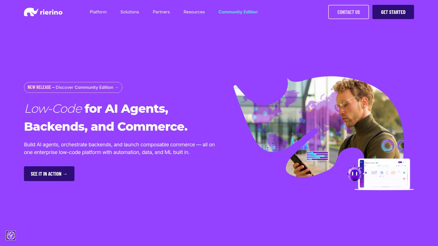
Cognition (SI-focused AI, formerly with ERP delivery focus) — Gluon by RierinoLaptop mockup showing a workflow-builder product UI beside the hero
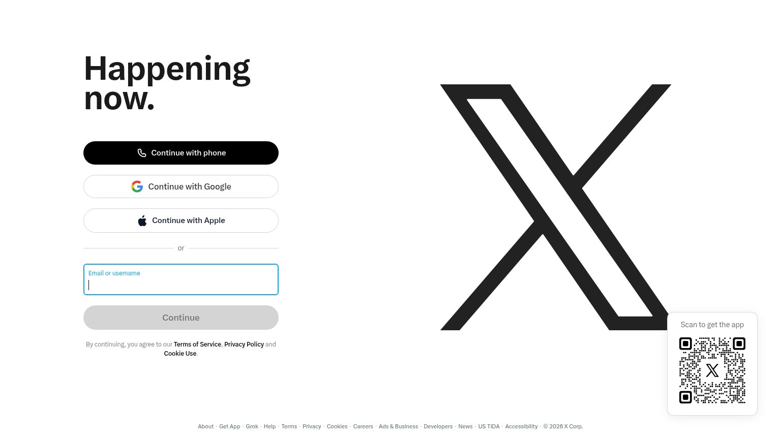
X"Continue with Google" / "Continue with Apple" OAuth sign-in options

Value props

62Fair

Title, subtitle, hero — do they sell the product's true value?

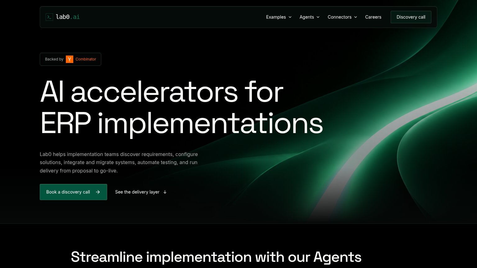
Lab0’s headline undersellsAI accelerators for ERP implementationsLab0 helps implementation teams discover requirements, configure solutions, integrate and migrate systems, automate testing, and run delivery from proposal to go-live.

Working

  • Names exact audience: ERP implementers
  • Subhead maps the full delivery lifecycle
  • YC badge adds instant credibility

Could improve

  • No outcome or metric anywhere in fold
  • "AI accelerators" is jargon, not a benefit
  • Hero art decorates, shows no product

CTA

64Fair

Copy, size, verb, cost-feel — does the primary CTA earn the click?

Lab0
X
Cognition (SI-focused AI, formerly with ERP delivery focus) — Gluon by Rierino

Problems

  • 'discovery call' feels costly
  • four words, over the limit
  • nav label differs: 'Discovery call'
  • no self-serve or product entry

Mobile web

78Fair

The phone experience as a first-class citizen.

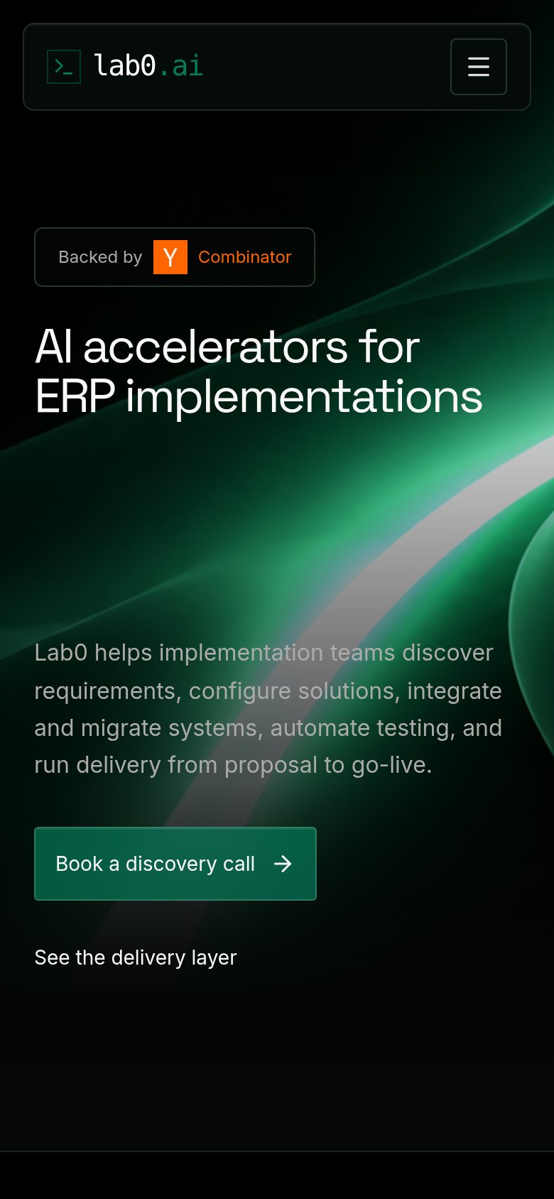
Mobile web annotations on the mobile capture12
  1. Subheadline paragraph — Four dense lines push the primary CTA toward the bottom of the fold.
  2. See delivery layer link — Plain text with no tap affordance or arrow; easy to miss as a secondary action.

Information hierarchy

82Strong

Does the design help or inhibit what the page is trying to say?

Information hierarchy annotations on the desktop capture123
  1. Nav Discovery call button — Boxed duplicate of the hero CTA competes at near-equal weight and splits the click path.
  2. Three dropdown nav items — Examples, Agents, and Connectors each open more paths, leaking attention before the primary action.
  3. Book discovery call CTA — Dark muted green sits low-contrast against the black hero, weakening one-second findability.