
Your landing page’s weakest score is Trust.
How CentralComs ranks
- 1.
Sameday AI82
- 2.
Rosie80
- 3.
Avoca78
- 4.
CentralComs71
- 5.
Goodcall71
- 6.
Hatch70
71Growth scoreupdated
category scores
category scoresShowHide
Score over time
Trust
42PoorProof that the product is real, competent, and safe to try.
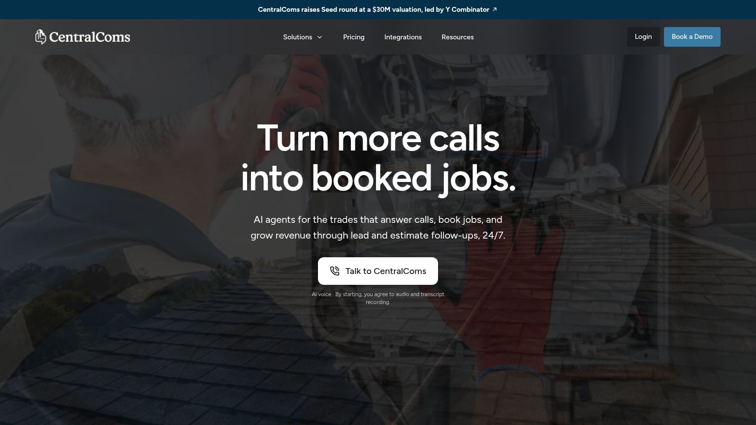
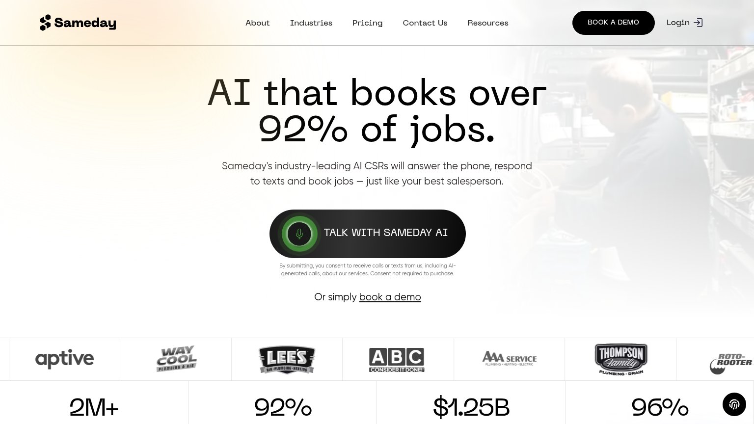
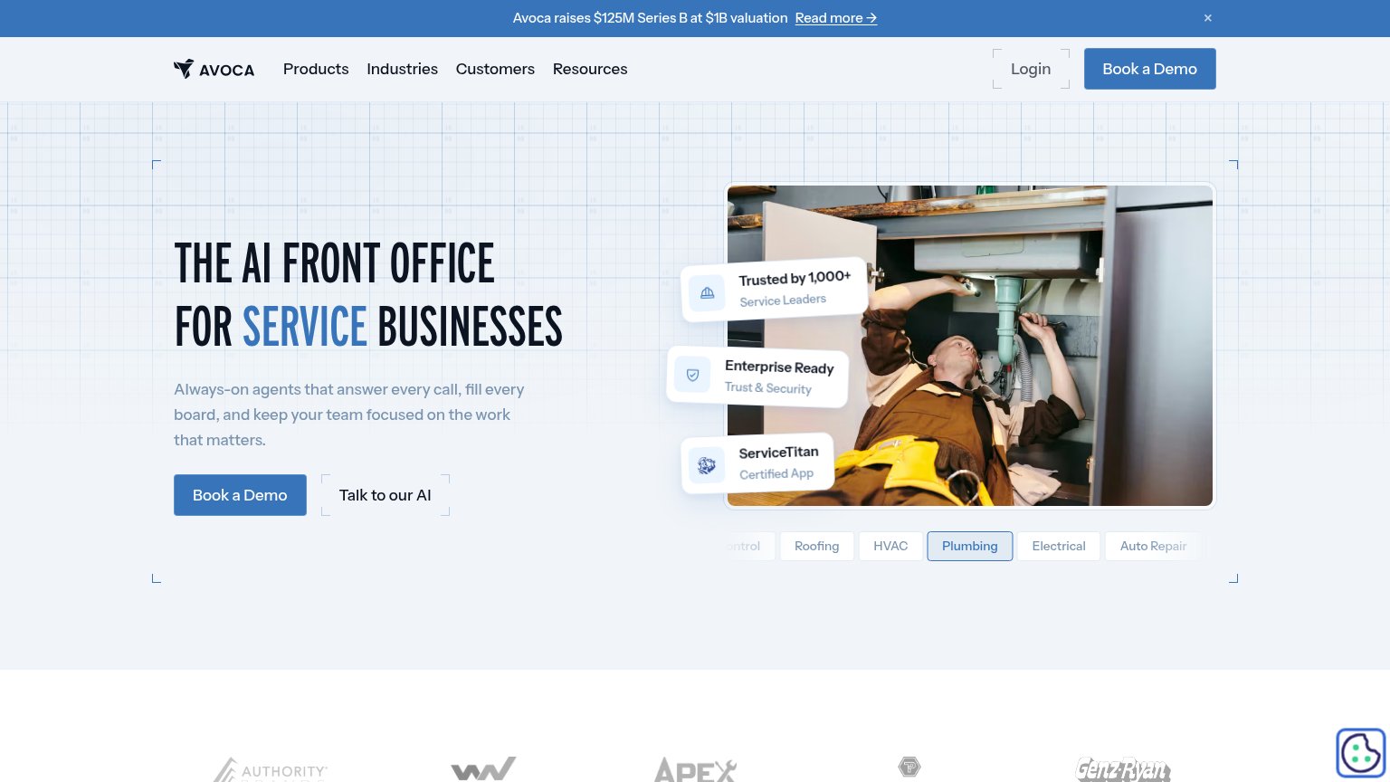
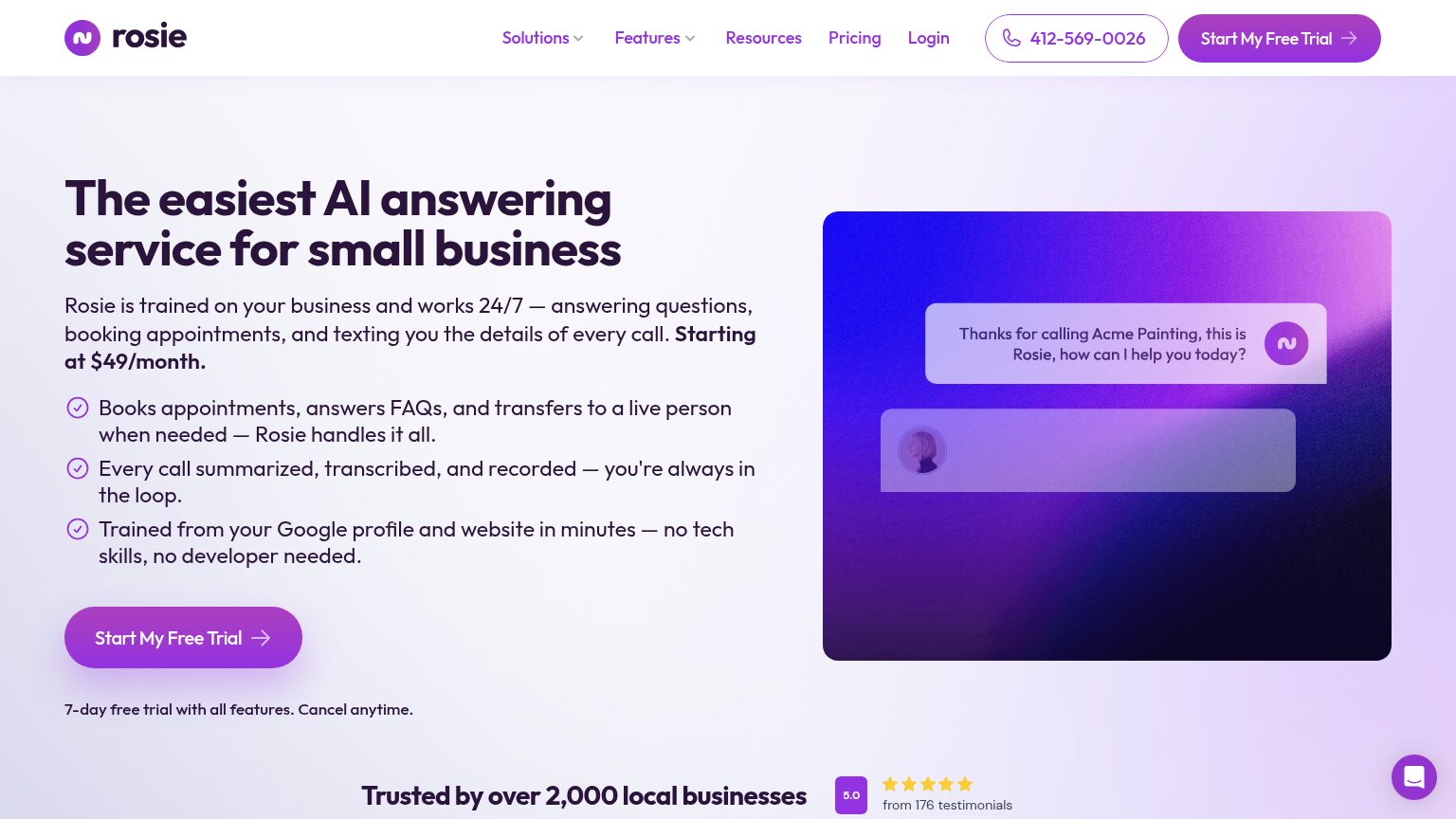
| Trust read | |
|---|---|
| CentralComs | "CentralComs raises Seed round at a $30M valuation, led by Y Combinator" banner |
| "Trusted by 1,000+ Service Leaders" badge | |
| Stats bar: "2M+ Calls answered in the trades" and "92% Booking rate in most channels" beneath the customer logo strip | |
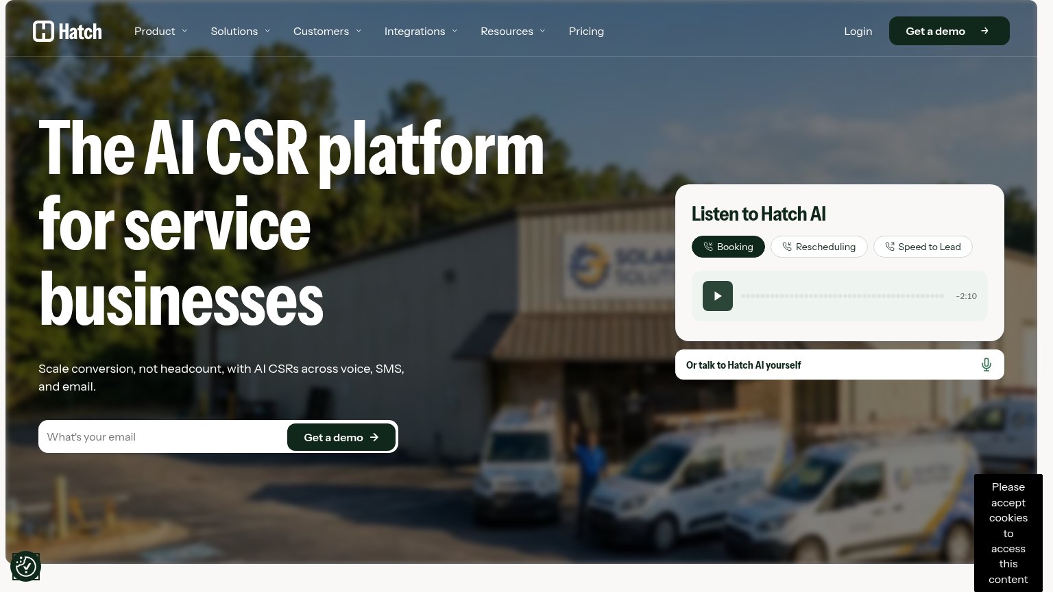
| "Listen to Hatch AI" audio demo widget with Booking / Rescheduling / Speed to Lead sample calls | |
| "Born at Google." heading with supporting copy on the mobile capture | |
| "Trusted by over 2,000 local businesses" with 5.0 rating badge "from 176 testimonials" |
CTA
76FairCopy, size, verb, cost-feel — does the primary CTA earn the click?
Problems
- recording consent adds cost-feel
- competes with nav 'Book a Demo'
- payoff of the call is not stated
Information hierarchy
78FairDoes the design help or inhibit what the page is trying to say?
1234- Book a Demo button — Blue filled button competes at equal weight with the hero's "Talk to CentralComs", splitting the primary action.
- Fundraise announcement banner — Outbound Y Combinator link sits at the top of the scan path, leaking attention before the value prop lands.
- Nav link row — Four links plus Login give six exits above the fold before the visitor reaches the hero CTA.
- Consent microcopy — Low-contrast recording disclaimer directly under the CTA adds hesitation at the moment of action.
Value props
78FairTitle, subtitle, hero — do they sell the product's true value?
CentralComs’s headline sells
Turn more calls into booked jobs.
AI agents for the trades that answer calls, book jobs, and grow revenue through lead and estimate follow-ups, 24/7.
Working
- Outcome-first headline, not features
- Subhead names audience and mechanism
- Live "Talk to CentralComs" demo CTA
Could improve
- No numbers or proof points in fold
- Hero photo decorates, doesn't demo
- No emotional hook for missed-call pain
Mobile web
83StrongThe phone experience as a first-class citizen.
 123
- Announcement bar — Wraps to two lines and consumes a large slice of the mobile fold before the hero starts.
- Hero headline — Scaled down too little — wraps into four oversized lines that push the CTA to the fold's bottom edge.
- Recording disclaimer text — Legalistic 'audio and transcript recording' line sits directly under the CTA and adds hesitation at the tap moment.