
Your landing page’s weakest score is CTA.
How Arzana ranks
76Growth scoreupdated
category scores
category scoresShowHide
Score over time
CTA
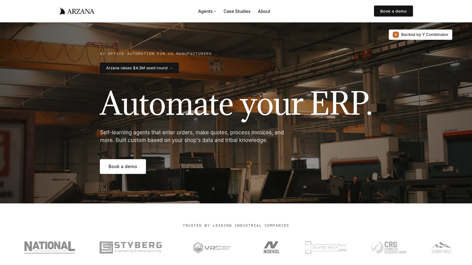
72FairCopy, size, verb, cost-feel — does the primary CTA earn the click?
Problems
- 'demo' click feels costly/sales-y
- no low-commitment alternative path
- hero button small vs huge headline
- nav pill outweighs hero CTA
Trust
72FairProof that the product is real, competent, and safe to try.
| Trust read | |
|---|---|
| Arzana | Customer logo bar under "TRUSTED BY LEADING INDUSTRIAL COMPANIES" |
| "ITAR-registered warehousing and kitting" | |
| Gartner 4.8/5 and G2 4.7/5 star ratings under the hero headline |
Mobile web
74FairThe phone experience as a first-class citizen.
 123
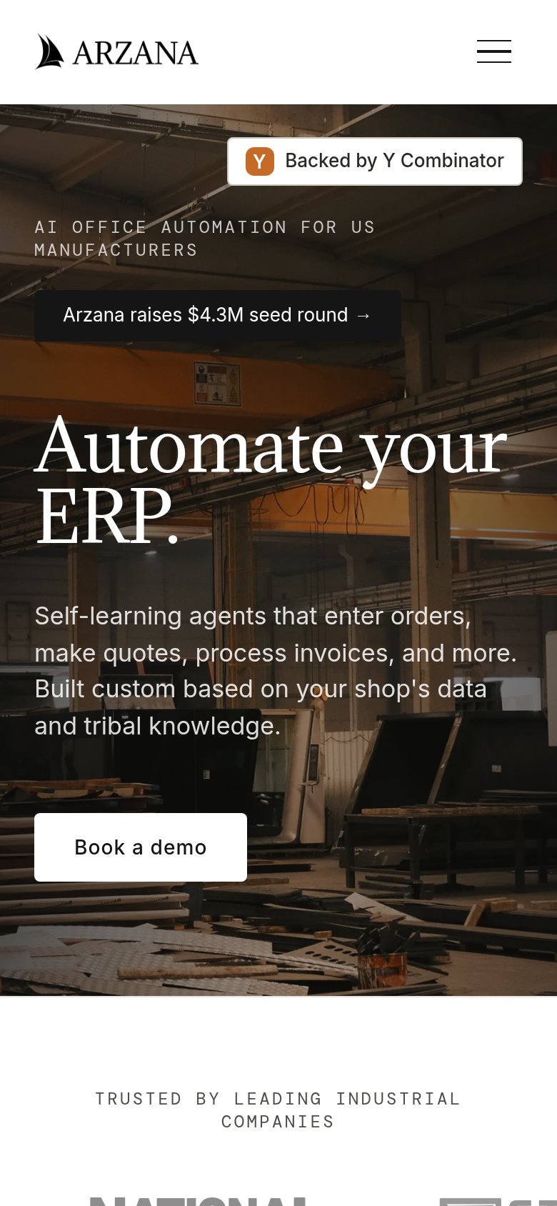
- Book a demo button — Sits below the descriptive paragraph at the very bottom of the fold and spans barely a third of the column instead of full width.
- Seed round banner — Dark announcement pill competes with the headline for attention and pushes the hero copy and CTA further down the viewport.
- Y Combinator badge — Large trust badge occupies the first visual slot above the eyebrow text, delaying the value statement.
Value props
78FairTitle, subtitle, hero — do they sell the product's true value?
Arzana’s headline sells
Automate your ERP.
Self-learning agents that enter orders, make quotes, process invoices, and more. Built custom based on your shop's data and tribal knowledge.
Working
- Concrete task list: orders, quotes, invoices
- 'Tribal knowledge' speaks the shop's language
- Clear audience: US manufacturers
Could improve
- No numbers or time-saved outcome
- Hero photo decorates, doesn't demo product
- Assumes reader knows what an ERP is
Information hierarchy
82StrongDoes the design help or inhibit what the page is trying to say?
123- Seed round banner — Button-styled funding announcement sits above the headline and pulls first attention toward investor news, not the demo.
- Y Combinator chip — High-contrast badge floats alone in the top-right corner, off the scan path and competing with the nav CTA.
- Nav Book a demo — Duplicates the hero CTA at equal visual weight, splitting the single primary action across two targets.