
Your landing page’s weakest score is Value props.
How Antinuous ranks
38Growth scoreupdated
category scores
category scoresShowHide
Score over time
Value props
32PoorTitle, subtitle, hero — do they sell the product's true value?
Antinuous’s headline vague
Antinuous
Working
- Sharp problem framing of the AI gap
- Concrete industry stats add credibility
- Distinctive voice, no buzzword filler
Could improve
- No headline stating the product's value
- Product never named or described in fold
- No image showing the product working
Information hierarchy
38PoorDoes the design help or inhibit what the page is trying to say?
 1234
- Eleven-paragraph text wall — Same-weight body copy with no headline or hierarchy forces the visitor to read everything to find the point.
- Buried value proposition — The core claim about the missing interface sits in the fourth paragraph instead of leading the page as a headline.
- Right gradient panel — The blurred grayscale visual carries no product meaning and is not composed around a message or action.
- Antinuous wordmark row — Header contains only a wordmark with no CTA, leaving the fold with zero actionable elements.
Trust
38PoorProof that the product is real, competent, and safe to try.
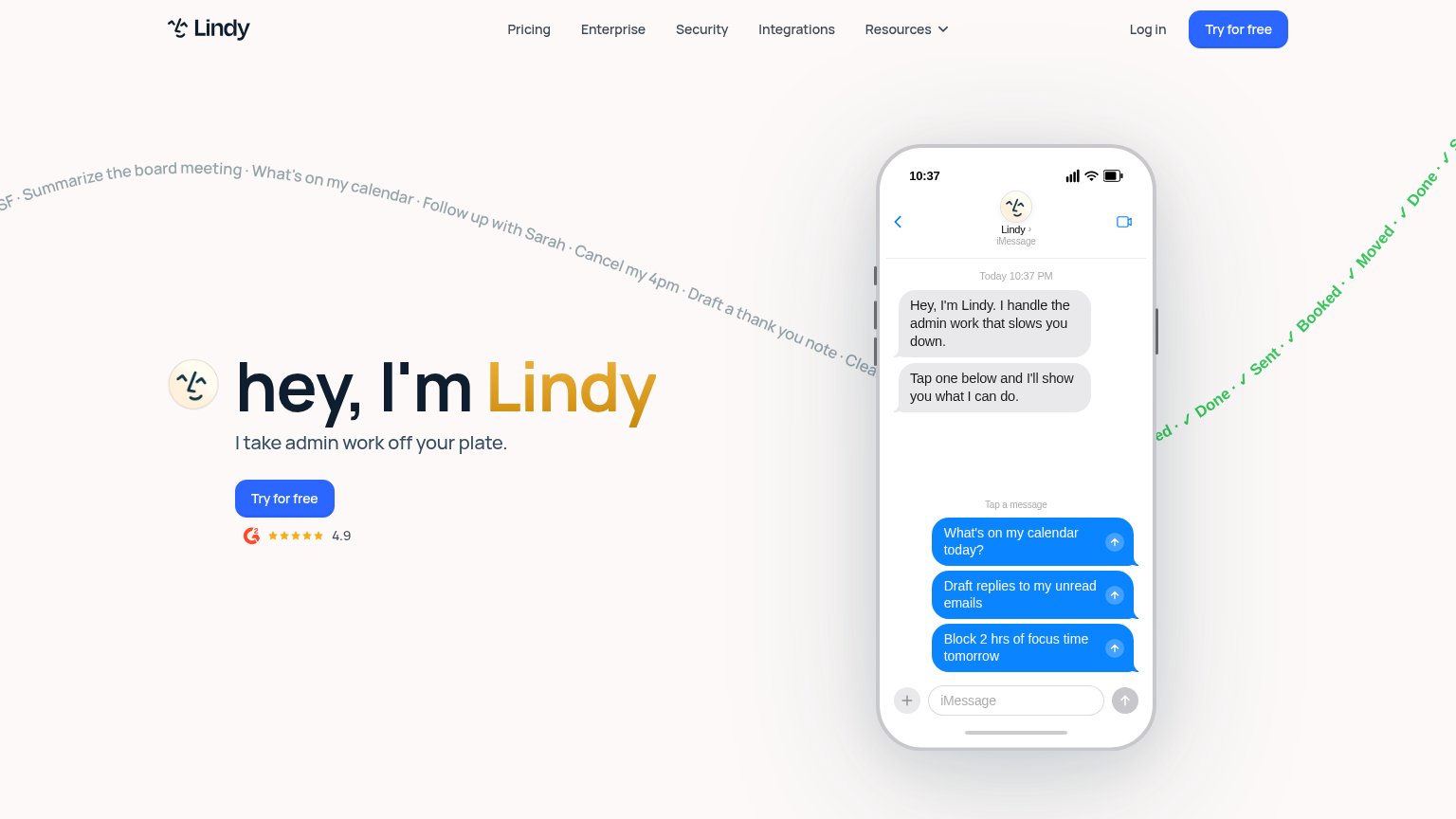
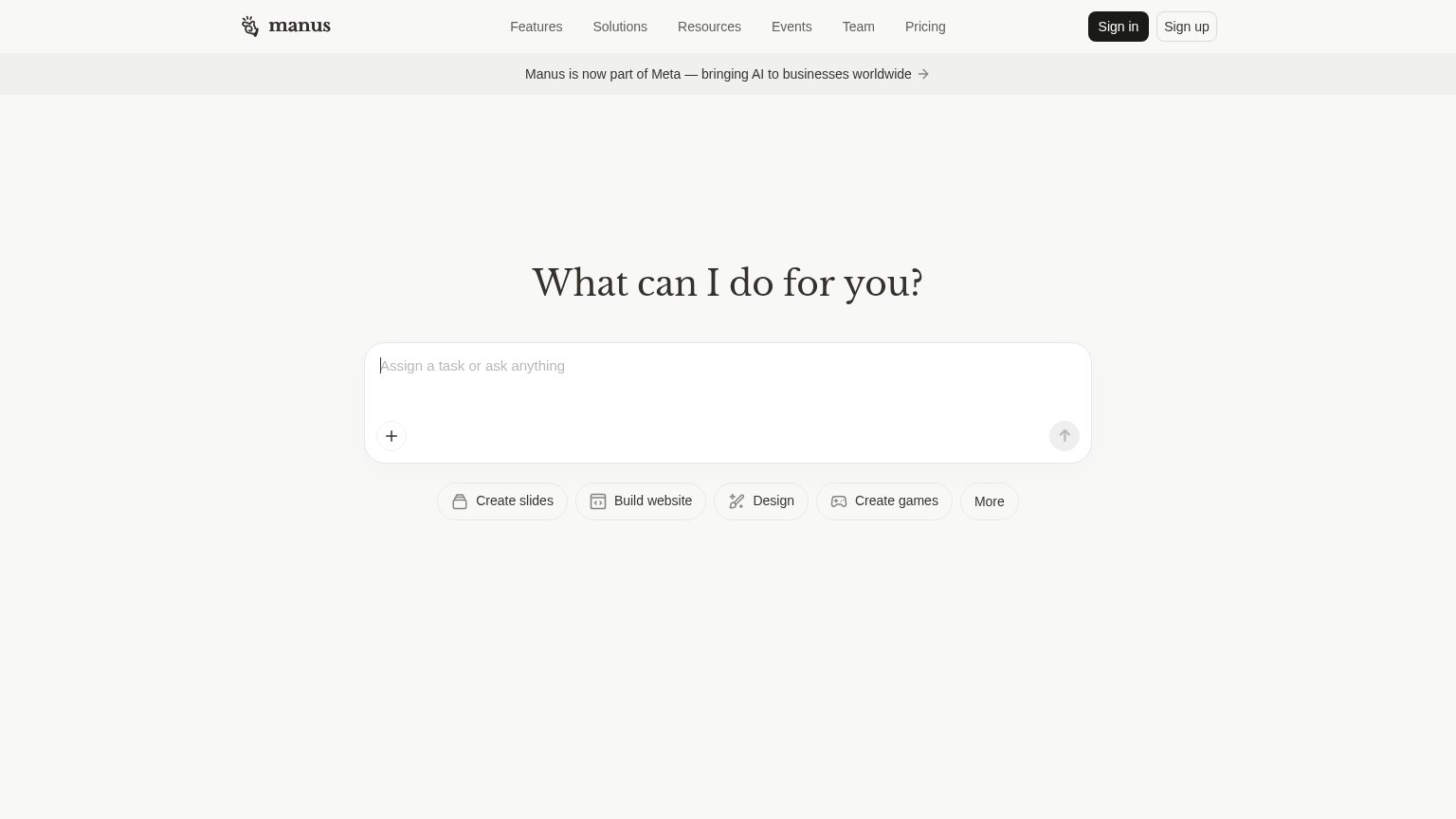
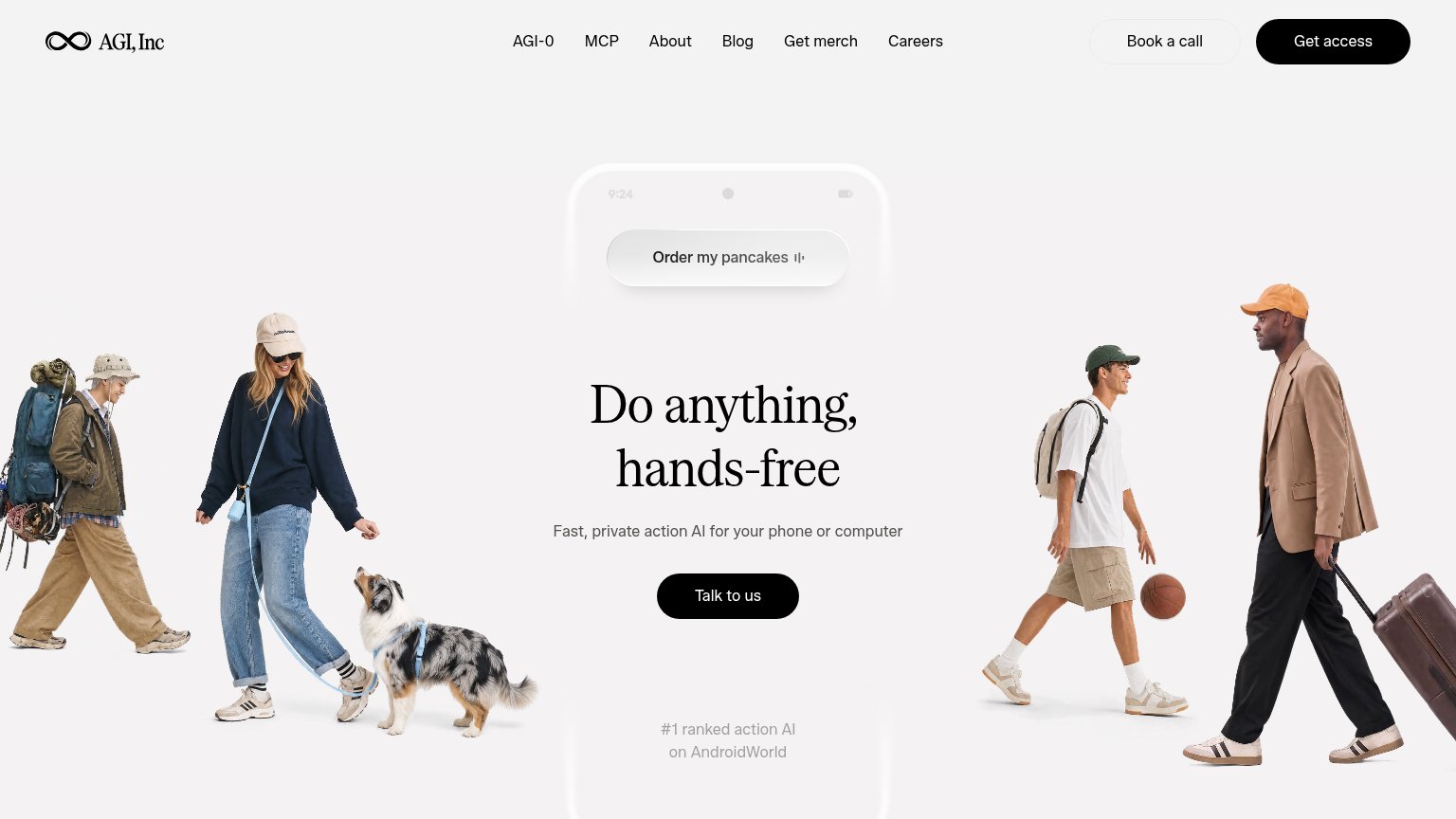
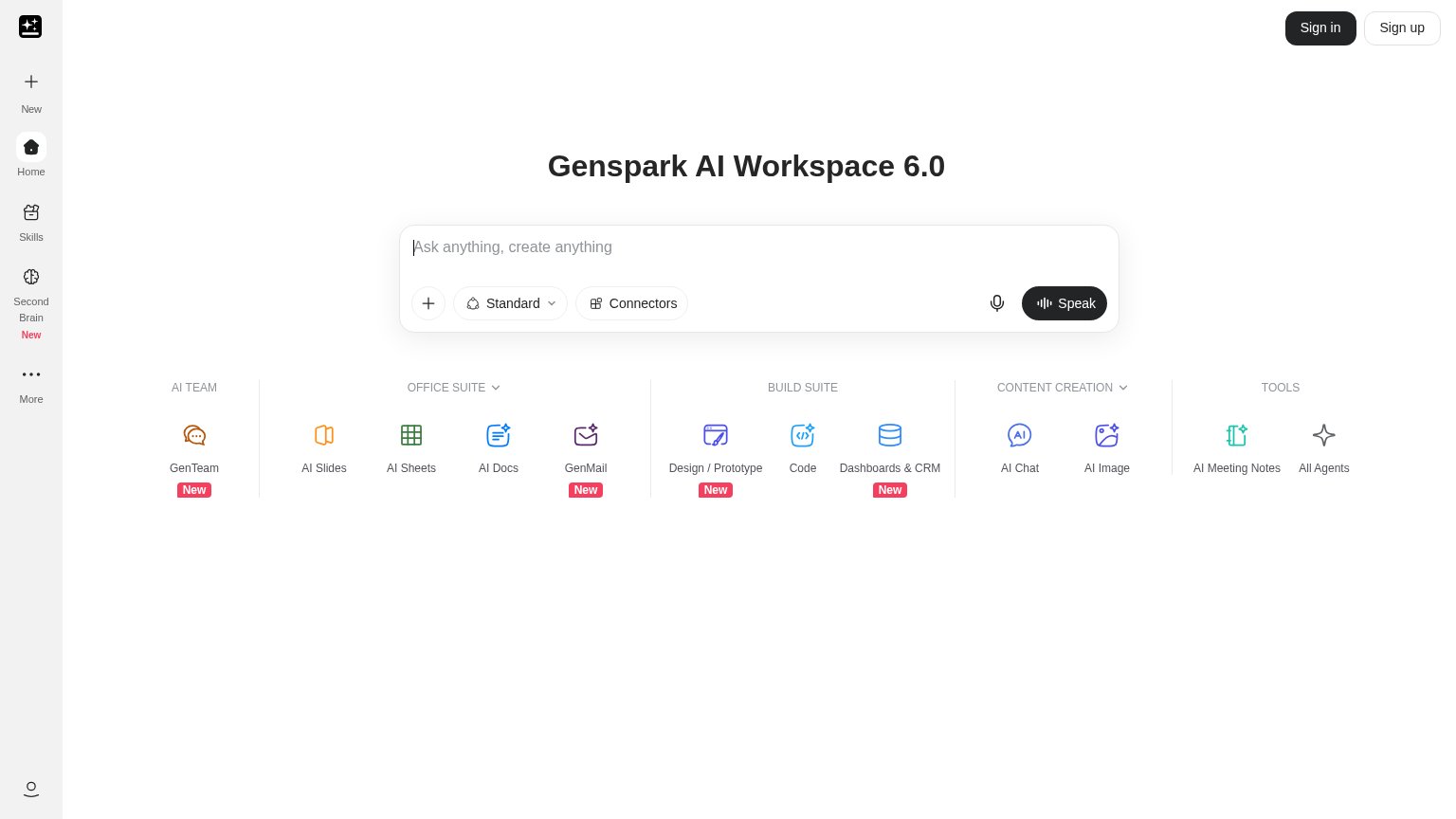
| Trust read | |
|---|---|
| Antinuous | No visible trust signal identified. |
| G2 badge with 4.9 star rating below the "Try for free" CTA | |
| "#1 ranked action AI on AndroidWorld" claim below the CTA | |
| Banner: "Manus is now part of Meta — bringing AI to businesses worldwide" | |
| Live product UI: working prompt bar with feature suite (AI Slides, AI Sheets, GenMail, Dashboards & CRM) |
CTA
42PoorCopy, size, verb, cost-feel — does the primary CTA earn the click?
Problems
- no CTA anywhere in fold
- essay ends with no next action
- no interactive element on mobile
Mobile web
42PoorThe phone experience as a first-class citizen.
 1
- Logo-only header — The header offers no menu, link, or action, leaving visitors with nothing to tap.