
Your landing page’s weakest score is Trust.
How Vesence ranks
- 1.
Vesence73
- 2.
Cluely (formerly known)? — excluded38
73Growth scoreupdated
category scores
category scoresShowHide
Trust
62FairProof that the product is real, competent, and safe to try.
| Trust read | |
|---|---|
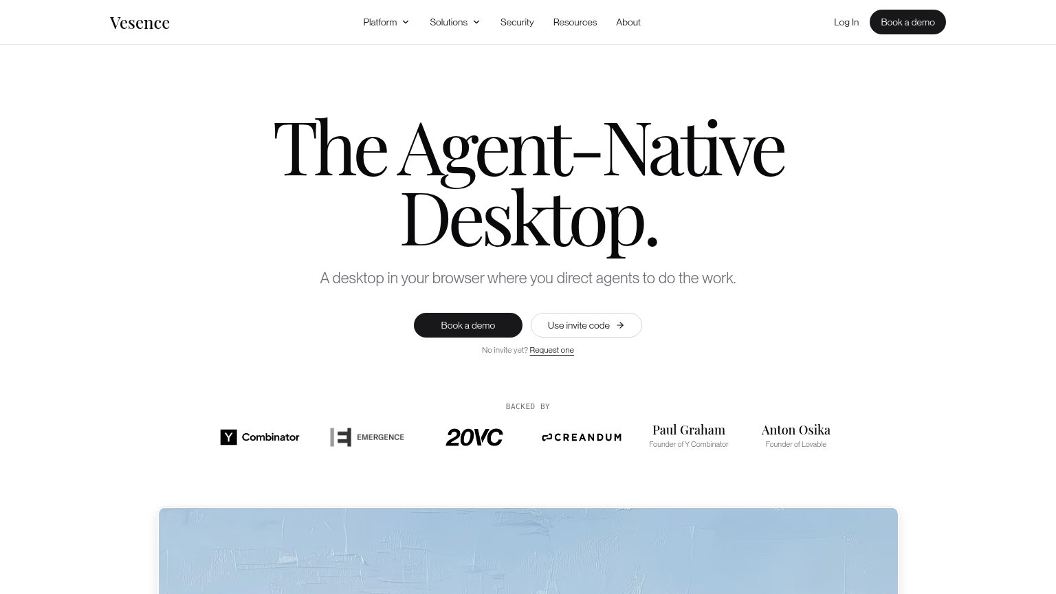
| Vesence | "BACKED BY" strip with Y Combinator, Emergence, 20VC, Creandum logos and named angels "Paul Graham — Founder of Y Combin |
| No visible trust signal identified. |
Value props
68FairTitle, subtitle, hero — do they sell the product's true value?
Vesence’s headline undersells
The Agent-Native Desktop.
A desktop in your browser where you direct agents to do the work.
Working
- Names the real mechanic: Vesence direct, agents work
- Clean category claim, no buzzword stack
- Elite investor proof strip below CTAs
Could improve
- Zero specifics: no tasks, numbers, outcomes
- Hero shows wallpaper, not agents working
- No emotional payoff (time back, relief)
CTA
72FairCopy, size, verb, cost-feel — does the primary CTA earn the click?
Problems
- 'Book' implies a costly sales call
- cheapest path buried as text link
- invite gating signals friction
Information hierarchy
78FairDoes the design help or inhibit what the page is trying to say?
123- Use invite code button — Same-size secondary button beside "Book a demo" splits the primary action into a two-choice decision.
- Request one link — Third conversion path ("No invite yet? Request one") stacked under the buttons dilutes the single next step.
- Nav menu links — Six nav items plus Log In offer seven exits before the visitor reaches the hero CTA.
Mobile web
86StrongThe phone experience as a first-class citizen.
 12
- Side-by-side CTA pair — Two half-width buttons split the tap target; "Book a demo" deserves a full-bleed row of its own.
- Backed-by logo grid — Six investor items in a dense two-row grid compete for attention right under the CTAs; one row would do.