
Your landing page’s weakest score is Trust.
How Sureform ranks
64Growth scoreupdated
category scores
category scoresShowHide
Score over time
Trust
48PoorProof that the product is real, competent, and safe to try.
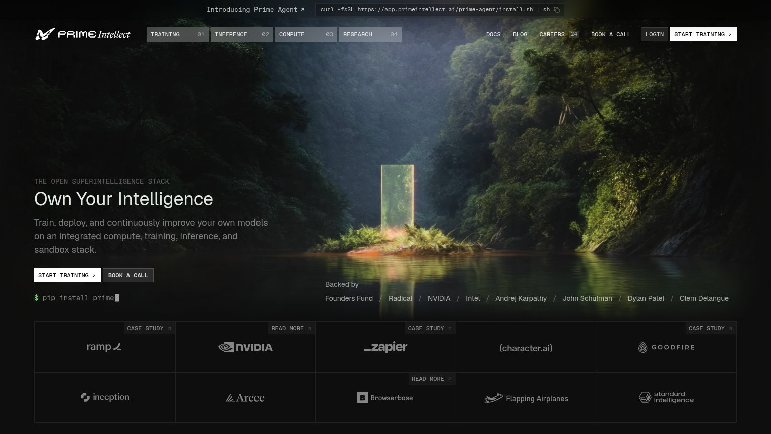
| Trust read | |
|---|---|
| Sureform | "Backed by Y Combinator" badge above the headline |
| implicit context Mercor may benefit from pre-existing familiarity among its target audience. | |
| "New Frontier data and RL environments, off the shelf" announcement banner | |
| implicit context Scale AI may benefit from pre-existing familiarity among its target audience. | |
| Customer logo grid with CASE STUDY links: ramp, NVIDIA, Zapier, character.ai, Goodfire, Arcee, Browserbase | |
| implicit context Turing may benefit from pre-existing familiarity among its target audience. |
Value props
62FairTitle, subtitle, hero — do they sell the product's true value?
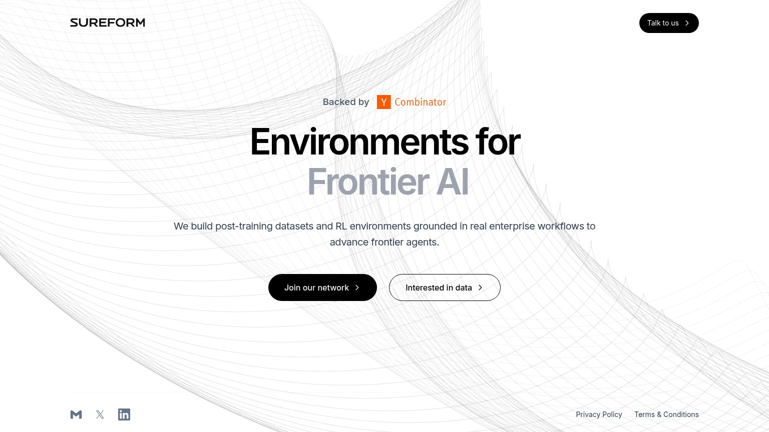
Sureform’s headline undersells
Environments for Frontier AI
We build post-training datasets and RL environments grounded in real enterprise workflows to advance frontier agents.
Working
- Subhead names the real product plainly
- "Real enterprise workflows" is a differentiator
- YC badge adds instant credibility
Could improve
- Headline is category jargon, no outcome
- Zero numbers or proof points in the fold
- Hero art decorates, shows no environment
CTA
64FairCopy, size, verb, cost-feel — does the primary CTA earn the click?


Problems
- 'Join' feels committal, no payoff
- three competing labels above fold
- secondary CTA has no verb
- unclear who each CTA is for
Information hierarchy
72FairDoes the design help or inhibit what the page is trying to say?
1234- Talk to us button — Same solid-black weight as the hero's Join our network, splitting the primary action across two CTAs.
- Interested in data button — Third equal-size action beside the hero CTA; three routes with no ranked hierarchy dilute the one conversion.
- Footer social icons — Gmail, X, and LinkedIn exits leak into the fold and pull attention off-site before the CTA is clicked.
- Footer legal links — Privacy Policy and Terms links surface inside the first viewport, adding two more exit paths to the fold.
Mobile web
72FairThe phone experience as a first-class citizen.
 123
- Join our network button — Primary CTA sits below the first mobile viewport, forcing a scroll before any action is tappable.
- Environments for headline — Desktop-scale type wraps to three tall lines, eating the fold and pushing the CTAs down.
- Interested in data button — Secondary CTA stacks directly under the primary at near-equal weight, splitting the tap decision.